Introduction

On 25 September 2015, all 193 Member States of the United Nations adopted the 17 Sustainable Development Goals (SDGs), aka the Global Goals.

This book articulates a path to make these Goals appear manageable, to implement in your life, adapting the 120 indicators used by the SDG Index to the individual level. The scope of the Goals is gargantuan, ill-fitted for individual countries, let alone individual people, implying their international nature.

What follows is a loose method to apply to your life, to keep yourself accountable to your responsibility toward the Goals as a global citizen.

What is sustainable development?

Sustainable development is a way of thinking about and uniting all the complicated, yet intersecting issues we’ll come to explore ahead, centred on three pillars:

  • Economic growth

  • Social inclusion

  • Environmental sustainability

Three pillars of sustainable development 

The genesis of the concept of sustainable development at a UN level is 1972 in Stockholm, where a UN conference linked human development with the environment. 20 years later, in 1992 in Rio de Janeiro, the UN held the Earth Summit, the biggest summit of world leaders at the time, putting environmental sustainability at the forefront. From this summit came three important treaties:

  • UN Framework Convention on Climate Change (UNFCCC)

  • Convention on Biological Diversity

  • United Nations Convention to Combat Desertification (UNCCD)

20 years hence from the Rio Summit, the UN held another conference in Rio in 2012, the United Nations Conference on Sustainable Development. Upon reflection and assessment of the above three treaties ahead of Rio+20, the scorecard of their progress was scathing. It was at this conference the impetus solidified to form what would become the SDGs.

The UN’s primary agenda from 2000 to 2015 was the era of the Millennium Development Goals (MDGs). The concept central to the MDGs was international development, as sustainable development is to the SDGs. In 2000, a summit of world leaders at the UN Headquarters, known as the Millennium Summit, adopted the MDGs.

The MDGs were eight goals, on the topics of:

  1. extreme poverty and hunger

  2. universal primary education

  3. gender equality and women’s empowerment

  4. child mortality

  5. maternal mortality and health

  6. HIV/AIDS, malaria and other diseases

  7. environmental sustainability

  8. global partnership

The Millenium Development Goals 

In 2000, a count of those living within the definition of extreme poverty (which we’ll define in the next chapter) was 1.7 billion. At the end of the MDG period in 2015, this was down by a billion, to 750 million people. China bears most credit for this, from a worldwide height of 2 billion people in extreme poverty in 1990, when two-thirds of the Chinese population lived within the definition of extreme poverty. The period from 1990 to 2015 accounts for approximately 750 million Chinese coming out of extreme poverty to less than 1% of its population.

Though the principles of international development guided the span of the MDGs between 2000 and 2015, a sentiment grew that the MDGs needed to emphasise some key issues. Inequality within countries had become a prevailing concern, as well as strengthening the environmental component of MDG #7. Humans had been making as much money as we could, much of it at the expense of the Earth’s ability to heal itself along the way. Environmental advocates had been crying out about the human effects on nature and ecosystems for decades, but by the 2010s, it was evident the effects were catastrophic. Humanity was edging toward a cataclysm imperilling our species, as well as courting a mass extinction of other species.

In the twilight of the MDG period, the UN was considering what would follow to guide its agenda after 2015, the due date of the MDGs. The conception of sustainable development as the guiding principle for this post-2015 UN agenda took shape.

In September each year, a new session of the UN General Assembly opens to address the forthcoming agenda. The opening session of the UN General Assembly on 25 September 2015 passed a UN Resolution titled Transforming our world: The 2030 Agenda for Sustainable Development. The 2030 Agenda, including the 17 Goals, now guides the UN and its member states between 2015 to 2030.

SDG Index

To better break down how to act on the 17 SDGs, the UN divides the Goals into 169 targets, and below these targets, 236 measurable official indicators. Within this book, we’ll instead use the indicators used by the SDG Index, produced by the Sustainable Development Solutions Network (SDSN).

The SDSN is the greatest source of this book, a knowledge network of universities and research institutes around the world, under UN auspices, chartered by former UN Secretary-General Ban Ki-Moon. Much of this book is a distillation of the SDSN’s SDG Index, to which the world’s foremost academics in their respective fields have lent their knowledge and research efforts toward.

The lead authors for the 2022 SDG Index are Professor Jeffrey Sachs, Guillaume Lafortune, Professor Christian Kroll. Grayson Fuller and Finn Woelm. Also integral to the SDG Index and SDSN legacy is Guido Schmidt-Traub, former SDSN Executive Director, and co-author of the SDG Index reports from its first iteration in 2016 to 2020.

Professor Christian Kroll authored a report alongside the SDSN before the adoption of the SDGs in 2015. With a foreword by Kofi Annan, the format of the report acted as a progenitor and template of the SDG Index. Kroll’s report selected indicators well ahead of the UN, as even the Goals were yet to become official, displaying an index for scores in SDG preparedness for the rich countries.

The 2022 SDG Index consists of 120 indicators corresponding to the 17 Goals, with each country’s indicator scores combined into a composite index score and ranking. The Index score reflects a percentage of progress toward full achievement of all Goals i.e., 100. Therefore Finland, top of the rankings for the 2022 Index with a score of 86.51, is 86.51% of the way toward achieving all 17 SDGs. By contrast, bottom-ranked South Sudan scores 39.05, meaning it has a great distance to get from 39.05% progress toward achieving all the SDGs by 2030.

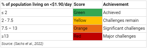
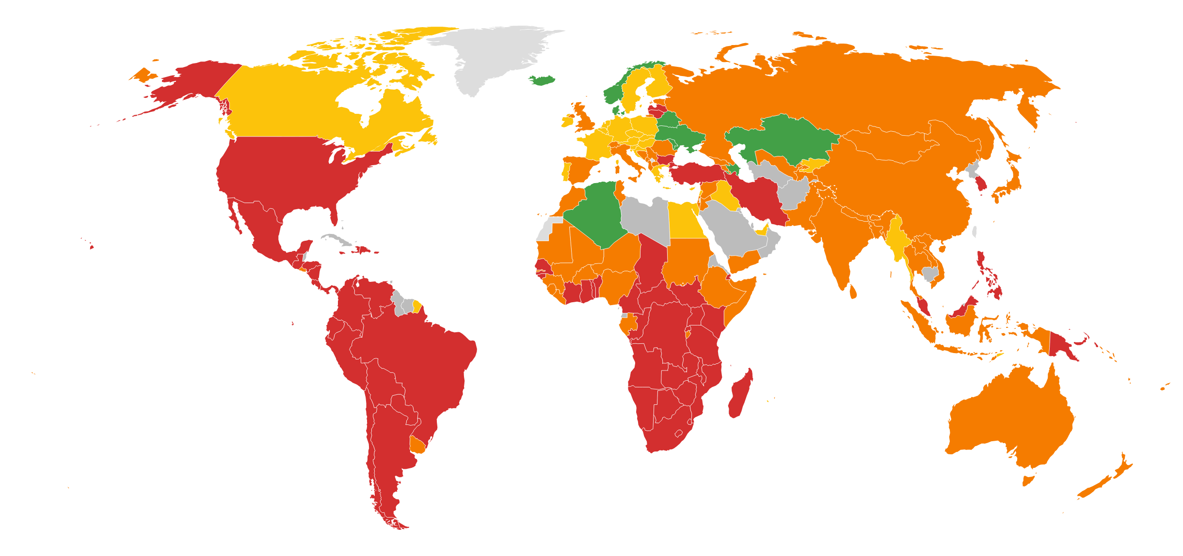
To illustrate, the SDG Index uses a traffic light system, with green indicating an achievement of the respective Goal, or otherwise being on track to achieve it by 2030. Red is the opposite, being far off course, with major challenges remaining. In between, yellow and orange are gradations of the middle light, orange suggesting further off course than yellow.

Using the example of the first indicator we’ll explore in SDG #1 (% of population living on less than $1.90/day), the bounds for each colour in the SDG Index for this indicator correspond to the below.

Paramount to the SDG Index is priority. This colour coding serves to illustrate chromatically where we’re at in our progress, to guide our prioritisation. The importance placed on countries scoring red or orange per indicator or Goal will be an overriding refrain throughout the book. If your country scored green on an indicator, you can put your feet up for that issue, and instead turn to those Goals or indicators for which your country has scored red.

The Global Goals are ambitious in breadth, intimidating at times to what we’re to do in what seems like a tiny frame of less than eight years at the time of writing. The purpose of the SDG Index is to show us which Goals and indicators need our immediate attention and energies, because the gap between where we need to be by 2030 and our present state is too far off course.

I’ll use my two countries of citizenship as an illustration. In the 2022 SDG Index, Australia scored red for:

  • SDG #2 (Zero Hunger)

  • SDG #12 (Responsible Consumption & Production)

  • SDG #13 (Climate Action)

  • SDG #15 (Life on Land)

Therefore, I focus on these Goals as a matter of prioritisation.

I hold dual citizenship with Malta, so incorporate it into my prioritised, red Goals. In the 2022 Index, Malta scored red for Goals #2, 6, 12 & 14, so I prioritise the extra Goals for which Malta has scored red i.e., Goals #6 and #14.

Some indicators are only for Organisation for Economic Coordination and Development (OECD) countries, which will be represented with an asterisk (*) next to the indicator heading. The OECD countries are often used to refer to the developed, high-income countries. Any further mention of ‘developed’ or ‘high-income’ countries will be synonymous with the high-income OECD members: US, Canada, UK, Australia, New Zealand, Japan, South Korea, Israel, most EU countries, Norway and Switzerland.

The reason why some indicators are OECD-only in the SDG Index is either because they're issues relevant only to high-income, developed countries, or only OECD countries have sufficient data for the indicator.

Many of the SDG Index indicators are appropriate at the national, state or city level, yet this book aims to adapt these indicators to the level of the individual. Implementing the SDGs in our personal lives means familiarising yourself with the underlying topics, and trying to coordinate your action toward implementing and monitoring these indicators.

Assigning individual responsibility is a stark request to place upon the shoulders of our fragile minds. We’re fortunate in the reality that the SDGs are tasks for the world. Yet for the tasks staked in this book, it must begin with you.

SDG #1 - No Poverty

Dashboard map for 2022 SDG Index Goal #1 ratings. Data source: sdgindex.org

Poverty headcount ratio at $1.90/day (%)

The definition of extreme poverty is an international poverty line, as deemed by the World Bank. The World Bank is an international financial institution within the UN System, with the task to provide loans to developing countries with the goal of poverty eradication. The World Bank measures the international poverty line as living on $US1.90 a day or less, which is less than enough to meet the basic needs of safe drinking water, food at or below subsistence, and access to health and education.

Approximately 740 million people met the definition of living in extreme poverty upon the adoption of the SDGs in 2015, the overwhelming majority living in Sub-Saharan Africa and South Asia. Before the industrial era, beginning in the middle of the 19th century, close to all the human population lived in a state of extreme poverty. Since the turn of the millennium, there has been a steady decrease in the number of people living in extreme poverty, as well as a decrease in the percentage of extreme poverty for the global population.

One of the key reasons for this encouraging drop in extreme poverty rates was the power of the Millennium Development Goals. The sister goal of SDG #1 was MDG #1, to halve extreme poverty levels by 2015, again using the international poverty line measure. The world met MDG #1 five years before its due date in 2010, due to the astounding growth rates of China in the period of the MDGs between 2000 and 2015. This meant MDG #1 saw a billion people lifted from extreme poverty compared to 1990, when almost half the population of developing countries lived under the international poverty line. Yet the three-quarters of a billion still left behind at the end of the MDG period in 2015 is an enormous number of people continuing to live in destitution and penury.

How to measure this Goal’s target to eradicate extreme poverty - those living under $1.90 a day - by 2030? The first indicator in use by the SDG Index is the poverty headcount ratio at $1.90/day.

As of June 2022, 682,614,000 people lived in extreme poverty, with a rate of one person per second escaping extreme poverty, an estimated metric you can view in real-time at the World Poverty Clock website. Yet the target rate to be met for those escaping poverty to eradicate extreme poverty by 2030 is 2.5 people per second. In total, this means the world is off-track by 254,758,130 people. Yet, as some escape poverty, others enter it, with the COVID-19 pandemic impacting progress on this target - though there were signs of slowing progress even before, compounded by conflict and climate change.

In 2015, the world’s extreme poverty rate was 10%, dropping to a low of 8.3% in 2019, then back up to 9.2% in 2020, equated with throwing up to 93 million people back into extreme poverty. This means the global extreme poverty rate rose in 2020 for the first time in over 20 years. The above trend projects 262 million people would still be living in extreme poverty in 2030, missing the extreme poverty eradication target - unless we instead accelerate our efforts between now and 2030.

It’s difficult, verging on impossible, to lift oneself from such an extreme poverty trap. Professor Jeffrey Sachs, co-author of the SDG Index, explains why in his magisterial book, The End of Poverty, using the analogy of the ladder of development. The End of Poverty outlines how we can end extreme poverty as though it were procedural, illuminating how achievable and within reach it is.

Those living in extreme poverty live hand-to-mouth, day-to-day. As such, they fail to produce a surplus e.g., from a crop’s harvest for smallholder farmers, thus without anything to sell to the market for a profit. Due to a high proportion of citizens living by such means in a country, a tax base to draw revenues from is missing. Thus, the government is missing the means to provide healthcare, education, or for any services to increase well-being and relieve extreme poverty. The least developed countries need aid to allow them to get their hand on the bottom rung of the development ladder. Then they have the means to lift themselves out of poverty. Without aid, this cycle will proceed mercilessly, compounded by climate change, disease, famine, demography, etc. The aim of development aid is to improve the economic and social development of humans living in countries which have yet to industrialise and are considered ‘developing’ in the parlance of the field of international development.

Aid has been chronically below the amount promised by developed countries to their developing counterparts for a half-century. Thus, the first task of the reader in high-income countries is to act on behalf of the 682 million living in extreme poverty.

The measure of aid used by the high-income OECD countries is known as ‘official development assistance’ (ODA), a concept defined in 1969 by the Development Assistance Committee (DAC) of the OECD. The DAC consists of 30 OECD members, making up the largest aid donors, as a forum to discuss aid and poverty reduction efforts.

Map of OECD DAC members

The predominant means of measuring donor amounts is as a percentage of the donor country's gross national income (GNI), a concept like GDP (gross domestic product). Whereas GDP is the value of all goods and services produced in a period, by contrast GNI includes the economic output of foreign residents of the country. The OECD DAC has an official List of ODA Recipients, all the developing countries and territories eligible to receive ODA. Included are dollar flows made via so-called ‘multilateral institutions’ e.g., the World Bank, International Monetary Fund, and UN agencies like UNICEF and the WHO. To count as ODA, donor flows must come from government agencies, and the aim of the flows must be economic development and the welfare of developing countries. They must either be free of the obligation to be repaid, or otherwise loans with much more generous repayment terms than available in the commercial market.

The spending counted toward poverty reduction for ODA includes food aid; basic health; education; water and sanitation; population programmes and reproductive health. Separate, though entwined, to development aid, is humanitarian aid - synonymous with logistical help in the face of disaster or conflict.

The 30 high-income country donors of the DAC spend 0.33% of their collective GNI on ODA - far below the 0.7% of GNI committed by these countries across decades, though reneged upon.

The only 2021 exceptions among the DAC members to meet or exceed the 0.7% commitment were Denmark, Sweden, Norway, Luxembourg, and Germany.

The international agreement whereby high-income OECD countries were supposed to give 0.7% of GNI as ODA goes back to 1970, affirmed in repeated agreements since. This means for every $10 made in high-income countries, for around 50 years now, they’ve committed, yet failed to produce, 7 cents of every $10 for the world's destitute. 7 cents which would otherwise solve extreme poverty by 2030. Instead, like my country Australia, our government, out of our tax revenue, for every $10 of GNI, produces 2 cents for ODA - a 5-cent differential from its pledge. Yet my country, and all other developed countries except five, withhold upon the opportunity to end extreme poverty in a decade. Why dither over 7¢ on every $10?

According to the principles of the poverty trap, 700 million are unable to escape from extreme poverty without this ODA. Their only lifeline from being an orphan of famine or infectious disease is foreign aid. For indicators related to living under the poverty line, it would be insensitive to set the task to readers to try to live above the poverty line. Who is the responsibility falling to? This book, rather than being about the government’s responsibility, is about your responsibility. There’s a solution to this, which is where OECD/DAC country readers come in. The affirmed commitment of 0.7% of GNI represents what the government is to offer in ODA. Whatever the gap between 0.7% and what your country’s government is providing in ODA, your opportunity is to step in to bridge the gap. Of course, as with every action in this book, it requires a scale of near ubiquity to have the desired impact, but the behaviours and attitudes of several million of your compatriots are outside your immediate control. Again, the focus of this book is you, and what change you can affect.

This is to achieve the Goals globally - in a sense, on behalf of the low-income countries, which barring a miracle, appear to be unable to meet the Goals. I’m imploring a mechanism pinning the burden on readers from high-income countries. If you're a reader from one of these countries, in this book, you'll shoulder the burden of your own developed country, as well as of the least developed countries. It will cost you seven cents upon every $10 you make. I’ll come back to this repeatedly, with good reason, as a mechanism to lift the least developed countries to a fighting chance, as their wherewithal makes it an impossibility to do so of their own accord.

Let's say the shortfall of ODA is approximately 0.48% of GNI, as it is as an Australian at the time of writing. Then for every $10 I earn, I should donate 48 cents - put another way, 0.48% of my gross income. I say gross, in contrast to after-tax net income, because in all high-income countries, you’ll be able to deduct the donation from your taxable income.

When you’re taxed by your home country, it’s to affect the greater well-being of the broad populace. Depending on the outlook of the population, it could be to provide a social safety net, or distribute income to the less fortunate, or fund the infrastructure we enjoy. Our ability to earn income benefits from this ecosystem of infrastructure, health care, education, laws, and monetary systems. Yet charitable donations allow you to be your treasurer. You can appropriate what the government was going to otherwise spend, and instead send it as aid abroad to a country teetering on famine.

If everyone in the developed world made up the shortfall from what their country is withholding from aid commitments, extreme poverty will go close to evaporating by 2030. What could be better? People die every day in parching heat, flies all over them, days since they’ve eaten, except some mud and roots of meagre nutritional value - all their siblings already dead from a treatable disease. Those described live so remotely - their only salvation being aid from someone in the developed world preoccupied by Netflix, porn, and Instagram. Dear reader, if you live in a high-income country, you are the only way out for someone in this situation.

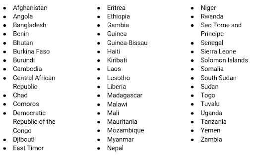
Listed below are the least developed countries (LDCs), an official UN designation - countries which readers of the high-income countries will be working on behalf of in much of the pages of this book.

Map of least developed countries (LDCs). Source: https://unctad.org/topic/least-developed-countries/list

The DAC divides the List of ODA Recipients into four categories. Though I’ll continue to emphasise the LDCs, who are the priority by need, the other developing country categories outside of the LDCs category are:

To reinforce, if you live in an LDC, you’re exempt from Goal #1 for this book, though one imagines in your circumstances you’re industrious to better your lot in life. The status quo is unfair. You’re in a sea of a global community who have the ready means to help, but do not, yet you experience the burden. I view it as unjust that a part of the world could live in plenty, with tools available to mitigate others from suffering and dying of preventable disease.

Can extreme poverty prevail in developed countries? Yes, in instances of the homeless, or those living in an isolated indigenous community, where daily income may be less than $US 1.90. Both examples have access to income help in countries with social safety nets. For all these reasons, developed countries have fractional populations living in extreme poverty. If readers from a developed country are out of work for a few weeks or months, and are without income for this period, they have access to a social safety net offered by their government to provide unemployment income assistance. Readers able to access such protections live above the measure of extreme poverty, better characterised by countries without such a safety net.

Who should OECD/DAC country readers be giving 0.7% of their gross income to? I propose a similar list to that used by the DAC, both available on their website:

However, any charity operating in the developing world focused on eradicating poverty ought to be suitable, whether focused on health, education, water, and sanitation, etc.

Summary: For OECD country readers, annually give 0.7% of your gross income as aid, aiming to end poverty by 2030.

Poverty headcount ratio at $3.20/day (%)

Another measure of poverty in use is poverty at the rate of US$3.20 a day. Alas, poverty continues once crossing the $1.90 international poverty line. Yet this meagre difference of a threshold of $3.20 is common in lower-middle-income countries, as well as low-income countries who've surpassed the $1.90 a day threshold. This $3.20 poverty line is the subject of our second indicator, aiming again to eliminate the prevalence of those living below it.

23% of the world’s population live under $3.20 a day, in contrast to less than a tenth living under the extreme poverty line of $1.90. This proportion is just less than at the adoption of the SDGs in 2015, when 27% lived under $3.20 a day, down from more than half the global population in 1990. The number of people living under $3.20 is comparable now to the number of people living on $1.90 a day in 1990.

We now know countries with a high prevalence living in extreme poverty are stuck in the poverty trap and require ODA to get out. But countries with a high prevalence of its population living under $3.20 may be a middle-income country. In this instance, whilst foreign aid is certainly welcome, and would accelerate lifting its people from poverty, the country may have the capacity to improve its lot without aid being a prerequisite.

The 0.7% of gross personal income donated as aid from high-income readers will go toward those living under $3.20 a day. But what can readers from middle-income countries off-track for SDG #1 do? For those living below $3.20, the same applies as for those living under $1.90 i.e., the responsibility of achieving these first two indicators is for others on your behalf. Though you experience its burden, it’s instead the responsibility of the high-income countries to care for you.

If you’re a citizen of a middle-income country scoring red for this indicator, earning above what’s equal to $US3.20 a day in your local currency, then I encourage you to donate 0.7% of your gross income toward a charity operating within your country’s borders focused on poverty reduction. For example, if you live in South Africa (a middle-income country), and make $US5,000 a year, find a charity you trust focused on poverty in South Africa and donate $35.

For OECD/DAC readers, you pay 0.7% once, covering all indicators related to poverty. Across the developing world, 0.7% of GNI of the developed world is enough to cover the costs to achieve poverty reduction, hunger elimination, health improvements, and much more, as we’ll come to see. It may become tiresome to hear this refrain, but it will illustrate the bang for our buck, and an incredible bargain.

Summary: For OECD country readers, annually give 0.7% of your gross income as aid, aiming to end poverty by 2030.

Poverty rate after taxes and transfers *

Quite separate from the severe plight of the low and middle-income countries is relative poverty, synonymous with the poverty line of an individual country. The definition of this indicator is the share of the population whose disposable incomes fall below half the median income. Disposable income in this sense means gross income minus income tax. It addresses taxing individuals who have taxable income, then transferring those revenues to the needy in the same country living below the poverty line - a test for the affluent countries to see whether they’re covering their own people living in poverty. Someone in an OECD country may well be living above the international poverty line of $1.90, or $3.20, and a great many multiples of these amounts. But due to their meagre income relative to their compatriots, they’re excluded from full participation in society. The long-term goal for this indicator is 6.1% or less of the population living in relative poverty within the ranks of the respective OECD countries.

I’ll compare the US (scoring red in 2022 for this indicator) with Finland (green). The US poverty rate after taxes and transfers was 18% for 2019, 11.9% above the long-term aim for the indicator. Let's say the US federal and state governments have collected all their taxes for the year. They've done their budget, and made transfers to the budgeted poverty reduction programs, whether welfare in the form of food stamps or cash help. Still, after these transfers, 17.8% of Americans live under half the median.

This suggests a lot of people live in poverty relative to the median of their counterparts, and the government's tax and transfer system is failing to redistribute tax revenue to the poor to lift them above the poverty line. The poor in the developed world have malnourished themselves in a separate way, characteristic of obesity borne of cheap, convenient junk food, rather than emaciation.

Finland has a relative poverty rate of 6.5% as of 2018, on track to achieve the indicator by 2030. Why the gap between the two countries? Remember, whatever the respective income levels are in each country, the measure is half the median income, whatever the income level between countries. The culprit lies within the relative rates of taxation and transfer between the two countries. The Nordic countries are world leaders in taxation and redistribution, with high rates of tax, as well as high rates of those tax takings apportioned to social welfare. Finland’s tax revenue as a percentage of GDP was 42% in 2020, compared to the US’ 25%. For the broad measure of social spending as a percentage of GDP, Finland spends 29.1% compared to the US’ expenditure of 18.7%. So, Finland's government taxes the Finns greater, and their government spends a greater part of the tax revenue than the US on social policies. The effect is a lower relative poverty rate, on par with the long-term goal of this indicator.

Different developed countries have diverse cultures and attitudes towards taxation, differing on how much to transfer such proceeds to the poor. These ingrained cultural attitudes can be tough to shake, despite looking in the face of the obvious benefits of the Nordic countries’ tax rates and social security net.

What to do? The suggested remedy is like the prescription for the first two indicators, calling for a private redistribution of income at your own hands, but within your country’s borders. For our first indicator on extreme poverty, I asked high-income country citizens to give foreign aid abroad, equal to 0.7% of their gross income. My suggestion for those with a high priority of relative poverty rates in their high-income country is to donate to domestic charities focused on poverty reduction. Again, find a tax-deductible charity which has your confidence, and donate. The percentage can be at your own discretion, but a suggestion could be the shortfall percentage between your country’s poverty rate and the long-term objective of 6.1%.

You will have ended up paying this amount in tax anyway, and will get to deduct this donation from your taxable income, but instead hand-pick to where it goes. If you’re living in a country with a red score for this indicator, and you live on less than half the median income, you’re exempt. Donations from your fellow citizens are intended to benefit you, to help you on your way to bringing your income above the threshold of half the median i.e., above your country’s poverty line.

The task of the individual for this indicator is to do the job the government was unable to, whether due to insufficient taxing of the populace, or insufficient transferring of tax revenue to reduce poverty for its citizens, despite the means to do so.

Also, advocate with your government representative to raise the tax rate and apportion more of the government revenue to poverty alleviation.

Summary: For OECD country readers off-track, who are living above your country’s poverty line, donate a percentage of your gross income. A suggestion is an amount equivalent to the shortfall percentage of your country's relative poverty rate and the long-term objective of 6.1%. You will be able to find your country’s relative poverty rate on the SDG Index website, and the median disposable income on the OECD Statistics website.

SDG #2 - Zero Hunger

Dashboard map for 2022 SDG Index Goal #2 ratings. Data source: sdgindex.org

Prevalence of undernourishment (%)

The aim by 2030 is to achieve zero hunger as part of SDG #2. As of 2020, a tenth of the global population, equal to 811 million, experienced hunger and undernourishment. Due to the effects of COVID-19, the number of people suffering acute hunger may have doubled by the end of 2020, and may also have pushed up to 132 million into chronic hunger. The global proportion of those living in hunger has been decreasing, though the total number of those living in a state of hunger has risen - the main causes due to climate, conflict and recessions.

This indicator’s definition is the portion of the populace unable to meet dietary energy requirements for a year or more, defining energy requirements as maintaining body functions, health and normal activity. As with ending extreme poverty, this indicator aims for a 2030 goal of eliminating undernourishment, aligned with Goal #2 (Zero Hunger).

SDG #2 flows on from SDG #1, implying the interrelationship between poverty and hunger. One of the reasons for this is the poor are among the most sensitive to fluctuations in food prices. Undernourishment is often due to geographical isolation. Hunger affects the most vulnerable regions of the world, represented by the LDCs, landlocked developing countries, and small island developing states.

Hunger, in the context of sustainable development, is different from the sensation of being less than satiated. In the context we’re looking at, it’s the global leading cause of death, to be unable to meet the essential nutrients humans need to sustain healthful lives over a long period. The global areas most vulnerable to acute hunger are those experiencing wars, pandemics and extreme weather. Undernourishment is a diet with insufficient nutrients, meaning calories providing us with energy. The right biochemical combination allows for proper metabolism in the form of proteins, carbohydrates, fat, vitamins and minerals. At the extreme of undernourishment is starvation, as well as micronutrient deficiency, when an individual is experiencing the undernourishment of a particular vitamin or mineral.

Many of us are familiar with the heart-rending images of starving children. The medical term, marasmus, is often characterised by the wasted mass of emaciation from energy deficiency, occurring from a diet of starchy carbohydrates offering little nutritional value. We recognise the symptom of distended abdomens, caused by a swelling of fluid retention, and a liver overwhelmed with fatty deposits. Sufficient calories, but protein deficiency, causes this condition, termed kwashiorkor.

A clear remedy to preventing and reducing undernourishment is food aid in the form of dietary supplements to fortify food with micronutrients.

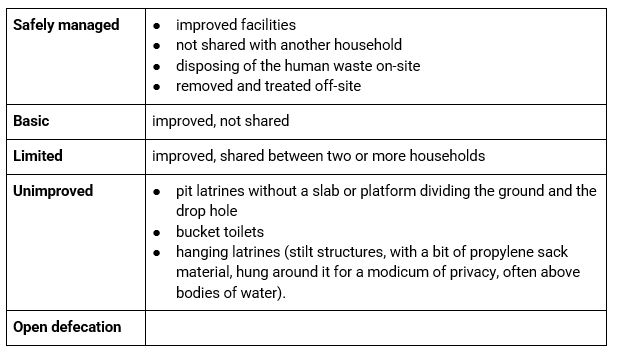
Aid can assist the development of sanitation systems to ensure drinking water and sewage remain separate, which can otherwise lead to infectious diseases causing undernourishment. This can also lead to dehydration, further exacerbated if the drinking water is contaminated by infectious pathogens.

For readers from high-income countries, your commitment is to give 0.7% of your gross income as foreign aid. This captures the necessary expenditure to help low-income countries scoring red for this indicator. The remedy once again lies in the wealth transfer from those with means to those without. Foreign aid satisfies this, with food aid a component of ODA. Ensure whichever charity you’ve donated the 0.7% of your gross income to also includes a food aid component, whether famine relief, or more long-term remedies ensuring food security. This could even mean sharing technologies with communities for more productive food yields.

What about readers from middle-income countries which scored red or orange? Is it too much to ask of the nourished citizenry of these countries to make up the shortfall? If this is you, ask yourself if this is workable or realistic. Cash amounts might seem burdensome, but food aid to a food bank - even giving first-hand - may feel less of a big ask. In any regard, to remedy this, the ultimate responsibility should live with the DAC countries. The priority of their aid dollars will be the LDCs, but will touch any developing country experiencing the serious malady of undernourishment.

Summary: For OECD country readers, annually give 0.7% of your gross income as aid, aiming to end undernourishment by 2030.

Prevalence of stunting in children under 5 years of age (%)

This indicator, like the one before, considers the effects of undernourishment manifesting in the form of stunting for children under 5. Again, the 2030 goal is 0%, ending stunting for kids under 5. Stunting is the prevention of the development of height in a child due to malnutrition, often caused by diarrhoea or infection by parasitic worms. Open defecation in the absence of toilets and sewage systems creates such conditions. 149.2 million children under 5, or 22% of all children, suffer from stunting, down a quarter from 2015.

Stunting occurs for two-fold reasons. One is due to lack of food, overlapping with the undernourishment indicator. Another reason is enough food, but the inability of a child under 5 to absorb the nutrients due to ongoing infections drains the body of more nutrients than it absorbs. Such infections are common in environments with poor sanitation, explored in SDG #6 (Clean water and sanitation).

The promotion of breastfeeding in these early years from infancy is especially important, though there may be misconceptions in some developing countries about the importance of breastfeeding. Mothers may substitute baby formulas, mixed with contaminated water. Furthermore, if the mother’s undernourished, it makes sense her ability to breastfeed is also affected.

If you’re a mother in a country off-track to achieve this indicator, the WHO encourages breastfeeding instead of formulas for the best nutrition in infants. If a medical professional has indicated to you to use formula rather than breastfeed, then observe this expert medical advice. Note, the above only applies to countries experiencing a high proportion of stunting, indicating unsanitary water sources are being mixed with formula. Otherwise, it’s between you and your doctor or maternal nurse whether you choose to breastfeed.

As much as possible in your circumstances, assure your own nutrition during pregnancy and breastfeeding years. Even if you’re considering planning for a family, this pre-natal period will affect the stunting potential of the child. Further yet, responsibility for the encouragement of breastfeeding extends to employers, as well as societal and cultural attitudes in public and private toward breastfeeding.

Also of immense importance is the period when a mother weans a child from breastfeeding. Whether this is due to the birth of another child, the mother must ensure the weaned child transfers to a balanced diet i.e., enough vitamins, minerals, proteins, and fats. This is of emphasis as children may be weaned onto African staples such as cassava, yams, and plantains - all starchy carbohydrates missing critical nutrients.

For parents of children in these countries scoring red for this indicator, be mindful of risks for children around the water they drink or play nearby, which may be subject to contamination of infectious diseases. This may be a particular challenge for slum dwellers. Also, if you live in a malarial zone, use bed nets and other means of prevention where available.

Another factor in stunting is the age of marriage and childbirth for girls. Cultural attitudes surrounding this may often be strong and difficult to break down. But looking at it from the perspective of the child's health, the younger a bride and mother, the less chance the mother has to develop her healthfulness and ability to sustain a dependent infant.

Summary:

For OECD country readers, annually give 0.7% of your gross income as aid, aiming to end stunting worldwide by 2030.

For developing country readers off-track for the Goal/indicator:

  • Delay marriage and childbirth to adulthood.

  • For prenatal, pregnant, and breastfeeding mothers:

    • ensure infants are breastfed

    • ensure weaned children transition to a balanced, nutritious diet

    • ensure your own health and nutrition

  • For parents and carers of children under 5, monitor children near unsanitary points.

Prevalence of wasting in children under 5 years of age (%)

This measure is like the previous, substituting stunting for wasting, whereby muscle and fat waste away from the body. The long-term global goal is to eliminate wasting for kids under 5, down from current levels of 7%, or 45.4 million children, though it’s anticipated 15% more children will experience wasting due to the current pandemic.

Famine is an obvious cause of wasting in children. The arid band of the African Sahel and Arabian Peninsula has been at significant risk of acute famine, and will continue to be because of climate change.

As with stunting, infections can hinder the intake of essential nutrients in children, lost to diarrhoea or other symptoms of diseases such as tuberculosis and HIV/AIDS.

What can each of us do to end wasting in children under 5? You know the refrain by now: for high-income countries, as wasting is a feature of extreme poverty and LDCs, your foreign aid will go toward remedies for wasting - crucial in instances of acute famine. Such occurrences call for external help from a region unable to produce enough food for sustenance.

What of readers in countries scoring red for this indicator, thus with a priority for action? This indicator applies to parents, or whoever has responsibility for the care of a child under 5. For these readers, the guidance is the same as the prior indicator.

Please consult a medical professional - where available - for what constitutes healthy nutrition for a child under 5. Dismayingly, many of the regions experiencing wasting are those with insufficient health coverage, as we’ll see in the next chapter.

Summary: For OECD country readers, annually give 0.7% of your gross income as aid, aiming to end wasting worldwide by 2030.

Prevalence of obesity, BMI ≥ 30 (% of adult population)

We associate the prevalence of malnutrition as described in the prior indicators within the developing world. Yet some developing countries are beginning to see another form of malnutrition far more common in the developed world i.e., the inverse of undernourishment - overnutrition, overeating and obesity.

The body mass index (BMI) is a height-to-weight value, with a BMI of 30 meaning 30kg per square metre, the threshold for diagnosis from overweight to obese. To achieve this indicator by 2030, the aim is a prevalence of obesity in the adult population of 2.8% or less. Obesity is a strong risk factor for cancer, alongside cardiovascular disease and diabetes.

Processed food consists of a sea of carbohydrates, fats, and sugars, without the accompanying fibre, putting tremendous stress on our liver, an organ under-appreciated for its value in sustaining our health. The NOVA food classification, endorsed by the UN, can act as a guide to classifying ultra-processed foods, often identifiable by being in packaging, in contrast to “real food”.

The four categories of NOVA are below:

We're looking to encourage the first grouping, only use the second and third categories in spare quantities when cooking at home, or in the case of processed meats, omitting altogether. Plus, we’re aiming to cut the last category from our diets altogether.

The necessity of fibre has given way to sugars in the modern diet, leaving our intestinal bacteria unfed, unable to carry out the symbiotic role of assuring our metabolic health. In some countries, the prevalence of food deserts is a reality, characterised by cheap fast food, and a dearth of fresh produce. This is especially harmful to lower socio-economic segments of society, who may yet be educated about what constitutes good nutrition, or the harmful effects of bad nutritional choices.

The human mind is vulnerable to the sophisticated tactics of advertisers peddling obesogenic food and drink. For this, you can target your enmity to the most powerful, who derive their strength from their marketing prowess e.g., Nestlé, Mars, PepsiCo, Coca-Cola, Kraft Heinz/Mondelez.

Beyond the malnutrition aspect of accumulating excess body fat are more holistic factors resulting in unwanted weight gain, including:

Additional to the NOVA system, below are two great dietary guidelines for healthy, sustainable diets. The first is the evidence-based Harvard Healthy Eating Plate, illustrated below:

Copyright © 2011 Harvard University. For more information about The Healthy Eating Plate, please see The Nutrition Source, Department of Nutrition, Harvard T.H. Chan School of Public Health, http://www.thenutritionsource.org and Harvard Health Publications, health.harvard.edu.

Also recommended is the EAT-Lancet Commission’s report entitled Healthy Diets from Sustainable Food Systems. The basic precepts of this report are:

  • double the global consumption of fruits, vegetables, nuts, and legumes by 2050

  • halve red meat and sugar by 2050

It’s easy to remember to halve one type of food, and double another - a diet rich in plant-based foods with fewer animal-based foods. This is to afford us a planet for future generations with healthy land and a nourished population, curbing the prevalence of preventable diseases. As the EAT-Lancet Commission states:

“Food is the single strongest lever to optimise human health and environmental sustainability on Earth.”

What if you have a BMI below 30, but live in a country scoring red on this indicator? Your part to play is to encourage those in your household, social circle, and loved ones to exercise and eat a healthy diet.

For those with a BMI of 30 or more, use your GP if you live somewhere with access to healthcare, as you can go on this path with support. Medications or surgery may also be worth considering in consultation with your doctor.

Summary:

  • healthy diet, heeding the Harvard Healthy Eating Plate

  • regular exercise

  • halve red meat and sugar and double fruits, vegetables, nuts, and legumes

Human trophic level (best 2-3 worst)

Trophic levels tell us how energy intensive the food we consume is, measuring the content in our diets of other animals, in contrast to plant-based foods. The higher the rank on the food chain, the higher the human trophic level. This is because growing an animal requires far more energy compared to plant food. As an example, a cow may live off pasture or feed grain, and due to its size, requires a lot of it. If the cow eats grains, farmers use the land to grow animal feed at the expense of land used to grow food for humans. The land could even otherwise be forest, and once was, before being cleared for grazing. Once humans slaughter the cattle to eat beef, the amount of energy which has gone into the life of these ungulates - weighing almost a ton - is vast.

Humans are a combination of herbivorous and carnivorous, rather than the apex predators we may think of ourselves. Whereas a fox’s diet is exclusive to eating herbivores, instead humans are akin to pigs and anchovies in the global food web.

For this indicator, we’re aiming for a long-term goal of a trophic level of 2.04, with the global human median at 2.21 in 2009. Below’s an example of the respective levels:

  • Trophic level 1: plants and algae, metabolising via photosynthesis

  • Trophic level 2: herbivores

  • Trophic level 3: carnivores

  • Trophic level 4: carnivores who eat other carnivores

  • Apex predators: without natural predators

An example of what the 2030 objective of a human trophic level of 2.04 looks like is Burundi, which had a plant-based diet at the year of measure. Whereas Iceland, with the highest human trophic level of 2.58, had a diet split between fish and meat for one half, and plants for the other. To reach this indicator’s long-term goal you can aim for a similar diet mix as Burundi.

Take the following from Albert Einstein, synonymous with intelligence, but far more, humanity:

“Nothing will benefit human health and increase the chances for survival of life on Earth, as much as the evolution to a vegetarian diet.”

If you’re serious about this indicator, and Goal #2 of sustainable food systems in general, you’ll find a way to make your diet all plant-based. If you think your doctor might disagree, check with them e.g., if you’re anaemic, they might say you need to continue to eat meat when you feel weak. Taking cues from Burundi, we need only 96.7% of the population on board to meet the indicator’s goal - rather than everyone - so we have room for those with medical or nutritional reasons to eat animals.

Summary: Plant-based diet, targeting a national human trophic level of 2.04 by 2030.

Cereal yield (tonnes per hectare of harvested land)

For this indicator, we're aiming for 7 tonnes per hectare of harvested land by 2030. A hectare is 10,000 square metres, almost equal to a rugby field, or the grass interior of an athletic track. This indicator measures dry cereal grains (wheat, oats, maize/corn, rice, rye, barley, millet, and sorghum), in contrast to hay or grazing grasses used as feedstock for agricultural animals.

Agriculture is an aspect of sustainable development undervalued for its impact on all facets of human life. The cultivation of crops, rather than always being inherent to human culture, sprang forth when humans shifted from hunter-gatherer lifestyles. Settling into the land in fixed civilisations, humans tilled the land to make it arable to sow seeds, producing crop harvests to a surplus level beyond mere subsistence. Agriculture has since shifted from smallholdings to industrialised farms, characterised by crop monocultures bred through science for optimal traits.

This indicator is asking us to increase crop yield for food security for countries off-track. Yet making this balancing act trickier is the trend of human overpopulation at unsustainable levels, especially true in countries facing the most acute food security challenges.

Sustainable food systems - and SDG #2 as whole - can be intransigent to deal with, due to the complexity of diverse types of soil and terrestrial conditions for growing different crops. What’s good for northern England or southeast Australia might be less successful in equatorial Africa or the steppes of Central Asia, rather than a catch-all solution to improve global cereal yields. What can be universal though is the contribution of aid to finance improvements in technology transfer, in the form of innovative agricultural techniques.

Once again, the high representation of LDCs scoring red for this indicator invites DAC readers to reinforce the need for giving 0.7% of gross income as aid.

The affluent among us have the tools and knowledge to share the greatest advantages known to humankind. Technologies and knowledge need to be transferred to boost cereal yield in these regions, as well as to mitigate climate change by curbing our greenhouse gas emissions. The industrialised countries bear responsibility for a large concentration of such emissions, yet the harshest effects of warming will befall the rich world far less than developing counterparts. Smallholder farmers will experience the brunt, isolated from best practices, proffering staple crops for themselves. Climate variability is an inescapable facet of crop cultivation - true since the genesis of the Agricultural Revolution millennia ago. Yet the volatility of weather patterns will only become more turbulent due to climate change. Crop resilience is now a crucial, added consideration, which farmers can help by using resilient seed varieties and other practices.

Consistent with sustainable agriculture, we need to reconsider flooding the global ecology with fertilisers, overburdening the nitrogen cycles, pressing against many planetary boundaries. Though we need to boost cereal yields when lagging, rather than doing this at all costs, it must be consistent with the best agricultural practices and knowledge.

Summary:

For OECD country readers, annually give 0.7% of your gross income as aid, targeting a global cereal yield of 7t/ha of harvested land by 2030.

For all readers, decarbonise your life.

Sustainable Nitrogen Management Index (best 0-1.41 worst)

The Sustainable Nitrogen Management Index is a score combining two measures:

  • nitrogen use efficiency

  • land use efficiency, measured by crop yield (explored in the prior indicator)

Nitrogen use efficiency is often correlated with environmental performance, so we could consider the Sustainable Nitrogen Management Index as a measure for sustainable agricultural practices. The 2030 aim is for a Sustainable Nitrogen Management Index score of 0. The global map of scores for this indicator puts the whole global population off-track, except Paraguay and Ireland, who are on track.

Whilst there’s an economic imperative in agriculture for higher yields, we're attempting to conserve the soil to allow its continued use in future seasons. To grow in the soil, plants need nutrients, in the form of minerals such as carbon, oxygen, hydrogen, phosphorus, potassium, nitrogen and sulphur. Soil’s constituents are carbon-based organic matter, 'organic' meaning any compound containing carbon and hydrogen. These ingredients support life, alongside sunshine and water, via the process of photosynthesis.

To aid this process of nutrition for the soil, humans add fertiliser, to fertilise the conditions for life to occur in the soil. Fertilisers tend to focus on three ingredients needed by soil: nitrogen, phosphorus, and potassium. In the early era of agriculture, manure and compost served as fertilisers, as did blood meal and fish meal, by-products of animal and fish slaughter, as well as crop rotation to help manage the nutrients.

The invention of a chemical process would usher in the intensive agricultural practices now pervasive. The Haber-Bosch process was monikered after its inventors, German chemists Fritz Haber, and Carl Bosch. The Haber-Bosch process allowed for the synthesis of ammonia, a compound of nitrogen and hydrogen.

We want to use an efficient amount of nitrogen, at the same time compromising as little as possible on crop yield. Conventional farming tends to use too much nitrogen, risking harmful runoffs, but organic farming uses nitrogen too. This is tricky, because there’s a strong link between the amount of nitrogen used and the yield. Nitrogen is necessary for the soil to harbour the conditions for growth. But we’re aiming for sustainability, rather than high yields at all costs to the environment, risking our future food security. Sustainable agriculture ensures use of nitrogen is in harmony with the nitrogen cycle of the planet. If we need less agricultural produce, because we’re wasting less, and we need to grow less feedstock for livestock, then we ought to have enough yield.

Excess nitrogen use in agriculture is a driver of climate change. Also, the surface runoff results in dead zones of eutrophication in bodies of water, robbing conditions for life. Excess nitrogen erodes the long-term biology of the soil, threatening biodiversity and destroying habitats. All this puts us at perilous risk of food insecurity. Business-as-usual farming today may very well lead to our inability to feed ourselves long-term.

But without the legacy of the Haber-Bosch process, could humanity sustain the global food system feeding 8 billion mouths? In 2015, of a global population of 7 billion people, chemical fertilisers supported 3.84 billion. Before the innovation of the Haber-Bosch process, the entirety of the global population of 1.65 billion had little choice but to support themselves with natural fertilisers.

Could the global population today survive on organic food? Let’s weigh up some points:

Living off organic is more within reach if you reduce food waste, and reduce your meat and dairy consumption, which would reduce the need to grow feedstock. Studies show we can feed a projected scenario of 9.6 billion people in 2050 with the necessary yield if we shift to a vegetarian or vegan diet.

We’re striving for sustainable agriculture, whether organic or some other form e.g., permaculture, local food, Slow Food. The food system must be sustainable, inclusive of food distribution, diets, and food waste. There ought to be a guiding principle of sustainability of our food systems. It’s an open-ended exploration of ideas and improvement of behaviours central to our lives, yet very much shaped by a lifetime of habit, as well as cultural or familial attitudes.

Very few of you will be farmers, weighing up how much nitrogen you use. Most of us live in urban environments, where our food production needs are met by someone else, exchanging money we’ve earned doing another occupation, rather than having to till fields each day. The consideration of nitrogen in your day-to-day experience in likelihood appears distant and far-flung.

Yet sustainable agriculture is a gargantuan issue - the most ambitious of all, surpassing decarbonising the global energy system. If you know the food which you’re sourcing is grown with sustainable agriculture techniques, whatever its method, this is encouraged alongside organic food. Keep in mind an attitude toward sustainable food systems, inclusive of distribution and waste. Be curious, and be dubious of where your food is coming from. Explore and educate yourself over a lifetime to improve your knowledge around this most important facet of our lives.

Summary:

  • plant-based diet

  • end food waste

  • eat local produce

  • eat organic food, or food grown by sustainable agriculture methods

Exports of hazardous pesticides (tonnes per million population)

This indicator aims to end by 2030 the export of pesticides deemed hazardous to human health.

Pesticides can be chemicals or biological agents intended to kill or repel the lifeforms it targets e.g., plants, insects, rodents, microorganisms, fungi.

Yet these same agents can also be poisonous to species other than those it intends to target, e.g., humans, bees, plants, or other wildlife. Pesticides are another contributor to the negative environmental effects of agriculture. Due to cycles of pesticides in the flow of agriculture, they make their way into the lives and bodies of humans via runoff of water from the soil surface following rain and storms.

If you work in the chemical export industry, you’d be aware of which chemicals fall within those deemed hazardous by the Rotterdam Convention. For casual readers, there’s only a couple household names among these e.g., DDT and asbestos. Many of these pesticides are hazardous to human health, either because they’re carcinogens, disrupt your endocrine system, or are persistent organic compounds, affecting us by resisting degradation in the environment.

Summary:

  • End exports of hazardous pesticides by 2030.

  • As an alternative:

    • use biological pest control 

    • adopt integrated pest management methods

Yield gap closure (% of potential yield) *

This indicator measures the percentage of a country’s potential yield in the three annual crops using the most land area, aiming to close the gap in the actual yield to 77% of this potential yield.

Using Australia as an example, the percentage of yield in its top three crops, according to land area use, was 47% in 2015. Phrased another way, the field for these three crops was half its potential. For Australia to close this gap to achieve the indicator, it would need a yield of 77% for the three largest crops by land area used: wheat, barley and canola.

My ideas around the solution to this indicator are the most extreme in this book. For the 2022 SDG Index, there’s only data for some European countries, the US and Australia, so my wild idea ought to only affect a small portion of readers. My recommendation is for those countries scoring red for this indicator to reduce, or eschew altogether, the consumption or use of the top three crops by land area.

Your initial reaction might be, “This guy wants me to go plant-based - now he’s taking staple crops out of the equation?! What, he wants to protect the feelings of the barley grains too?”

In an OECD country, a farmer has access to best practice agricultural tools and techniques, but humankind still depends on the good charity of Mother Nature. Thus, I’ve placed liability downstream to the consumer.

What does this look like? Using the example of Australia, this would mean abstaining from wheat, barley, and canola. There are alternatives, notably rye. Yet if Australians substituted rye for wheat at a similar scale, we’d be in the same situation. One of the issues with the predominance of wheat is the lack of variability in crops, or the prevalence of monoculture, inclusive of wheat’s varieties like spelt and durum. Wheat might be central to an Australian diet, or a Western diet in general, but our digestion systems are unevolved to digest it, hence the prevalence of gluten intolerances. Processed wheat is the true culprit, which we’ve already seen from the harms of processed food. When wheat is refined beyond its whole grain form, stripped of its fibre, it's worthless. In Australia, can we bridge the yield gap for wheat for the long-term aim whilst its end uses are being processed to offer little nutritional value?

For those unable to fathom a life without wheat, you could consider ensuring any wheat you consume is wholegrain and organic. This seems an acceptable compromise, and sets a good example for others. Wheat stripped of the fibre of its whole grain form includes the ultra-processed foods listed earlier. All of these are contributing to unsustainable agricultural practices or are a form of food waste in the sense the whole grain is hulled. What’s left is a foodstuff devoid of nutritional value, other than empty calories.

The other top two crops in Australia by land area are barley and canola. Barley is the main constituent of beer. In Australia, there are good beers free of barley, which anyone on a gluten-free diet would know about, and which most liquor stores stock - if not, you can buy a carton from the brewers online. In Australia, beer seems a national pastime, yet ought naff cultural traditions get in the way of sustainable development?

Canola has other uses besides food, but for this indicator, if you’re Australian, use a substitute. Many kinds of margarine and other foodstuffs list ‘vegetable oils’ in their ingredients as a catchall, which may well include canola. You could prioritise products you know exclude canola, or abstain from margarine altogether.

Readers from the countries scoring red for this indicator will need to research their respective countries’ top three crops by land area, and make the call whether it’s a crop they could live without, or seek out an organic alternative.

Summary: For readers in countries off-track:

  1. Research your country’s top three crops by land area

  2. Either:

    • Seek alternatives to consuming these three crops until your country returns to 77% of potential yield by 2030

    • Buy organic forms of these crops

SDG #3 - Good Health and Well-being

Dashboard map for 2022 SDG Index Goal #3 ratings. Data source: sdgindex.org

Maternal mortality rate (per 100,000 live births)

This indicator measures the estimated number of women between the ages of 15 and 49 dying from pregnancy-related causes whilst pregnant, or within 42 days of the pregnancy’s termination. The long-term aim is 3.4 deaths from these causes per 100,000 live births. Globally, the estimated maternal mortality ratio was 211 per 100,000 live births as of 2017, well above the long-term goal.

The maternal mortality rate is a proxy for the quality of a healthcare system. Complications due to pregnancy and childbirth can be common, but with proper care, healthcare professionals can handle difficulties, preventing the worst outcomes. Without proper healthcare available, it’s more difficult to prevent, diagnose and treat any complications arising due to pregnancy.

The LDCs and sub-Saharan Africa and mostly off-track on this measure, with the rest of the world on track, an illustration of the link to insufficient health care.

The same is true here for other indicators already mentioned which have a strong correlation between a red score and LDCs i.e., OECD countries will shoulder the responsibility on behalf of the LDCs in the form of giving 0.7% of gross income as foreign aid. This giving will afford an army of skilled birth attendants in rural areas, as well as affording medical techniques taken for granted in the developed world e.g., blood transfusions, asepsis and preventive prenatal care. A skilled health attendant can curtail these risks by caring for the mother during the pregnancy, childbirth, and postpartum period, including any postpartum bleeding or obstructed labours.

If aid flows to the LDCs and other aid recipient countries, the global maternal mortality rate can drop, achieving a measure which had a dedicated Millennium Development Goals (MDG #5 - Improve maternal health).

Summary: For OECD country readers, annually give 0.7% of your gross income as aid, aiming to reduce the global maternal mortality rate to 3.4 per 100,000 live births by 2030.

Neonatal mortality rate (per 1,000 live births)

This indicator measures the number of newborns per 1,000 live births who die within 28 days following birth, with a long-term aim of a neonatal mortality rate of 1.1 per 1,000 live births.

Causes of infant mortality in the first 28 days include deprivation of oxygen; congenital birth defects; prolonged labour; infection; low birth weight and poor sanitation.

The absence of healthcare raises the risk factors for neonatal mortality. As with the prior indicator, such is the priority of infant mortality, it warranted its own Millennium Development Goal (MDG #4 - Reduce child mortality).

The correlation between extreme poverty and high birth rates also exacerbates neonatal mortality. As we reduce extreme poverty, birth rates will in turn reduce, as is the demographic trend observed worldwide. Therefore, we must encourage gender equality, women’s empowerment in the labour force, as well as educating girls.

The 2022 SDG Index map for this indicator is uniform with the prior indicator, again highlighting the link between mortality rates for both mothers and neonates. Again, there’s a strong correlation between LDCs and those countries with red scores.

Thus, the responsibility again lies with the OECD countries to finance improvements in healthcare in the LDCs. The 0.7% of gross income of OECD citizens will finance the outreach of a mass workforce of skilled community health workers, with resources on hand to meet the needs of rural areas.

Summary: For OECD country readers, annually give 0.7% of your gross income as aid, aiming to reduce the global neonatal mortality rate to less than 1.1 per 1,000 live births by 2030.

Mortality rate, under 5 per 1,000 deaths

The distinction between this indicator and the previous is age - this indicator measures the number of children under 5 per 1,000 who’ll die before reaching age 5. The long-term aim for this indicator is 2.6 deaths for children under 5 per 1,000, down from the 2019 rate of 37.7. As such, this measure of children under 5 also includes neonatal and infant mortality.

The leading causes are premature births and infections, especially pneumonia, diarrhoea and malaria. But the prevention measures are alike to the two prior indicators i.e., we need to finance public health needs. Most child deaths are preventable, and cheap to treat and prevent, yet the cost is irrelevant without the meagre funding forthcoming. We therefore need to fund vaccines, antibiotics, mosquito nets, fluid replacement, promotion of breastfeeding and handwashing, as well as improved sanitation and drinking water facilities.

A meagre 0.7% of your income will make you a literal hero, saving lives - without a cape, cowl or superpowers - just a bank account, a charity, and a device to make the donation. Rather than treating a diarrheal infection or making the trip to Africa, you pay someone to do it on your behalf, then get to go to bed knowing you’ve saved the lives of helpless children.

Summary: For OECD country readers, annually give 0.7% of your gross income as aid, aiming to reduce the global under-5 mortality rate to less than 2.6 per 1,000 live births by 2030.

Incidence of tuberculosis (per 100,000 population)

This indicator estimates the number of cases per 100,000 people with either new or relapsed cases of TB, inclusive of cases for those also living with HIV. The long-term goal is 0 cases of TB per 100,000, from a current global rate of 127 per 100,000 in 2020.

TB’s an infectious disease caused by a bacterium, Mycobacterium tuberculosis affecting the lungs. Symptoms include coughing bloody mucus, fever, and night sweats, though TB cases can be asymptomatic whilst contagious. The bacterium spreads by aerosol droplets micrometres wide.

Before the COVID-19 pandemic, TB was the highest cause of death from an infectious disease. A quarter of the global population may carry the disease in its latent form, with an annual rate of new infections of 1%. An estimated 10 million people have active cases worldwide, resulting in 1.5 million deaths, close to half occurring in Southeast Asia, and a quarter in Africa. TB is a disease of poverty, exacerbated by slum living, as well as malnutrition and poor sanitation conditions.

As suggested in the indicator’s definition, cases of TB often occur alongside HIV/AIDS. We’ll address HIV/AIDS in a later SDG #3 indicator, but taking preventive measures for HIV infection will affect the degree to which one may be at risk of TB.

In many countries, the diagnosis and testing of TB can be difficult, slow, or unavailable. Many poor countries, or poor parts of middle-income countries, are without affordable x-ray facilities, or affordable and accessible testing based on sputum cultures or other means.

A preventive measure is keeping from contact with known TB cases. You’ll be at greater risk if your immune system is low, a risk factor often caused by the generalities of poverty. Enter the responsibility of high-income readers to improve poverty in all its dimensions via aid.

Prevention is difficult, due to the poverty conditions TB thrives in, so treatment may be our best option. The vaccine for TB is the most widely used in the world, with an estimated 88% of all children vaccinated for TB, though the vaccine has less than complete efficacy.

TB can be treated with antibiotics, but resistance has become an issue with a growing prevalence of drug-resistant cases. TB carries with it many factors affecting successful prevention and treatment, sometimes with complexity on a scale addressed by public health efforts of national governments, or international agencies like the WHO.

For new cases of active TB, the patient should seek medical care where available, to undergo a regimen of antibiotic medications for up to six months. For recurrent cases of TB, a medical professional will need to find out which antibiotics in a treatment regimen are proving resistant. Testing may need to investigate whether the strain of TB in one’s system is multi-drug resistant, whereby the patient may need the other antibiotics in their regimen which are yet to prove resistant for a longer course up to 1-2 years.

If you’re finding it challenging to scrounge enough money to feed your family and yourself, having ready access to testing and treatment - if paid out of pocket, in contrast to government-funded - could be crippling to a household. You see how important it is for us to fund organisations like the WHO to carry out the work either households or national governments are unable to. Humanity has been battling TB since antiquity - a formidable foe. But we can manage TB at the population level if resourced and financed, as the rich countries did within their societies. The aid dollars we’ve been discussing from our rich country readers are going to go toward TB to aid public health efforts. The path to achieving the long-term aim of this indicator lies in the larger vantage of SDG #3 i.e., healthcare for all.

Summary:

For OECD country readers, annually give 0.7% of your gross income as aid, aiming to end TB by 2030.

For developing country readers:

  • vaccinate for TB, including your children

  • if symptomatic, seek diagnosis if available and affordable

  • if diagnosed, seek treatment, where available and affordable

New HIV infections (per 1,000 uninfected population)

The issue of HIV, alongside malaria, had its own Millennium Development Goal, MDG #6 (Combat HIV/AIDS, malaria, and other diseases). This indicator is aiming to eliminate new infections by 2030.

In the past decade, global deaths from AIDS have halved, yet can still kill a million people a year. In some countries, AIDS is the leading cause of death, resulting in a quarter of all deaths. The highest concentration of new HIV cases is in sub-Saharan Africa, below the equator. Several of the southernmost African countries are now middle-income countries e.g., South Africa, Namibia, and Botswana, yet each are very much in the grip of HIV/AIDS.

A cure is yet to be discovered, but the treatment or management of HIV/AIDS, when financed and resourced, is encouraging, via the use of antiretroviral drugs. These drugs are inexpensive to manufacture, but even their modest cost may be high for households living in extreme poverty. A national healthcare budget must cover the cost of these drugs, though when national governments are too poor to do so, we turn to the international donor community to step in.

For middle-income countries with high rates of new HIV infections, the message is the same as public health promotion efforts. We first need to acknowledge the infection known as AIDS is caused by a virus, therefore is a transmissible infection, spread via blood, semen, vaginal lubrication, and pre-ejaculate. The use of condoms, whether one’s sexual partner is a known carrier of the virus or unknown, is essential. A diagnosis of HIV/AIDS can be sought via a sample of either blood serum, saliva, or urine. If one suspects they may have had a sexual encounter with a carrier of the virus, it’s an opportunity to prevent further spread, and to receive management of the worst effects of AIDS if transmission has occurred. If you’re a carrier of the virus, and planning a family, transmission can occur to the baby via the course of pregnancy, childbirth, and the expression of breastmilk. If you suspect you may have been exposed to the virus, and are in a region where the following is available and affordable, you could use the treatment known as post-exposure prophylaxis, which could prevent exposure to the virus from turning into AIDS.

Though a vaccine is yet to be discovered for HIV/AIDS, with financing for medical research, a breakthrough may occur before 2030. Antiretroviral drugs are available for treatment for those who've received a diagnosis of HIV/AIDS.

For OECD readers, it’s time to mobilise your 0.7% of gross individual income. Some circumstances of poverty offer more of a fertile ground for the virus’ spread than in more affluent countries. Immune systems are already low for those living with malnutrition or absent healthcare, compounding the effects of a virus targeting the immune system. We’ve seen earlier how active infection by TB puts individuals living with HIV/AIDS at increased risk. Subpar sanitation conditions in medical settings could further place individuals at risk of transmission. Also, many sub-Saharan African countries may have cultural or religious attitudes hindering the use of condoms. As such, public health promotion efforts need funding to reach these communities to overcome stigmas and misperceptions.

Universal health care, per the aims of SDG #3, must be made available and affordable to all. Healthcare systems can then observe signs and symptoms, health promotion efforts can mitigate transmission via behavioural change, and we can champion the further financing of medical research.

This is an issue of financing. From the financing everything flows - from research, prevention, and treatment. We can end new cases of HIV/AIDS by 2030, but the key variable is the dollars.

Summary:

For OECD country readers, annually give 0.7% of your gross income as aid, aiming to end new cases of HIV by 2030.

For developing country readers:

  • use condoms

  • if you suspect you may have been exposed to HIV, get tested

  • if you receive a positive diagnosis, seek treatment with antiretroviral drugs, where affordable

Age-standardised death rate due to cardiovascular disease, cancer, diabetes, or chronic respiratory disease in adults aged 30-70 years (%)

Whereas TB and HIV are infectious diseases, involving the spread of a pathogen, the diseases for this indicator are all non-communicable diseases (NCDs), with altogether different risk factors.

Let’s profile the diseases to see what you can do to protect against dying from them before you turn 70, per the aim of this indicator.

Cardiovascular systems circulate blood throughout our bodies, transporting nutrients, hormones, and oxygen to and from cells, as well as aiding in our immune system, regulating our body temperature, and maintaining homeostasis.

Cardiovascular diseases are the leading cause of death in the world, by quite a margin, followed by cancer, then respiratory disease and diabetes, all of which we’ll soon address. Cardiovascular diseases manifest in many forms, from the restriction of blood supply in the arteries of the heart, caused by a build-up of plaque. This can hinder blood flow to the heart, which can result in a heart attack. Stroke is the hindrance of necessary blood flow to the brain, depriving the death of some brain cells.

Causes of cardiovascular disease include high blood pressure, which you can be alerted to by a sphygmomanometer, the inflatable cuff fitted to your arm by doctors and nurses. Smoking is a cause, as is lack of exercise, obesity, high cholesterol, poor diet, drinking too much alcohol, and diabetes.

How do you prevent cardiovascular disease? Abstain from smoking, eat healthily, drink alcohol in moderation or abstain altogether, and exercise. These are hackneyed commonplaces, seeming so obvious and simple, yet they so easily elude us, essential for healthy functioning. Depending on your doctor’s advice, you may need treatment to address high blood pressure.

The second-leading killer worldwide is cancer, the abnormal growth of cells into neighbouring tissues, which can then metastasise throughout the body. This contrasts with benign tumours, which leave neighbouring cells alone. The drivers of this disease are known as carcinogens, which include tobacco smoking, the cause of close to a quarter of all cancer deaths. Other major causes match with the risk factors for cardiovascular disease, including obesity, diet, sedentary lifestyles, alcohol abuse and radiation.

70% of all cancer deaths occur in low and middle-income countries. A third of the prevalence of cancer in these countries is due to hepatitis, the human papillomavirus, and a couple other bacterial and viral infections, including HIV. Less robust access to diagnosis and treatment in developing countries exacerbates this, where presenting to a medical professional in the late stages of cancer is a sad commonplace. Developed countries enjoy coverage of 90% comprehensive treatment of cancer, whereas low-income countries can only expect 15%.

Cancer screening, where recommended by public health authorities for your given age or sex, is important to adhere to. Our less affluent counterparts may be missing access to such regular screening, as is promoted in many developed countries. The success of screening is one of the reasons death rates from cancer have dropped in the developed world. Medical imaging technologies are expensive, but seek cancer screening if you have affordable access. Otherwise, the foreign aid spoken about throughout this book allows for the universal uptake of screening before 2030.

To limit your exposure to carcinogens, you can limit your alcohol intake, as alcohol is a Group 1 carcinogen, alongside processed and red meats. What risk factors can we mitigate in our personal lives as preventative measures? Early detection is important, where your healthcare system is capable, as is appropriate treatment and care.

  • Eat fruits, vegetables and whole grains, and exercise regularly.

  • Get vaccinated against human papillomavirus and hepatitis, if you have access in your country.

  • Limit overexposure to the Sun, or occupational radiation exposure.

  • Limit exposure to carcinogenic chemicals and agents common in some occupations, including outdoor and indoor pollution.

  • Seek preventive screening, where available in your country. This is of urgency for cervical Pap tests and mammography screenings for breast cancer.

  • The ethanol in alcoholic drinks metabolises into the carcinogen acetaldehyde. Consider what effects alcohol has, and whether it’s worth putting yourself and your loved ones at the tragic scene of your deathbed. If, in this example, and of tobacco smoking, you feel it’s beyond you to quit this addictive practice, chat to your GP - it’s what they’re there for.

Diabetes is a modern-day disease of our behaviours and poor choices. I’ve said enough elsewhere in these pages about the perils of processed food and refined sugar playing havoc with our insulin response. I recommend Dr Robert Lustig’s illuminating book Metabolical, if you’re curious for a deeper dive. We can characterise a healthy lifestyle by a healthy diet, high in fibre and whole grains, with sparing to zero consumption of refined sugars. Limiting ultra-processed carbohydrates and saturated fats is essential. These diet choices are healthy for people and the planet, as is regular exercise. It’s simple, but is why we underestimate the benefits of such healthful habits. If we eat well and exercise, we ought to keep our body weight in a healthy range, which otherwise would become another diabetes risk factor. As Lustig says, the simple mantra to curb metabolic diseases like diabetes is to “protect the liver and feed the gut”. The latter means to eat high-fibre foods, which feed the bacteria coexisting in our intestines’ walls, which digest the fibre before the rest of our body has the chance. Protecting the liver means avoiding processed foods and refined sugars, which put a strain on the functions of the liver, sometimes overwhelming it, leading to the accretion of fatty deposits. Drink alcohol in moderation, or abstain altogether, with your liver’s health in mind. Abstain from eating refined sugar, white carbohydrates, and saturated fats, and please abstain from eating foods containing all three - such concoctions together are like the nutritional equivalent of a speedball.

This indicator focuses on chronic forms of respiratory disease, rather than short-term occurrences, such as the common cold, flu, or COVID-19. Chronic forms include asthma, emphysema and chronic bronchitis. Smoking is a controllable risk factor, though less controllable is air pollution, plus exposure to occupational chemicals and dust. There’s yet a cure to many forms of chronic respiratory disease, but treatments can dilate airways to aid shortness of breath.

You can attempt to limit exposure to harmful particulate matter in the air around you, if you’re aware of it, by limiting the release of particulate matter, whether indoor, outdoor, of an occupational nature, or in a residential setting. Any dust or fine matter suspended in the air is putting you at risk. Dust may seem innocuous, as it’s all-pervading, but is often harmful. Our foreign aid from OECD readers will finance the adoption of cooking methods for those living in poverty, as many cooking methods used among the extreme poor are a cause of indoor pollution from the fumes of biomass, accompanied by poor ventilation. You already know smoking tobacco is harmful to health. You may be unable to control genetic factors, but you can control the degree to which you expose yourself to further risk of the above causes of chronic respiratory disease.

Summary:

For OECD country readers, annually give 0.7% of your gross income as aid.

For developing country readers:

  • mitigate the risk factors

  • if experiencing symptoms, seek diagnosis

  • if diagnosed, seek treatment, where affordable and available

Age-standardised death rate attributable to household air pollution and ambient air pollution (per 100,000 population)

We touched on the issue of air pollution as a cause of death in the prior indicator, in the context of it being a risk factor and a carcinogen. This indicator targets a mortality rate caused by air pollution of 0 per 100,000 population by 2030.

We see household air pollution in developing countries using biomass as cooking fuel in the form of wood, charcoal, dung, or crop residues left over in an agricultural field after the harvest. The exhaust gas from combusting these fuels contains particulate matter: microscopic particles suspended in the air, such as carbon monoxide, nitrogen dioxide, sulphur dioxide and a bunch of organic pollutants.

By contrast, ambient air pollution in the atmosphere has adverse consequences to human health, as well as the Earth’s climate when in the form of nitrous oxide, methane, carbon dioxide and chlorofluorocarbons. We know carbon dioxide is a driver of climate change, affecting the natural environment, destroying habitats, and hurting human health. Chlorofluorocarbons result in the depletion of the ozone. Many of the above chemical substances are also toxic to the organisms absorbing them. Ambient air pollution can cause acute respiratory tract infections, and is also a risk factor for cardiovascular disease, including stroke and lung cancer, in addition to evidence of its relationship between depression and prenatal development. We’ve known for a long time that air pollution in all its guises is damaging for human health. But the death toll has become startling, estimated to kill 7 million people a year, as well as costing the global economy $5 trillion, with an estimated 90% of the global population breathing dirty air.

The data we’re looking at combines deaths from ambient and indoor air pollution, but we can estimate the high death rate in sub-Saharan Africa is due to dirty cooking stoves. The global development community has been seeking to remedy this with the distribution of clean cooking stoves to the world’s poorest to prevent these needless deaths. Pneumonia is still the world’s biggest killer of children by infectious diseases, for which indoor air pollution is a risk factor.

The LDCs are short of the domestic resources to resolve this of their own accord, and will need help to reinforce their budgets. Aid workers can try to help ease the adoption of clean cooking and heating stoves in homes. What if you’re a reader from an LDC, or anyone living in a country scoring red or orange for this indicator, and are combusting solid biomass in your home? Please attempt to ensure there’s enough ventilation to keep combustion from polluting the surrounding environment of the living space. Some of the above-mentioned chemicals are microscopic, so even in the absence of smoke, there can be a danger - carbon monoxide being a good example of an invisible killer. We’re pinning our hopes to achieve the clean cooking stove issue via the international donor community paying for this on behalf of the extreme poor. Whatever the suite of solutions, we’ll return to this in Goal #7 (Affordable and Clean Energy).

What can we do about ambient air pollution? What we pollute in the immediate vicinity will be lurking in the nearby atmosphere - yet over time, we share the same air. In other chapters, we’ll look further at the effects of many of these air pollutants, and we’ll see throughout the coming indicators the degree to which we ought to be curbing carbon dioxide emissions. In the chapters for SDG #12 and 13, we’ll see how industry ought to curb its emissions of sulphur dioxide, nitrous oxide and carbon dioxide.

Some simple individual solutions include:

  • Eschew internal combustion vehicles, assisting in the phase-out of fossil fuel vehicles toward electric vehicles.

  • Prioritise more sustainable transport modes, including cycling.

  • Limit air travel until aviation fuel becomes less polluting.

  • Adopt a lifestyle more characterised by localism, reducing your need for transport.

  • Use electricity generated from clean, renewable energy, including heating.

For anyone running or managing an industrial operation, control devices should be of priority for the consideration of human health. If you live in a democracy and have a representative elected on your behalf, you can write to them to affirm your request for stringent air quality laws.

We know for the LDCs, our 0.7% foreign aid from OECD readers will help finance solutions to the main source of indoor air pollution.

The OECD countries are all on track for this indicator, and may in some cases have more stringent air quality laws. A health care system resourced and financed to treat diseases born of airborne pollutants is a vital factor in their success, despite playing their part as sources of air pollution in faraway countries.

Summary:

For all readers, be mindful of emissions contributing to ambient air pollution:

  • greenhouse gases

  • ozone

  • particulate matter (PM2.5)

  • sulphur dioxide

For OECD country readers, annually give 0.7% of your gross income as aid, aiming to end deaths from air pollution by 2030.

For developing country readers, use clean cooking fuels, where available and affordable.

Traffic deaths (per 100,000 population)

This indicator aims by 2030 for 3.2 deaths or less from traffic per 100,000 people.

To mitigate the risks of vehicle collisions, you can:

  • Drive free from the influence of intoxicating substances.

  • Remain focused from mobile phone distractions.

  • Follow the rules of the road, including observing speed limits.

  • Ensure while driving to have a clear distance ahead of the vehicle in front of you.

  • Be mindful of poor vision or a disability, if this may have progressed since you last underwent a driving test - pertinent for those of old age.

  • Be mindful of your disposition whilst driving, including if you find yourself irritable.

  • Consider what is, or is not, displayed in your side-view mirror.

  • Be careful in low visibility through the windshield in fog conditions.

  • As a driver in society, adopt a culture of safety, for yourself and others.

  • Wear seatbelts.

  • If riding a motorcycle, be mindful of the necessary safety precautions, including personal protective equipment.

What of the lack of universal health care in poor countries with high traffic fatality rates? Some of these deaths could have been prevented had enough medical care been available, keeping a road-related injury from being fatal. We’ve already seen how donor help goes a long way toward building up healthcare systems so medical access is universal, which could bring down traffic fatality rates.

You’re attempting to lower traffic fatalities which you as an individual reader have the power to control, but if you feel concerned about a certain stretch of road as it relates to safety, you may wish to alert this to the attention of the local road authority. They may very well remedy this upon your request if it poses a risk to road safety. If you work in the automotive industry at any level, be mindful of risks in the production or design process which could endanger drivers.

Driving a vehicle at a speed of 60km/h or more is a big responsibility for anybody getting behind the wheel. You must drive safely and accommodate your capacity for human error, as well as be aware of the fallibility of other drivers, pedestrians, cyclists, or motorcyclists.

Summary: Drive safe, heeding the above points, aiming to reduce national traffic deaths to less than 3.2 per 100,000 population by 2030.

Life expectancy at birth (years)

The fuller description of this indicator is the average years an infant can expect to live if exposed to age and sex-specific death rates in the country of their birth, aiming for a life expectancy of 83 by 2030. The global average is 73 as of 2022.

Most of the developed countries are on track for the 2022 SDG Index, with a glaring exception of the US, where life expectancy is falling. The priority countries are the LDCs, with low life expectancy in poor countries due to the demographic effects of high child mortality.

Let’s compare Angola and Afghanistan as examples to examine causes of death in countries both scoring red in the 2022 Index. Both have life expectancies at birth of 63 using 2019 data, both stagnating in their progress.

We see in Afghanistan a combination of deaths through communicable diseases, perinatal and non-communicable diseases, as well as collective violence due to war. The top six leading causes of death in Angola were all either communicable or perinatal.

Both countries have a need to address poverty - requiring enough nutrition, healthcare systems, and water and sanitation to meet their basic needs. Otherwise, infectious diseases and diseases of poverty will continue to remain rooted, and we can expect the life expectancy of these countries to continue to stagnate.

Nature has spared Afghanistan from the Petri dish of infectious diseases endemic to much of the tropical LDCs such as Angola. Still, Afghans have had to contend with what seems like an ongoing war, with one aggressor or another for decades to centuries. Such conditions make for less than fertile ground for a healthcare system to take root, or for an upward trajectory of life expectancy.

What can readers do vis-a-vis our LDC compatriots? The foreign aid we’re donating will lift them from poverty in all its dimensions, inclusive of financing health for all. What can readers do for poor countries in conflict, like Afghanistan or Yemen? If you believe your government is perpetuating such conflict for cynical ends, you can contact them to declaim against their tacit or overt support for such conflicts at the expense of the citizenry.

What about middle-income country readers? The quality and accessibility of healthcare where you live may be beyond your scope to control, though seeking medical attention where available may be within your control. The simplest route is a healthy life, characterised by a healthy diet, regular exercise, and limiting or eliminating harmful behaviours like alcohol abuse and smoking. Be a little more mindful of the leading causes of death in your country which you may be most vulnerable to in your circumstances. You can check what those top causes are on the WHO website. From there, you can discover what the risk factors are for those causes, ensuring you’re limiting any behaviours which may speed up their effect on your health and lifespan. It’s likely the leading causes of death in middle-income families will be non-communicable - if so, it’ll be worthwhile to revert to the earlier indicator relating to NCDs, and what you can do to mitigate their onset.

Summary:

For OECD country readers, annually give 0.7% of your gross income as aid, aiming for a global life expectancy at birth of 83 years by 2030.

For middle-income country readers:

  • healthy diet

  • regular exercise

  • be mindful of risk factors

Adolescent fertility rate (births per 1,000 females aged 15 to 19)

This indicator aims for 2.5 births per 1,000 women aged 15 to 19 by 2030, down from a global rate of 41.5 in 2019.

The 2022 map for this indicator shows a split result across the world, half the globe scoring green, the other red or orange. Close to the entirety of Latin America scores red or orange, as has sub-Saharan Africa, and about 10 countries across Asia.

In developing countries facing challenges on this indicator, teens falling pregnant may often have gotten married, seen as a good thing to the broader society and family. Yet many of these countries face issues with malnutrition and under-developed healthcare access - compounding any complications with the pregnancy, threatening maternal and infant mortality.

This issue is acute in sub-Saharan Africa, where we can expect a demographic explosion throughout this century. Elevated levels of extreme poverty will result in high birth rates due to anticipated high rates of child mortality by families. What is the solution to curbing such a demographic explosion? The region is already unable to support its existing population due to the depredations of extreme poverty, yet is expected to add up to a billion more souls to share in its already slim domestic resources.

Interweaving with Goal #5, the key is for teenage girls to remain longer in education, and to value them as staples of the labour market. We can encourage their value to society, so families see their greater worth by working or studying, rather than marrying young and starting a family. This is especially true between 13 and 19 years of age, when young women may yet feel they have the resources to care for themselves.

Cultural attitudes will differ wherever in the world one finds high rates of teenage pregnancy, and to shift these attitudes can be difficult. But we’re only looking to influence the sample size of one i.e., you. You need to reconcile any attitudes you may hold related to your society’s traditional practices and mores with those of the SDGs.

This indicator resides within Goal #3 because there are risks with teenage pregnancy of low birth weight, preterm births, seizures in the mother from high blood pressure, anaemia, lack of access to prenatal care, and developmental psychology issues of the child.

We need to emphasise educating girls, and lift them from poverty. We know by now our DAC readers will transfer foreign aid to reduce the conditions of poverty, which can also finance comprehensive sex education and access to birth control.

Core to this is keeping girls in education, a sentiment at the heart of Goal #4. The opportunity cost to the economy is a woman lost to the labour market as a wage earner for her family and self.

If you’re a reader in a middle-income country off-track, you may have better access to resources than a counterpart living in extreme poverty. The most valuable forms of prevention of teenage pregnancy are sex education and birth control. Be forthright with yourself within your conscience - there is a real-world imperative to bring teenage pregnancy rates down. We must decide which takes precedence: is it our pre-existing beliefs, or the principles of sustainable development, ensuring human health? There’s room to try to find compromise in a way allowing for your conscience to be at relative ease.

Global adolescent fertility rates are at present incompatible with public health. At the heart of any reservations about sex education and birth control is an overarching concern for the sanctity of human life - yet the greatest expression of this sentiment is to compromise on what we thought we valued in the sacrifice of what is healthiest.

Summary:

For OECD country readers, annually give 0.7% of your gross income as aid, aiming to reduce the global adolescent fertility rate to 2.5 births per 1,000 females aged 15-19.

For developing country readers, encourage women to wait until adulthood for marriage and childbirth, prioritising labour force participation and education.

Births attended by skilled health personnel (%)

This indicator reflects a crucial necessity of all the indicators thus far explored relating to maternal and infant health. The goal by 2030 is for all births to be attended by healthcare workers skilled in care during pregnancy, childbirth, and the postpartum period. This could include midwives, medical doctors, obstetricians or nurses. All can respond to any complications related to the pregnancy, offering prenatal care in a doctor’s clinic, hospital, or even a home.

As of 2018, skilled health personnel attend 80% of global births. Off-track in the 2022 SDG Index is most of the African continent, South Asia, and several Southeast Asian and Latin American countries. This indicator is very much consistent with Goal #3 to offer healthcare for all, as birth attendants are often the very first step in the beginning of a new life.

Those countries with major challenges remaining for this indicator need more robust healthcare. We could train a vast labour force in each of these lagging countries, and mobilise them to ensure all receive healthcare - the crucial factor is financing to build the network.

The key task for most readers will be to assist those living in extreme poverty in rural areas. Sometimes this means in middle-income countries with patches of dislocated, remote populations - like Bolivia, the Philippines, Morocco, or Guatemala - all scoring red for this indicator. In 2020, the split between births attended by skilled health personnel was 70% rural versus 90% urban. Our foreign aid must reach these isolated mothers. Further, the governments of these countries must prioritise their domestic resources to ensure they offer healthcare to all corners, inclusive of skilled birth attendants attending all births by 2030.

Summary:

For OECD country readers, annually give 0.7% of your gross income as aid, aiming for all births to be attended by skilled health personnel by 2030.

For developing country readers, if you’re an expecting reader, ensure a skilled health professional attends your birth, even if the skilled professional is in tandem with a traditional birth attendant.

Surviving infants who received 2 WHO-recommended vaccines (%)

The aim by 2030 is for all infants under 12 months of age to receive their first dose of the measles shot, as well as the third dose of the DPT vaccine, which combines diphtheria, pertussis (aka whooping cough) and tetanus.

The 2022 scores display most of the LDCs and countries in conflict facing challenges on this indicator, as well as any middle-income countries. The WHO estimates 20 million infants have insufficient access to vaccines.

In the instance of LDC countries off-track, we expect DAC readers will pick up the slack to finance this gap to reach 100% coverage by 2030. This includes costs for production, distribution, and administration of the vaccines to infants. We’re inviting a swath of the global population to fall through the cracks when a healthcare system could otherwise offer them coverage. Producing these specific vaccines is an affordable cost to developed world readers - but it is beyond reach for those living at or below subsistence. The developed world also needs to foot the remaining bill for the training or wages for those administering the vaccines.

If you're a parent or guardian in a middle-income country, and have affordable access to the measles and DPT vaccines, please immunise your child with these WHO-recommended vaccines. It may well be that your country’s national routine immunisation program for infants is sub-par. If so, you can contact a government representative to request a more robust national immunisation program, though you otherwise may need to seek out such immunisations out-of-pocket.

Summary:

For OECD country readers, annually give 0.7% of your gross income as aid, aiming for all surviving infants to receive the 2 WHO-recommended vaccines by 2030.

For middle-income countries off-track, vaccinate your infants younger than 12 months with the measles and DPT vaccines.

Universal health coverage (UHC) Index of service coverage

UHC cuts to the core of Goal #3 in its entirety, aiming for healthcare and well-being for all, with this indicator measuring this with the objective for UHC by 2030.

The indicator includes treatment of the following within the definition of UHC: reproductive, maternal, newborn and child health; infectious diseases and non-communicable diseases.

What can you do to ensure UHC in countries off-track? By now, readers might be able to answer themselves given the hint of the link between LDCs and low UHC. Nevertheless, LDC and lower-middle-income country governments need to mobilise as much of their domestic resources as possible to ensure UHC for their citizens. Although of greater emphasis, we know, is foreign aid. UHC requires money to train personnel, and develop the infrastructure of a health system accessible and affordable to all. Rather than DAC citizens financing the healthcare systems of the neediest countries in perpetuity, LDCs will gain a grasp on the bottom rung of the development ladder with aid, and can then climb up further rungs.

All these countries lagging on the indicator for meeting the aim of UHC by 2030 will have their heads above the poverty line to finance UHC, if high-income country readers meet aid commitments between now and 2030. Fostering the scale, skills, and quality of care necessary everywhere is a complicated, challenging task - but it’s fundamental to the precepts of wellbeing at the core of sustainable development. It requires significant effort, much expertise, a skilled workforce, and the financing to pump the lifeblood through all these much-needed possibilities. We first need to give priority to the most disadvantaged, who are the furthest from coverage.

Summary: For OECD country readers, annually give 0.7% of your gross income as aid, aiming for UHC by 2030.

Subjective well-being (average ladder score, worst 0-10 best)

This is one of my favourite indicators, drawing upon the World Happiness Report (WHR), published by the SDSN since 2012, and co-edited by SDG Index co-author Jeffrey Sachs. The WHR, rather than measuring the value of a country’s output by economic means such as GDP or GNI, instead measures the happiness of the citizenry i.e., GNH (gross national happiness). Bhutan pioneered the metric, including GNH in the country’s constitution in 2008.

Running an economy and society around the idea of happiness used to seem naive - now happiness is in the realm of measurable science, due to the work of the WHR, and the body of work it draws upon.

The WHR offers an index, akin to the SDG Index, based on ladder scores i.e., a measure of 0-10. Surveyors ask respondents how they perceive the well-being of their life, 10 being the highest score.

The long-term aim for this indicator is a score of subjective well-being of 7.6 out of 10. Compared to Finland, the #1 ranked country in the 2022 WHR with a score of 7.8, 7.6 makes for a lofty ambition. Below Finland, only Denmark and Iceland scored 7.6 or over in the 2021 data.

We can rank countries upon their sample size’s score for happiness. There’s a good parallel between the countries topping the WHR’s rankings and those of the SDG Index. The Nordic countries are luminaries in each, Finland taking the top prize for both in 2022. (Although my understanding is the Finns would object to this as ludicrous, and would be more content with the wooden spoon for the measure).

Below are the top 10 rankings of the 2022 WHR and 2022 SDG Index.

You can check your happiness by asking yourself the same question the Gallup World Poll employs for subjective well-being: How do you rate your life, 10 being the best, 0 the worst?

Whatever your score, rather than being static, can be improved upon. How do you make yourself happier? It seems an existential question, but you can keep six explanatory factors - measured by the WHR - in mind to cultivate:

  • GDP per capita

  • Social support

  • Healthy life expectancy

  • Freedom to make life choices

  • Generosity

  • Perceptions of corruption

I’ll use my home country of Australia to expand on how the six explanatory measures constitute a happiness score. Australia’s subjective well-being score is 7.1. This is akin to asking an average Australian, “What do you give your life out of 10?”, their response being approximately 7. Of this score of 7.1 out of 10, the below pie chart displays the explaining variables contributing toward this score, the white slice representing the gap between 7.1 and a perfect score of 10.

Life is more complicated than six explanatory variables, but if you want to make some headway toward boosting your self-reported measure of subjective wellbeing for your life, a place to start could well be:

  • attempting to increase your income

  • strengthening or broadening your social ties, including support of others

  • practise a healthy lifestyle to maximise your lifespan spent in health, free of disease or disability

  • donate monthly to charity, per the definition of the generosity measure

They may seem simple prescriptions, but try them first, then check in with your ladder score to see if it nudges the needle. Rather than expecting to go from 7 to 9 overnight, it’ll be more incremental and moderate, though progress worth maximising, nevertheless.

All of Africa and South Asia score red for this indicator, as do any LDCs outside those regions, as well as several Middle Eastern countries either in conflict, or bordering a country in conflict.

Afghanistan is the lowest ranking country in the 2022 WHR, a country in conflict at the time of data collection, scoring 2.4 out of 10. The WHR breaks down this score of 2.4 into the explaining variables illustrated in the below pie chart.

For the LDCs scoring red on this indicator, high-income country readers need to mobilise their foreign aid to boost, over time, the GDP per capita of the LDCs, to better the score of the strongest of the six explaining variables.

Two of the explaining measures further outside our control are the freedom and corruption measures - influential as they are due to the powerlessness one may feel. Like the GDP per capita explanation measure, if it’s too challenging for you to increase income due to external circumstances, this is a cause for poor well-being.

Incorporating all the topics already discussed relating to the Goal #3 indicators will contribute toward the healthy life expectancy explanatory variable. Better yet, if you have affordable access to a mental health professional, like a psychologist, put them to work. Go to your GP first to set off on this path if you think it might be suitable, which your subjective well-being score may well suggest. You may need medical attention for disorders of emotion, cognition, mood or personality. If you live in an LDC, it’s improbable you can afford a psychologist, if there are many in your country at all, but the purpose of SDG #3 is ‘Good Health and Well-being’, which means aiming for everyone to have such access by 2030.

Summary:

For all readers, maximise the explaining variables within your control, aiming for a subjective well-being score of 7.6 by 2030:

  • offer social support, defined as the ability to rely on someone in a time of need

  • give to a charity monthly

  • attempt to increase your income

  • visit a mental health professional, if affordable and accessible

For OECD country readers, annually give 0.7% of your gross income as aid.

Gap in life expectancy at birth among regions (years) *

This measures the difference in highest and lowest life expectancy between a country’s regions, aiming to narrow the gap to be non-existent by 2030 - ensuring we leave no one behind due to where they live in the country. For this indicator, the OECD countries scoring red are Canada, Colombia, Australia, Turkey and France.

In Canada, this means the gap between the life expectancies of the country’s provinces and territories. In Canada, the highest province or territory for life expectancy is Ontario, the lowest being the northernmost territory, Nunavut, comparable to the life expectancy of Tajikistan.

There’s only one hospital in Nunavut, with 35 beds for the population of 37,000, compared to 17,000 beds in Ontario. Whilst 11% of Ontarians smoke, the Nunavummiut rate is 65%. Between 2000-2007, the age-standardised suicide rate was 71 per 100,000 population, compared to 7 per 100,000 in Ontario, ten times higher. If Nunavut were an independent country, it would have the highest suicide rate in the world. The runner-up is another ethnic Inuit territory, Greenland, separated from Nunavut by the Baffin Bay and Davis Strait. Furthermore, a third of Nunavut Inuit attempt suicide.

The high suicide rates in Nunavut are due to a variety of mental afflictions characterised by a severe emotional reaction to an event, the catalyst of which can be by a variety of conditions, including abuse, neglect, unemployment, school dropout and relationship conflicts.

Inuit in the Canadian Arctic are also eating foods low in nutrient density compared to the amount of energy in foods i.e., the ultra-processed foods explored in the SDG #2 chapter. The Inuit are eating less traditional food, and little fresh fruit and vegetables, reflecting the food insecurity of communities only accessible by air. Furthermore, a third of Inuit children lived below the poverty line in the territory. The reasons for poor nutrition could range from behavioural reasons linked to a legacy of colonial trauma, as well as the general food insecurity reasons synonymous with isolation. Differentials in the life expectancies of indigenous people are common in colonial-settler countries, further evidenced by Australia’s red score for this metric. To remedy the above, the Government of Canada’s Nutrition North Canada works to make nutritious food more accessible and affordable.

Let’s use the same mechanism we have for OECD countries toward LDC countries, whereby the fortunate apportion their relative prosperity to the less fortunate among us i.e., directing the attention of Ontarians to the health outcomes in Nunavummiut.

Summary: For countries off-track, residents of regions with the highest life expectancy can donate to a charity focused on health operating in the region with the lowest low expectancy. The aim is to eliminate the gap in life expectancy at birth among the regions by 2030.

Gap in self-reported health status by income *

This indicator traces health inequalities within countries, on this occasion based on income. It considers those within a country who self-report their health to be ‘good’ or ‘very good’, comparing the poorest fifth to the richest fifth. The goal by 2030 is to close the gap between the upper and lower quintiles’ self-reporting of health. Only the Czech Republic and Baltics states have scored red in the 2022 SDG Index.

We’ll deal with income inequality with a much greater focus in Goal #10 (Reduced Inequalities), but social inclusion is central to all Goals, as well as the concept of sustainable development overall. The Czech Republic is an equal country according to income equality metrics, and its relative equality keeps its SDG Index score amongst the world’s highest. The three Baltic countries are a mix of income equality, though each is off-track to varying levels.

We’re looking at health equity in this indicator, and the social determinants of health. Health inequalities and diseases among the poor could be borne by those who are ageing, lack shelter, have poor sanitation, face social exclusion, or are unemployed, leading to higher levels of chronic conditions and death. Why does this occur? It could result from childhood development, education levels, the time someone spent in the labour force, as well as the type of employment, and healthcare available across their lifetime. Gender inequality, as well as ethnic and racial prejudices, can also be drivers of health inequity, or may arise between those living in metropolitan areas compared to isolated communities, as seen in the regional indicator before. Gaps can also occur due to the health policies of different governments, and social norms surrounding health behaviours.

The Czech Republic and the Baltics have public health insurance, which ought to capture the poor, but is resulting in the poor still self-reporting worse health. Identifiable to the above countries is the post-Soviet nature of each - all either former Soviet republics, or within the Eastern bloc.

To focus on Estonia, self-reporting on health seems consistent with other post-Soviet states, which could be a vestige of the legacy of the heavy industry of communism. Poor self-reporting of health also correlates with low education levels, and for men, living in rural areas. Russian citizenship forms a quarter of the Estonian population, who may import their poor health and NCD outcomes to the more developed Baltics. Research shows being of Russian nationality, as well as education levels of Russian women, have a negative effect on Estonian self-reported health. The research observed another correlation, of an individual's locus of control affecting self-reporting. This could be a by-product of coming of age under the rule of a one-party socialist state, atop actual poor health status. Another correlate was the emotional distress of transitioning from communism to a market economy, a dislocation experienced in all former Soviet and Eastern bloc countries to varying degrees.

To offer a contrast, Estonia and its neighbour across the Baltic Sea, Finland, share similar socioeconomic patterns of health, but self-reporting on health is much poorer in the former. Education may be the key determinant, accompanied by limitations on making healthy decisions, or a sense of the potential for social mobility.

Summary: For readers in countries off-track, and in your country's top income quintile, compensate for the lower income quintile by donating to charities operating within your country focused on health and/or poverty. The aim is to close the gap in self-reported health status by income by 2030.

Daily smokers (% of population aged 15 and over) *

Most OECD countries are close to on track for this indicator in the 2022 SDG Index. The aim by 2030 is for the percentage of people over age 15 smoking daily to be a tenth of the population.

Smoking is the leading preventable cause of death worldwide. The prevalence of tobacco use is higher for those experiencing mental disorder, alcoholism, physical dependence on drugs and homelessness.

If you can avoid using tobacco in adolescence, all the better. If you want to choose to achieve this indicator more than you want to smoke, first contact your GP. Nicotine is such an addictive substance, that you’ll need medical help. Unless you reckon your neural circuitry can outwit the chemistry of nicotine by going cold turkey, you have access to medication and nicotine replacement therapies. You might baulk at the idea of medication, but it means substituting one chemical you heretofore had welcomed into your body for another. Nicotine withdrawal will be an unwelcome experience for you, and those around you, with the attendant anxiety and depression it could induce. There are all manner of alternative ways of ceasing smoking which you might care to try alongside consultations with your GP e.g., acupuncture, hypnosis, herbal medicine, smokeless tobacco, aversion therapy, or even vaccines.

Summary: Quit smoking, aiming for 10.1% or less of the national population aged 15 and over to be daily smokers by 2030.

SDG #4 - Quality Education

Dashboard map for 2022 SDG Index Goal #4 ratings. Data source: sdgindex.org

Participation rate in pre-primary organized learning (% of children aged 4 to 6)

This indicator defines pre-primary as one year before primary school entry.

Over the past decade, based on research, the recognition has grown as to the importance of early childhood education as among the most important for a child's development to help them thrive later in life.

Many of the countries off-track for the indicator are LDCs - the same countries off-track for the following indicators for primary and secondary schooling. More striking however are the middle-income countries off-track, in the Middle East and North Africa, as well as several post-Soviet states.

Summary:

For OECD country readers, annually give 0.7% of your gross income as aid, aiming for all children aged 4-6 to participate in pre-primary organised learning by 2030.

For developing country readers off-track with children aged 4 to 6, enter your child in early childhood education, where available and affordable.

Net primary enrollment rate (%)

This indicator measures the percentage of school-age kids enrolled in primary school, consistent with the singular target of MDG #2, aiming for 100% enrollment by 2030.

For MDG #2, the aim from the previous 15-year period preceding the SDGs focused upon universal primary education, which reached a primary school net enrolment rate in the developing regions of 91% by 2015. This was an increase of 8% from the beginning of the millennium, with a 20% rise in sub-Saharan Africa during the same period, but still leaving 57 million primary school aged children out of school worldwide in 2015.

As we saw above, the gap to 100% primary enrolment is small, though still in the tens of millions in total numbers. The countries facing major challenges on this indicator are consistent with the Sahel, as well as Syria and neighbouring Jordan, the latter in likelihood due to the presence of Syrian refugees.

Will aid alone make for a 100% net primary enrolment? If we regard the countries with major challenges for this indicator, there are other factors at play, complicating the path to universal primary enrolment e.g., disease, cultural attitudes toward girls’ education, and effects of climate change. As with all issues we’re looking at, each application in a different culture and environment entails trial and error, with the MDG period displaying the challenges facing development in sub-Saharan Africa.

Summary:

For OECD country readers, affirm your annual commitment to give 0.7% of your gross income as aid, aiming for 100% net primary enrolment rate by 2030.

For developing country readers with school age children, enrol your child in primary education, where affordable and available.

Lower secondary completion rate (%)

Here, the distinction is made between enrolment to completion, in this case lower secondary, rather than primary, again aiming for 100% by 2030. The 2020 world total shows a rate of 77% lower secondary school completion.

Lower secondary is the seventh to ninth years of education, with completion of the ninth year classified as ‘basic education’. Upper secondary education begins in the tenth year of education, before any tertiary education. Lower secondary education is a human right, enshrined in the UN Convention on the Rights of the Child, ratified by every UN member state except the USA.

You know by now what you must do if you’re a reader from a DAC member on behalf of the LDC countries with major challenges remaining on this indicator. But what of the middle-income countries? Many of the middle-income countries scoring red for this indicator are on the DAC’s List of ODA Recipients, and there are segments of the population in these countries affected by extreme poverty.

What if you’re a reader from a middle-income country, and your national government fails to ensure your right to accessible and available education, per the Convention on the Rights of the Child?

We all must observe this treaty on behalf of children, obliged to act in their best interests. This means to attempt to provide for your child’s basic needs, to ensure a life of opportunity and social mobility. Anything short of the completion of a basic education (primary and lower secondary education) risks dislocating your child from society.

Summary:

For OECD country readers, affirm your annual commitment to give 0.7% of your gross income as aid, aiming for a 100% lower secondary completion rate.

For developing country readers:

  • For parents with children enrolled in lower secondary education, ensure your child completes lower secondary.

  • For adults yet to complete basic education, complete lower secondary education.

Literacy rate (% of population aged 15 to 24)

The definition of literacy for ages 15 to 24 is the ability to read and write a short, simple statement on everyday life, with an understanding of this statement, aiming for 100% literacy by 2030.

We know from our Goal #4 results that LDCs have major challenges remaining, and we know the remedy for the LDCs on this indicator.

Pakistan, a middle-income country, should have a literacy rate above LDC countries. Pakistan’s Constitution codifies the obligation for the state to provide free and compulsory education for all. Yet 22.8 million children, or 44% of the population of school age, are out of school. How do the Pakistani government expect to see any economic growth with such a dismal literacy rate?

Regional differences are one reason, as is gender, a phenomenon popularised by Malala Yousafzai. Pakistan’s north-western border region with Afghanistan offered refuge to the Taliban insurgency, along with their accompanying attitudes toward female education. Further, literacy in the tribal areas of this region is low compared to the country’s metropolises, and national government spending on education is a disappointing 2.9%.

In a country with widespread illiteracy, can prosperity be around the corner, or ever be in reach? Pakistan is an Islamic republic (which differs from a theocracy), combined with a patriarchal societal structure. Pakistan thus leaves half of society on the sideline, when it could be participating in the economy, and educated to a tertiary level, beyond mere literacy.

Addressing any Pakistani readers, I acknowledge 5% of Pakistanis live below the international poverty line of $1.90 a day. This country, with a population nearing a quarter of a trillion, is wanting. Yet the escalator to even a modicum of meeting basic needs, as well as climate change resilience, is education. Without advancing on Goal #4, Pakistan holds the potential to find itself in a similar standard of living in decades to come.

The nature of the country’s values places Islamic principles central, as the state religion, per the Constitution. Pakistani laws must be in harmony with the Quran, and the traditions and practices of Muhammad via constitutional bodies. Yet the government of Pakistan must weigh the advice of these, whilst considering its obligations under the Convention on the Rights of the Child. The same applies to Pakistani citizens. Article 18 of the Universal Declaration of Human Rights enshrines freedom of religion. Two other UN member states are Islamic republics, and a little under 30 UN member states explicate Islam as the state religion within their respective constitutions. Each UN member state must balance their respective state religion with being a party to international treaties. If you’re a Pakistani parent of a child, there is a need to compromise. This may mean acknowledging the limitations of your own education. Enquire within yourself whether those who’ve passed their wisdom on to you could be of a limited education themselves. Humans are fallible, even well-intentioned pious people.

If you find yourself in this scenario, you have a choice to make, which might place you between your religion and the importance of literacy and education. You may perceive the two as incompatible. If you were God, setting the precepts for the humans you created, would you inscribe into the programming of life to keep half of your creations in depravity of knowledge? I expect you’d have the sense to blanch at any belief suggesting as much. You believe in a God who wants the best for everyone. Any suggestion otherwise is due to the interpretation passed down by fallible humans.

Summary: For OECD country readers, affirm your annual commitment to give 0.7% of your gross income as aid, aiming for a 100% literacy rate of the global population aged 15-24 by 2030.

Tertiary educational attainment (% of population aged 25-34) *

Most OECD countries are close to on track for this indicator, aiming for 52.2% of the population aged between 25 and 34 to complete some tertiary education i.e., universities and vocational schools, resulting in an academic certificate, diploma or degree.

If you’re in a country with challenges remaining for this indicator, and between the ages of 25 and 34, consider applying for and completing some tertiary education. Even a certificate at a vocational school ought to provide valuable skills to boost your income in the workforce.

Summary: For readers in countries off-track, aged 25 to 34, complete tertiary education, aiming for 52.2% of the national population aged 25-34 to attain tertiary education by 2030.

PISA Score (worst 0-600 best) *

PISA is the Programme for International Student Assessment, an initiative of the OECD. PISA assesses 15-year-old school students by a standardised test, showing how these students are approaching the end of their compulsory, basic education in lower secondary school. The fields assessed are mathematics, science and reading, averaged to give the PISA score. The 2030 aim for national PISA scores is 525.6, out of the best score of 600.

The Chinese cities of Beijing, Shanghai, and the provinces of Jiangsu and Zhejiang topped all three categories, followed by Singapore in all three categories. Macau, a Chinese city, placed third in all categories, with nearby Hong Kong fourth for mathematics and reading. This strong representation by China is notable for a developing country, in contrast to an OECD country.

The OECD countries off-track are middle-income countries, therefore for parents of 15-year-olds in these countries, encourage your children to focus on their academic performance.

Summary: For readers in countries off-track, who are parents of a child who will be 15-years-old at the time of the next PISA in 2025, encourage your child’s academic performance, aiming for a national PISA score of 525.6.

Variation in science performance explained by socio-economic status (%) *

This indicator measures the extent a student is doing poor in science class because of low socioeconomic status. The long-term objective for the indicator is an 8.3% variation or less in science achievement on the PISA explained by socio-economic status.

What can we expect to see at the lower end of the income and wealth spectrum within a country? Members of the household may be at greater risk of mental illness and/or substance abuse. If a caregiver is in poor health, it's probable to have detrimental effects on a student’s educational attainment. Economic inequality has many negative effects, among them spillover effects on population health. Poorer households may have different parenting styles, sometimes characterised by fewer instances of joint attention in a learning environment. Some households in OECD countries may be lacking an internet connection, a car, a quiet place to study, or a desk and books for schoolwork. All these can hinder a fertile environment in the home for parents to interact with their children and foster learning.

Two countries scored red for this indicator - France and Hungary. The variation in socioeconomic status on science performance for both these countries was 20% - in France's case, a gap of 108 points out of a PISA best score of 600. This is believed to be due to disadvantaged 15-year-olds having lower ambition relative to their academic performance. Only four-fifths in this category expect to complete tertiary education compared to high-achieving, advantaged counterparts - the same being true in Hungary.

In Hungary’s instance, it could be due to the structure of the secondary education model of selective schools, a model shared with neighbouring countries scoring orange for the indicator e.g., Germany, Belgium, Luxembourg, the Czech and Slovak Republic’s, and Switzerland.

The abovementioned European countries divide their secondary education system into gymnasium schools and vocational schools to train students for a trade. Students who’ve completed the ninth year of compulsory education can then join the workforce. We can see how a student from a working-class background may believe themselves to feel destined along this path, or otherwise may relate closer to an aptitude for a vocational trade familiar within their family, and may perceive little incentive to perform well in science.

This may be limiting in some countries though, as the demand for a labour force steeped in STEM subjects (science, technology, engineering, and mathematics) rewards these disciplines with wages and profits. What does this imply about the many streams of secondary education i.e., gymnasium schools and vocational schools? Does it disincentivize scientific performance for lower socioeconomic students? It's possible, if we look at the countries that are off-track for this indicator, yet many of these are the same countries doing best on the SDG Index overall. Furthermore, some European countries using the gymnasium model are on track for this indicator e.g., Finland.

Following lower secondary education in a collège, the French equivalent of the gymnasium is the lycée, in preparation for the baccalauréat . Within the baccalauréat, there are three streams divided by academic discipline, as well as the alternative of the vocational school for apprenticeships. In Hungary, the gymnasium system prevails in preparation for university, as well as ‘secondary vocational school’ and ‘vocational school’.

Summary: For readers in countries off-track:

  • who are parents of a child who will be 15-years-old at the time of the next PISA in 2025, and are at the lower end of the socioeconomic spectrum in your country, encourage your child’s academic performance in science

  • of high socioeconomic status, seek out a charity operating within your country focused on supporting education for those of low-socioeconomic status

Underachievers in science (% of 15-year-olds) *

This indicator measures the portion of students scoring below level 2 in the PISA for the science component, equal to 409.54 points out of the total 600. The aim by 2030 is for 10% or fewer OECD country students to score less than 409.5 points on the next PISA in 2025.

Level 2 means a student has “adequate scientific knowledge to provide possible explanations in familiar contexts". To compare to level 1, “students have such a limited scientific knowledge that it can only be applied to a few, familiar situations."

The countries scoring red are the middle-income OECD countries, plus Greece and Israel - both high-income countries, but the latter includes the lower-income Palestinian territories.

What if you live in an OECD country off-track, and suspect your child, who will be 15-years-old at the time of the next science PISA in 2025, may have a learning disability or ADHD? Consult a GP or paediatrician, in consultation with your child’s school. See if special attention in the classroom can remedy potential setbacks, and if the health and education system offer access to extra resources.

Summary: For readers in countries off-track, who are parents of a child who will be 15 years old at the time of the next PISA in 2025:

  • encourage your child’s academic performance in science

  • if symptoms of a learning disability or ADHD exist, seek a diagnosis with a GP or paediatrician, in consultation with your child’s school to seek special attention in the classroom

SDG #5 - Gender Equality

Dashboard map for 2022 SDG Index Goal #5 ratings. Data source: sdgindex.org

Demand for family planning is satisfied by modern methods (% of females aged 15 to 49)

This indicator measures women of reproductive age (15 to 49) whose demand for family planning is being met using modern methods of contraception, aiming to meet 100% of demand by 2030.

Sub-Saharan Africa has major challenges remaining, according to the 2022 SDG Index. As do most of the Islamic republics, most of the countries in the Middle East, as well as the Balkans, and a couple of Latin American and Southeast Asian countries.

The lack of availability in sub-Saharan Africa ought to be clear by the implications of extreme poverty, disallowing the affordability of modern contraceptives unless state-supplied. Projections show a population boom anticipated for the rest of this century to occur in the region, due to the demographics of extreme poverty and its correlation with population growth. The use of condoms serves double duty as a form of contraception, in addition to protecting against the transmission of HIV and other infections.

Other barriers include difficulty in access for young and unmarried people; uncertainty around side effects; the assent of a male partner; religious belief; cultural attitudes, and healthcare providers posing a barrier for the above reasons. Though cultural attitudes, even if rooted in religious belief, as well as governmental policy efforts, need to propel the shift.

If you live in a country where your contraception needs are unmet, religion may well be the culprit. Article 18 of the Universal Declaration of Human Rights enshrines freedom of religion. But how we reconcile the human right of freedom of religion with reproductive rights is a bit of a minefield. Even the branches of each religion differ, an example being Catholicism’s prohibition against condoms in contrast to Protestantism. The Quran appears quiet on the topic, yet a stigma surrounds the use of condoms in Islamic countries, synonymous with illicit sex. The low rates of contraception seem more related to the cultural ethos in the Islamic states, with a tenuous invocation of Islam to condemn contraception by leaders in the region. Malaysia and Pakistan are lagging. India has a Hindu population of 80%, but its government has played an active role in family planning for its country of 1.35 billion. The Philippines, with an 80% Catholic population, has also scored red. Ireland, also close to 80% Catholic, has scored green for the indicator, though contraception was illegal there until 1980. If you’re a reader in a country off-track, you’ll need to consult your conscience as it relates to your relationship with religion. Complicating this will be the availability of family planning methods in religious cultures, even via a physician.

What can you do as an individual in a country which hinders sourcing contraception? If you live in a country where the stigma is so high you face ostracism, this is a big problem. If you’re observant of a faith preaching the profanity of contraception, we’re also at an impasse. How deep to dig in our heels in such instances? Is a how-to book about the Global Goals the forum to persuade you away from the doctrines of your faith? With good fortune, according to the indicators we’re drawing from, we’re only looking to meet the demand for contraceptives i.e., if you are without demand due to your beliefs, then this is to be respected.

Serbia offers an example of impeding the issue of family planning in a middle-income country on the European continent.

If this reflects the personal practices of a decent portion of Serbian professionals, experts in their field, unable to draw upon modern knowledge, what hope can there be for the general population?

The African continent, the poorest on the planet, is facing a demographic explosion. It is imperative women have the opportunity they desire for birth spacing. This dynamic highlights how entwined the matter of family planning is with poverty reduction.

The UN treats the individual's right to decisions on fertility with care. Both people and the planet will benefit if we’re able, across generations, to shift the total fertility rate below replacement levels. A demographic transition to the lower-end scenarios of population growth gives the greatest chances to the benefits of sustainable development.

If you have demand, make your first port of call a physician, should you have access to one. It may even be worth seeking counsel before conception - either with your physician or a midwife - in relation to your thoughts and intentions around attempting to become pregnant. Sex education is also important, so you can weigh attitudes held around contraception according to the correct information. The form of birth control, rather than condoms, could be a method drawing on fertility awareness to the menstrual cycle, though different methods have varied levels of efficacy.

Males in partnerships or marriages, when planning to have a family or not, may also play a forceful position, which a reader may feel at the mercy of, complicating matters further. This is where the importance of Goal #5 comes to the fore. This indicator requires an overarching achievement of Goal #5, such as we engender (so to speak) gender equality in the country’s mores and healthcare system. The decision of the woman in a partnership or marriage ought to be of equal grounding respective to the male partner or husband.

Summary:

For OECD country readers, affirm your annual commitment to give 0.7% of your gross income as aid, aiming for 100% demand for family planning satisfied by methods for females aged 15-49 by 2030.

For readers in countries off-track, reduce any barriers preventing women from accessing family planning.

Ratio of female-to-male mean years of education received (%)

This indicator compares the average years of education for women over 25-years-old compared to their male counterparts. The aim is by 2030 for the ratio of years of education to be on equal footing for both sexes.

The Universal Declaration of Human Rights - the definitive distillation of morals for the world's populace to live up to - enshrines the right to education. Upholding a basic human right alone ought to be reason enough to educate girls.

In girls' education, we hold among the greatest drivers of actualising the SDGs. Many societies have marginalised the value of women in their societies, whether due to tradition or religion. If the choice between educating a boy or a girl is a decision a household faces in low-income countries, the choice often falls toward the boy, hindering the girl's prospects of income generation later in life. Many of these same societies marry off girls at an early age, instead of allowing them to work, or giving them the gift of education. After marriage comes babies, some of which will die, hence more babies follow to hedge this tragic bet. Affecting their ability to build upon and invest in the livelihoods of vulnerable mothers is the short cycle between high fertility rates, coupled with high infant mortality rates and high maternal mortality rates.

If we educate girls rather than marry them off young, the primary and secondary schooling gender gap would narrow in the developing world. After a girl graduates high school, they have the prospect of tertiary education, and increased power to seek employment and earn a living wage in the labour market. She'll delay marriage and childbirth, have more power in the household, as well as more power in society due to her earning potential. This couples with what is understood to be a woman's sounder managing of household finances in the developing world. The fertility rate drops. The infant mortality rate drops. The pace of population growth decreases. The rate of personal savings rises, allowing for greater personal investment, and investment in a woman's enterprise, which she now has the confidence to conduct. It may even be possible for the taxable income of the population to rise enough for the government to use any tax revenues received to invest further, creating more opportunities to lift others out of extreme poverty.

Imagine half a society's labour market left unused - one entire gender marginalised for either traditional, religious, or societal reasons. How could such a society expect to prosper? Since the 1980s, China has pulled an overwhelming proportion of its enormous populace from extreme poverty. One of the key drivers was the empowerment of women, educating and entrusting them as valuable members of the workforce driving an economy.

Educating a girl is the clearest path to lift 700 million from extreme poverty by 2030. Take it from former UN Secretary-General Kofi Annan:

"Study after study has taught us that there is no tool for development more effective than the education of girls and the empowerment of women.”

All countries in red are LDCs, so we’re going to finance this increase in the education of women via OECD readers' foreign aid. Outside sub-Saharan Africa, Morocco, Iraq, India, and Pakistan are the only middle-income countries to score red for this indicator. We’ve already explored the matter of female education in Pakistan. India has cultivated the development of women to a dismal level up to this point, and is one factor why China has prospered, whilst India’s growth has been less robust. In general, the South Asian region needs to reassess its attitudes toward women in society to thrive.

Summary:

For OECD country readers, affirm your annual commitment to give 0.7% of your gross income as aid, aiming for females and males to receive the same mean years of education worldwide by 2030.

For readers in countries off-track:

  • For men, encourage the women in your life to receive the same number of years of schooling as you, or more.

  • For women aged 25 and older, receive as many years of education as the males in your life, or more.

Ratio of female-to-male labour force participation rate (%)

We’re again aiming for parity between the sexes aged 15 and over on this measure by 2030. The 2021 world ratio is 68% of females, compared to all males active in the economy.

The global scores for this indicator hold some surprises compared to the indicator before it. Sub-Saharan Africa is on track (except Somalia), so there’s relative equality in the workforce in the region, which is tremendous. But on the other side, Saharan Africa has scored red, as has the entirety of the Middle East (except Israel). This differs from the gender education equality indicator, for which only Iraq and Yemen scored red, and is striking in the case of Iran, which scored green for female-to-male education parity. South Asia, again, has struck out, scoring red (except Nepal and Bhutan).

Ensure the integration of the women in your life into the workforce, and practise affirmative action if you’re an employer. It’s imperative to the healthy functioning of our societies and economies for women to partake. Otherwise, it’s only an economy running at less than half-speed. How can we task half an economy with improving livelihoods over time?

This can mean breaking down factors within our control, such as upholding social norms which pose a barrier. Citizens of the Middle East and North Africa must challenge religious and cultural conditions, reconciling whatever traditions may exist, tied into faith, or more secular. A regional ratio of 19% female participation compared to men is unacceptable, and has only improved a couple of percentage points in the past 30 years. Men must challenge their prior assumptions relating to making decisions on behalf of women, including allowing them to pursue a profession. In some of these countries, the law itself cynically provides cover.

Men must assure women a safe working environment, free of harassment or occupational hazard. Attitudes must shift from women as objects of romantic or sexual attention, toward the higher need for everyone to participate in the economy, both to better their lives for themselves and their families, as well as for the broader society. What sort of citizen wishes to perpetuate a high unemployment rate, keeping people who want to participate from doing so?

As with the indicators relating to poverty, we invert the responsibility afflicting those least able to help themselves. Men must play an inverted role of empowering women in their families, communities, and nations, affording women proper workers’ rights and conditions, on equal footing with those afforded males, or beyond. For female readers in these countries, explore any prejudices you may have held heretofore challenging your mindset about the roles expected of women. All these countries will continue to stagnate, and the rest of the global economy will leave them behind, unless they integrate women. They lack the resources to adapt to climate change, and will only consign another generation of women to a life short of flourishing.

Summary: For readers in countries off-track:

  • For men, encourage the women in your life to participate equally in the labour force, aiming for parity by 2030.

  • For women aged 15 and older, participate in the labour force.

Seats held by women in national parliament (%)

This indicator aims for full gender equity in a nation’s parliament i.e., 50% of seats in either of the lower chambers for bicameral parliaments, or 50% of seats in the single chamber for unicameral parliaments. This 2022 score paints an ugly picture of humanity, translating to a global percentage of a quarter of all seats held by women, leaving the world in the mess we find ourselves in. This percentage is rising, though too slow, insufficient to get us to gender parity by 2030.

Whether male or female voters vote for these seats, we need to get over our perceptions of gender roles, and elect more women to the national parliament. As of 2015, all UN Member States now allow women’s suffrage. The word ‘patriarchy’ seems an inflammatory word in modern parlance, yet the data for this indicator disallows us from any other conclusion until we achieve full gender parity.

What to do? Voting for female candidates is the most basic conclusion. But what if your political leanings or ideology differs from the gender of the candidate on the ballot? What if you intend to vote for a candidate from the party matching your political persuasions, but the party has nominated a male to the ticket, and the only female on the ballot is from a party you’re opposed to? This is quite the conundrum. If you’re a member of a political party, your best opportunity may be to select a female candidate. If any reader within their country can support a quota for their national parliament, I’d encourage this. If you’re a woman reader, consider running yourself.

Males must take a proactive approach to move past attitudes long past their use-by date, and prioritise the full participation of women to lead. It’s indisputable we’re in deep shit around the world. There’s little room to infer why this is, as there’s a big common denominator staring at us in the face: male leadership.

I am one, so am comfortable and confident to say males are pigs - a grave insult to the poor swine. Vote for a woman. We males should be relegated to lifting heavy objects. Let women run the show - it’s our only chance.

Summary: For readers in countries off-track, vote for women in national elections, aiming for women to hold half the seats of national parliament by 2030.

Gender wage gap (% of male median wage) *

This indicator measures the difference between median wages of full-time and self-employed women compared to males, with a 2030 aim to close this gap to, thus gender wage parity.

The 2021 data shows an OECD total of an 11.7% gap in wages between the sexes, South Korea standing out, with a gap of 31.1%. Adjacent Japan is also far off-track, as well as Israel and Latvia.

If you live in these countries, or those scoring orange, how do you remedy this? The males have a responsibility to females, but what about female readers in these countries? If you feel you have the leverage, negotiate a wage increase above the male median wage in your country, or the equivalent whilst self-employed).

If you’re a male business owner or manager, I’d suggest affirmative action in the form of increasing the wage of female employees by the percentage of your country’s gender wage gap, appropriating this amount from the wages of male colleagues. Males could or should practise this, where equal opportunity laws allow it.

If you're a male with a wife or female partner, encourage your spouse to earn the difference in the national gender wage gap above your wage, which could mean changing responsibilities. The male adult of the household may have worked full-time, and the female adult part-time. The couple should switch these roles.

Summary: For readers in countries off-track:

  • men: encourage the women in your life to earn the same wage as you, or more, aiming to end the gender wage gap by 2030

  • women aged 25 and older: earn the same wage as the males in your life, or more

SDG #6 - Clean Water and Sanitation

Dashboard map for 2022 SDG Index Goal #6 ratings. Data source: sdgindex.org

Population using at least basic drinking water services (%)

As of 2020, 90% of the world has basic drinking water services, with a steady upward trend since the start of the MDG period. Yet the 10% left over is still too much, with the 2022 SDG Index scores showing us the LDCs scoring red for this indicator. We’re aiming for 100% of the population to use basic drinking water services, defined as an ‘improved source’, meaning due to its “design and construction it has the potential to deliver safe water”. This definition is further categorised by whether the water is accessible on the premises, available when needed, and free from contamination.

Types of unimproved sources include:

  • unprotected springs and wells

  • surface water from sources such as rivers, dams, lakes, streams, and irrigation canals

An example of an improved source is:

  • water piped to the home

  • protected wells and springs

  • harvested rainwater

  • packaged or delivered water

Per the definition of this indicator, a ‘basic drinking water service’ is an ‘improved water source’, requiring a 30-minute or less round trip, including queuing. The definition of a source taking longer is ‘limited’, in contrast to ‘basic’.

To make this a little easier to conceptualise, UNICEF and the WHO use a ladder of drinking water:

Consider the role drinking water has in your life, and how you depend on its quality. You rely on it for basic survival, secondary in urgency to oxygen. Our planet’s surface area is 71% water, but 96.5% of this is saline, with only 2.5% fresh water.

Diarrhoea is the second leading cause of death of children under 5, killing over half a million every year. Imagine your parents conceiving you, brought to term by your mother, only losing you to diarrhoea within 5 years of birth. When I picture the children in my life below age 5, the thought of them dying is shocking. If the cause were something as feeble and preventable as diarrhoea, it’d be even more senseless.

How are you going to respond to this challenge to make up the shortfall of the 10% of the global population without basic drinking water services? You’re a step ahead of me. You’ve already concluded that because the countries far off-track are LDCs, the responsibility falls upon the DAC country readers to finance what's required to provide basic drinking water services.

The main point is providing quality drinking water up to the standard of the ‘basic’ rung on the above ladder, meaning free of pollution, including when the pollutants originate from the original groundwater.

Summary: For OECD country readers, affirm your annual commitment to give 0.7% of your gross income as aid, aiming for all to have at least basic drinking water services by 2030.

Population using at least basic sanitation services (%)

A similar worded indicator to before, albeit focused upon sanitation, in contrast to drinking water, aiming for 100% coverage of a population using basic sanitation, to bridge the gap of 78% of the world population.

The definition of an improved facility is designed to separate human waste from human contact, meaning it’s:

  • not shared with other households

  • treats the waste and disposes of it on-site

  • stored, then emptied, and treated off-site

  • transported via a sewer along with wastewater, and treated off-site

Examples of improved sources include:

  • flush toilets (connected to a sewer, septic tank, or pit latrine)

  • pit latrines, with slabs covering the pit

  • composting toilets

UNICEF and the WHO likewise has a ladder for sanitation, as it does for drinking water:

The upward trend has been steady and positive from the beginning of the MDG period in 2000, when only 55% of the world population had access to a basic sanitation service.

What to do? We’ll follow the same prescription as above for water, with LDC countries cared for by the foreign aid donations from our DAC readers.

What about middle-income countries? As mentioned earlier, DAC aid reaches recipients beyond the LDCs prioritised as neediest, but for this indicator, we have middle-income countries with portions of the population still living in extreme poverty. South Asia has scored red in the 2022 SDG Index for this indicator, as have Mongolia, Papua New Guinea, Bolivia, Nicaragua and Guatemala.

Let’s lean on the ability of foreign aid to resolve this. In the event you’re reading this perched on the stilts of a hanging latrine, then above is the standard of what’s required for a ‘basic’ sanitation service where you live to help you to meet this indicator of 100% of the population.

Summary:

For OECD country readers, affirm your annual commitment to give 0.7% of your gross income as aid, aiming for all to have at least basic sanitation services by 2030.

For readers in countries off-track, use a basic sanitation service from an improved sanitation facility, where available.

Freshwater withdrawal (% of available freshwater resources)

Water is renewable but finite, so we’re considering the measure of all available renewable resources, minus what’s required by the environment. By 2030, the aim is a withdrawal of 12.5 % of available freshwater sources or less. In an era of increasing climate change, what was already a swath of dryland (Middle East and North Africa; Central and South Asia) will face increasing pressures on freshwater withdrawal.

This indicator reflects water stress, measuring the proportion of freshwater withdrawn from all freshwater sources, applied to households, but also, due to the scale of their withdrawal, from industry. So please take heed if you’re a business owner, or if your influence in your role as an employee affects the outcome of freshwater withdrawal. This takes on pertinence within the industries of agriculture, forestry and fishing, manufacturing, and the electricity sector. Some common uses for these sectors include public water supply and irrigation, industrial processes, and electric power plant cooling. Agriculture accounts for 70% of the freshwater withdrawal. Food production has doubled in the past three decades, with estimates we’ll need 60% more food by mid-century, along with the accompanying intensity of water withdrawals.

In a household, most adults have a sense of how best to economise on using freshwater, so our focus turns toward agriculture. Very few readers will work in the agricultural sector. Agricultural productivity is important, though heading further into this century, we’ll be asking more of the planet to feed more human mouths. Our demand and consumption affect what is produced by the agricultural sector, thus easing production eases the demand for freshwater sources. We need to harness agricultural technology and emphasise those techniques making efficiency gains, both in water use, but also cost. We’re looking for water productivity i.e., a good crop yield compared to the ratio of water used. This is done by improving irrigation and water management, including efficiency. One of the means of this is through drip irrigation via pressurised pipes, rather than surface irrigation. Maximising outputs and minimising inputs are central, being mindful of natural resources. As a consumer or an intermediary in the supply chain, you can do your bit from contributing to food waste. Importing food may become a reality for some countries off-track for this indicator, if they continue to be unable to meet the needs of domestic irrigation, a drawback we’ll face again in the next indicator. North Africa and the Middle East may need to look past agriculture and industrial processes as a living, as it’s appearing unsustainable unless the inputs of water are more efficient, or the government or private sector remediate this.

Summary: For readers in countries off-track, conserve water and use efficiently, in residential, agricultural, and commercial settings, aiming for a national withdrawal of 12.5% or less of available freshwater resources by 2030.

Anthropogenic wastewater that receives treatment (%)

This indicator aims to treat 100% of wastewater for contamination of pollutants, either via sewage from the community, or industrial and agricultural treatment. Only then should we release the wastewater as effluent back into the water cycle.

There are three steps of treatment. The first, ‘primary treatment’, means wastewater has undergone an initial separation of any suspended solids and organic matter. Following is ‘secondary treatment’, removing biodegradable matter, then more advanced ‘tertiary treatment’. To count for this indicator, we need the wastewater to receive primary treatment.

Agriculture wastewater treatment treats the waste of farmed animals, and surface runoff from the soil after rain, which may contain residues of fertilisers, pesticides, and manure. Important to treat also is leachate, the liquid from landfills containing soluble matter, which if untreated, may contaminate the water cycle.

At large scale, sewerage systems are infrastructural operations requiring very large investments by governments, thus out of the scope of individual readers. Nevertheless, below are some actions readers can take.

Summary:

For OECD country readers, annually give 0.7% of your gross income as aid, aiming for the treatment of all wastewater by 2030.

For middle income countries off-track, if unconnected to a sewerage system able to treat waste, install an onsite sewage facility e.g., septic tank, or decentralised wastewater system, if affordable.

Scarce water consumption embodied in imports (m³/capita)

This indicator looks at the international trade of scarce water, entailing a concept known as ‘virtual water’ i.e., water embodied in the trade of commodities. But what if a country imports commodities from another country which itself has scarce water resources? This latter point is the focus of this indicator, measuring the per capita consumption of scarce water resources imported.

For countries off-track, this means being mindful of which countries are experiencing water stress, visible by referring to the earlier indicator for freshwater withdrawal. The results demonstrate the desert climates of North Africa, West Asia and Central Asia as experiencing the most water stress. Therefore, for readers from countries off-track, it’s important to be mindful of your consumption behaviour relating to commodities imported from these regions. These ecosystems have less water resources to supply for irrigation than it's able to manage to support the export of commodities, which climate change and water pollution exacerbates.

Summary: For readers in countries off-track, substitute commodities imported from regions experiencing water scarcity. The national aim is to keep the consumption of scarce water embedded in imports to the equivalent of 100m³ of water per capita by 2030.

Population using safely managed water services (%) *

We saw earlier what ‘safely managed water services’ means. The aim by 2030 is for the whole population of an OECD country to be using 'safely managed water services’. Only the middle-income OECD countries of Mexico and Colombia scored red for this indicator in the 2022 scores.

Summary: For readers in OECD countries off-track, use safely managed water services where available, aiming for all to use safely managed water services by 2030.

Population using safely managed sanitation services (%) *

This indicator is identical to the prior indicator, except for sanitation, with Mexico and Colombia again scoring red, plus Costa Rica. The task for readers from these countries is to meet the standard of a 'safely managed sanitation service', a rung on the ladder mentioned above in the basic sanitation indicator.

Summary: For readers in countries off-track, use safely managed sanitation services where available, aiming for all to use safely managed sanitation services by 2030.

SDG #7 - Affordable and Clean Energy

Dashboard map for 2022 SDG Index Goal #7 ratings Data source: sdgindex.org

Population with access to electricity (%)

Much of the world population is on track to meet the 2030 goal of 100% access to electricity, except for the low-income and lower-middle income countries, plus Libya. 90.5% of the world population has access to electricity, with an upward trend, though still leaving 759 million people without electricity. We can leverage so much economic growth off electricity, including access to remote health care and education via broader internet connectivity - a key driver for the poorer countries to converge in living standards with more developed countries.

The key issue is rural electrification, managing to ensure remote communities have access to electricity. Spare a thought for someone living in rural Africa, without even the notion of what an air conditioner is. Blankets of sub-Saharan Africa are devoid of electricity. It takes little imagination to envisage the relative deprivation it must be to live without it. Africa holds the capacity to transform from the Dark Continent, in terms of access to electricity, to a giant of energy exporting. This is a feasibility, in contrast to foreordained, and would rely on myriad factors to actualise, such as:

We need to be able to raise the funds to pay for the electrification of those developing countries off-track to meet this indicator.

Summary: For OECD country readers, affirm your annual commitment to give 0.7% of your gross income as aid, aiming for all to have access to electricity.

Population with access to clean fuels and technology for cooking (%)

The other side of the coin for SDG #7 is the cleanliness of the cooking methods used. The ‘cleanliness’ of energy is a serious factor for those living in poverty. The use of certain fuels results in smoke in confined mud-brick huts, polluting the home, and damaging health to the point of fatality.

Within SDG #3, we explored the topic of chronic respiratory disease, and saw how dirty cooking fuels contribute to illnesses from indoor pollution. Such dirty sources include stoves burning charcoal, coal, crop cuttings, animal manure, kerosene, and wood.

We’re aiming for 100% of a population with access to clean fuels and technology for cooking, from 70% of the world population with such access as of 2020.

Clean cooking fuels and technology include electricity, liquefied petroleum gas, natural gas, biogas, solar, and alcohol fuels like methanol or ethanol. We’re trying to dissuade people from burning fossil fuels like LPG and natural gas, so electricity generated by renewable energy is our primary aim.

High-income country readers know by now what the solution is, vis-a-vis the LDCs, to afford access to clean fuels. But for all readers living in countries off-track, where available and affordable, cook with one of the above-mentioned clean fuels.

Summary:

For OECD country readers, affirm your annual commitment to give 0.7% of your gross income as aid, aiming for all to have access to clean fuels and technology for cooking by 2030.

For developing country readers: use clean cooking fuels, where available and affordable.

CO₂ emissions from fuel combustion per total electricity output (MtCO₂/TWh)

This indicator measures the intensity of carbon emissions in the production of electricity. To quantify this, we use the amount of carbon dioxide released by burning the fuel which results in electricity, divided by the amount of electricity output. At the national level for which the SDG Index deals, this measure is in megatonnes (Mt) of carbon dioxide i.e., a million tonnes. To measure electricity output, it's terawatt-hours. Watts is a measurement for units of energy - if you know where your electricity meter is on your property, you can look at the dial measuring the electricity you’re using moment to moment. The meter measures in kilowatt-hours, which is also the unit of energy displayed on your electricity bill. A kilowatt-hour is the use of a thousand watts in an hour, whereas a terawatt-hour is a trillion watts an hour. So, a terawatt-hour is the best scale of measurement for describing the annual output of electricity for a whole country for a year.

The aim by 2030 is to bring the emissions of carbon dioxide (i.e., a carbon atom bonded with two oxygen atoms) released from the burning of fuel for electricity to zero. For every terawatt-hour a country uses for electricity, this power will result in no CO₂ being emitted.

Power plants emit CO₂ when they burn fossil fuels to generate electricity, but there are other ways to generate electricity besides burning fossil fuels e.g., renewable energy. Therefore, electrification is one of the most important pillars of decarbonisation. We can electrify as many power sources as possible, so long as the primary source of this energy is decarbonised.

So many countries are lagging, yet the solution is to decarbonise, ensuring the electricity you use is generated from renewable sources.

Now, let's bring the scale used to measure this indicator down to the level of you, the individual. Here, we'll measure in kilowatt-hours and tonnes of carbon dioxide, rather than terawatt-hours and megatonnes. If the electricity you get from your electric utility is from a power plant burning fossil fuels, then it’s emitting carbon dioxide. Remember, we’re trying to decarbonise whatever number of kilowatt-hours you’re using in your home or business.

So long as the electricity and heating sources we use emit carbon dioxide, the surface temperature of Earth will warm, endangering our existence. One way or another, you have nine years to figure out a solution appropriate to your circumstances, whether solar photovoltaic, geothermal, hydropower or wind.

Summary: Use 100% electricity generated from either renewable or carbon neutral sources, aiming to end CO₂ emissions from electricity output by 2030.

Share of renewable energy in total primary energy supply (%)

If as a reader, you live in a developed country, with the option available of 100% renewable energy supply to your home or small business, get it. The price of renewable energy is now - thank goodness - at parity with fossil fuels.

What’s to be overcome is the politicisation of the issue. The press of Rupert Murdoch’s News Corp has a potent stranglehold on political discourse, as is true in the US and UK. In Australia, such media seems tied up in coal and other fossil fuel-producing interests, colouring the everyday discourse of average citizens.

This indicator looks at the portion of renewables amongst all energy sources (e.g., oil, coal, gas, nuclear, etc.), including imports and excluding exports.

As of 2019, the global share of renewables in the total primary energy supply was 14%. With renewables at price parity with fossil fuels, 29% of the share of electricity was generated from renewables as of 2020. For this indicator, we’re aiming by 2030 for a 51% share of renewable energy among primary energy sources. By this definition, renewable energy includes hydropower, geothermal energy, solar energy, wind power, tidal and wave power, biofuels, and power generated from municipal waste when renewable. Excluded is pumped-storage hydroelectricity, a type of hydroelectric power storage used in an electric power system to balance loads.

We need all these primary energy sources to generate our electricity, heat our spaces and water, for air conditioning, transportation, as well as stand-alone off-the-grid power systems. The present reality is solar and wind power is cheap. Beyond 2030, we need to get to 100% renewable energy by 2050, and wind and solar are our easiest paths. Innovative technologies will play a part in our decarbonisation plans past mid-century, as well as for net negative emissions, which involves removing carbon already in the atmosphere and storing it in carbon sinks, like soil or vegetation. Part of the solution also entails ceasing fossil fuel subsidies.

Below is how the above energy sources work, in a basic way:

  • geothermal gets thermal energy from the Earth’s crust

  • solar power converts sunlight into electricity, using photovoltaics, or concentrates sunlight using mirrors. When photovoltaic panels are exposed to light, they create an electric current. The materials used to make photovoltaics are semiconducting, meaning the electric current flows less free than along copper in electrical wire. Solar-heated water receives sunlight’s heat via the solar thermal collector sitting on roofs

  • Wind turbines convert the kinetic power of wind for electricity generation

  • Hydroelectricity converts the force of moving water into electricity

  • Biofuels create electricity or heat by burning as a fuel, the same as fossil fuels, except without the greenhouse effect

Note, consumption of energy is different from the supply of energy. You may supply some renewable energy if you have solar panels which feed-in to the grid. But to tailor this indicator to your personal scale, we’ll focus on the demand created by you from a utility for renewable energy. But if you’re able to supply your own renewable energy, all the better.

If you live in a country off-track for this indicator, then ensure by 2030 you’ve figured out a way to generate 51% of your energy needs using renewable energy.

Summary: Ensure your energy supply is 51% or more from renewable sources by 2030.

SDG #8 - Decent Work and Economic Growth

Dashboard map for 2022 SDG Index Goal #8 ratings. Data source: sdgindex.org

Adjusted GDP growth (%)

This indicator measures the annual growth of GDP (gross domestic product), the total of everything produced (products and services) within a country.

In 2020, the per capita GDP of the world (or GWP, gross world product) was $17,061, growing from $5,529 in 1990. At the beginning of the MDG period in 2000, this was $7,998 per capita, and in 2015 was $15,137.

Rather than economic growth being a filthy term, we need to take measures to ensure it's coupled with environmental care and social inclusion. Sustainable development aims for economic growth in harmony with ensuring the other two pillars i.e., economic growth which is inclusive and sustainable.

We’re trying to adopt a macroeconomic concept to the scale of the individual reader here. Rather than the average individual having their hands on the levers of economic policymaking at the national level, let’s keep it simple, without putting onerous responsibilities on your shoulders. If you live in a country scoring red for the indicator, aim to increase your annual income by 5%. There will be so many factors at play out of your control, bearing down on you, but aim for 5% annual income growth. Figure out how much income you made in the past year, multiply it by 5%, and aim for this amount in the coming year. Divide the increase by 52 weeks or 12 months, if you think you’ll find it easier to set smaller targets, rather than a big one for year-end. How you go about increasing your income is up to you - the main thing is we set the intention to go out after the goal.

Summary:

For OECD country readers, affirm your annual commitment to give 0.7% of your gross income as aid.

For readers in countries off-track, attempt to increase your annual income by 5% a year.

Victims of modern slavery (per 1,000 population)

It’s unbelievable a practice such as slavery can continue to prevail in the 21st century, least of all ever occurred at all. Treating humans as property takes many forms, including:

  • human trafficking for forced labour

  • sexual slavery and forced prostitution

  • conscription in national military service

  • penal labour

  • debt bondage

  • bride buying

  • some conditions experienced by migrant workers

The definition of modern slavery for this indicator counts as forced labour or forced marriage, aiming for elimination by 2030.

The results for this indicator in the 2022 SDG Index are ugly. Due to what we can agree is a heinous practice, even the yellow scores are grotesque. For each of these countries, the reasons for high rates of forced labour and marriage are particular to each society. Some instances of forced labour may even entail state sanction of law, as in the case of conscription. Let’s instead focus on the instance of the individual reader. Rather than imposing responsibility on the victim of slavery, instead it ought to be on the enslaving person, whether ‘employer’, husband in forced matrimony, or parents of a bride in a forced marriage.

Summary: End forced labour and forced marriage by 2030.

Adults with an account at a bank or other financial institution or with a mobile-money-service provider (% of population aged 15 or over)

This indicator aims for 100% of a population, aged 15 and over, to have an account at a bank or other financial institution, either by themselves, or shared with someone else, or to have used mobile payments in the past year. In 2021, 76% of the world population owned such an account.

The beauty of mobile banking is in the unexpected ubiquity of mobile devices in low-income countries. There’s little incentive for a bank to open a branch in a far-flung, rural part of a low-income country. Populations in low-income countries can instead use a mobile app to transact, whether they own a device themselves, or share within a family or community.

Depending on the country and mobile payment service, this could rely on SMS technology, or more advanced mobile apps. Kenya is the success story, due to the success of M-Pesa, which also features a micro-financing function. M-Pesa has since expanded to more countries, but looking at the 2022 scores for this indicator, with unequal success as its native Kenya. When a survey asked respondents why they were yet to open a bank account, the most common answers were a dearth of funds to deposit, as well as cost and distance. If someone has only a couple of dollars to rub together, it’s only going to compound the issue of opening a bank account if this comes with account fees.

Summary: For readers in countries off-track, open an account at a bank, or a mobile-money-service provider, if affordable and available, aiming for all to have such accounts.

Fundamental labour rights are effectively guaranteed (worst 0 - 1 best)

This indicator measures the effective enforcement of fundamental labour rights, including:

  • freedom of association

  • right to collective bargaining

  • absence of discrimination related to employment

  • freedom from forced labour and child labour

The data source for this indicator is one of the factors of the World Justice Project’s Rule of Law Index. A score of 1 is the best score, with 0 the worst. In the context of this indicator, countries are aiming for a score of 0.85.

Depending on the country you live in, you may be familiar with the presence of trade unions and would have experienced the relationship between employers and employees and contracts. Your national government may have an agency upholding employment standards. In some countries, there’s a very prominent history of labour law in different guises, dating back to the cotton mills and factory systems of northern England at the beginning of the Industrial Revolution, and in other forms before industrialisation.

What should be the legal price floor for the exchange of payment for work, otherwise known as the minimum wage? What is the threshold of a living wage? What framework exists to ensure occupational health and safety? Are anti-discrimination laws applicable and enforced in workplaces? What are the grounds for unfair dismissal in terminating employment? What prohibitions exist around the use of child labour? Is freedom of association permitted, allowing groups to form a club and take collective action, such as a trade union?

Some countries have developed a tradition of co-determination, a model of corporate governance representing workers among the board of directors. The intention of this is to ease a more harmonious process of collective bargaining in negotiation, mitigating the risk of strike action.

The impacts of globalisation put a lot of pressure upon labour, and the UN has a body to oversee this field, the International Labour Organization, which brokers international labour law - both as it relates to international law, but also the conflict of laws between countries in dispute.

Summary: For readers in countries off-track:

  • as an employer:

    • ensure freedom of association

    • ensure collective bargaining

    • desist using forced or child labour

  • as employers and colleagues, ensure workplaces are free of discrimination

Fatal work-related accidents embodied in imports (per 100,000 population)

If we cast our minds back to the concept of something being embodied in an import, as we did with the earlier indicator about scarce water, a similar principle applies here. Developed countries import goods from countries with lower labour costs, by extension meaning lower labour standards, heightening the risk of accidents in the exporting country. Developed countries have robust health and safety standards in workplaces across all industries, enjoyed at the expense of importing from other countries, where standards may be so low that they risk fatalities. The 2030 aim for this indicator is to end fatal work-related accidents embodied in imports.

The indicator’s data source is an academic journal article titled Trade in occupational safety and health, looking at the role of labour conditions in developing countries for export markets, exploring the harms embodied in the global supply chain.

Only a handful of countries have scored red, including Kuwait, United Arab Emirates, Mauritius and Singapore. Referring to data you can explore in the SDSN website which tracks bilateral spillover effects, we can identify which imports from which countries are contributing to fatal work-related accidents. Based on this information, readers from countries off-track can identify imports from certain countries they should find alternative sources for, lest they create demand for fatal work accidents.

For Kuwait and UAE, most of these fatal accidents are being exported from India, and for Mauritius, from Madagascar.

Summary: For readers from countries off-track: 

  • research the countries from which the accidents are embedded in imports at https://environmentalimpact.global/spillovers/

  • seek alternative sources for these imports without embedded fatal work-related accidents, aiming to end global fatal work-related accidents embedded in imports by 2030

Unemployment rate (% of total labour force)

This indicator is an estimate of how much of the labour force is unemployed, yet is free to work, and looking for work. The indicator speaks to an economy-wide issue, often beyond the scope of the individual.

This indicator excludes OECD countries, with an aim by 2030 of 0.5% unemployment in the total labour force. The 2020 world unemployment rate was 6.5%, a modest improvement from the 2015 estimate of 5.6%.

Any government knows the importance of employment, both to ensure they stay in power, as well as the more benevolent consideration of ensuring the wellbeing and prosperity of the populace. Unemployment, whether acute or chronic, is detrimental to one’s sense of security and identity, with knock-on effects to mental health, as well as standard of living from lack of income. Evidence also suggests the effects of high unemployment rates on the rest of the workforce in employment can be negative, undermining their own sense of security. Individuals in the economy may feel they are bit players, far from the levers of the economic engine of the national and global economy. This can lead to a sense of powerlessness, bordering on despair when confronting periods of severe recession.

Technology and innovation have always played a disruptive role in labour economics, even though we also experience the boons of technological advances and inventions. Each of us has a tacit understanding of the role the increasing shift toward a digital economy will have on our employment prospects, even if one of the potential effects allows us more leisure time. Many of those looking for work, but unable to find any, may feel aggrieved toward the trends of globalisation. Globalisation has little consideration for, or consent of the individual - such grievances are often given full-throated voice at the ballot box. Competition defines the system of international trade i.e., labour markets abroad may be able to offer the lowest labour costs.

Governments are entrusted to attempt to remedy this, as though the government were a synonym for a guarantee of as close to possible full employment. Governments use whatever policies and regulations they have at their disposal to fulfil this brief. Yet whatever our perceptions of what politicians owe us as a populace, they are fallible humans, at the mercy of markets. Sometimes governments are unable or unwilling to impose themselves on economic markets to effect maximal change. Still, governments have fiscal policy tools in their kit. Central banks often have a degree of independence from the government, and can exercise monetary policy to target an ideal employment rate. We may finance the government as taxpayers, but in realistic terms, this is less than a guarantee of full employment in the economy.

If the solution to unemployment was commonplace, a lot of politicians and citizens would be a lot happier and relieved. Because this indicator calls upon an economy-wide matter, it’s impractical to offer an individual-scale solution. If an individual in a country off-track wants to work, though is unable to find employment in their home country, we can’t ask any more of them. Nor is it practical to ask their compatriots to create jobs on behalf of the unemployed. Aid and investments from OECD readers help build the foundation for an economy in the form of education and infrastructure, which could help lead to jobs. The fundamental reasons for unemployment are macroeconomic, therefore the best level to boost employment lies at the scale of national government policy and international labour and trade.

Employment-to-population ratio (%) *

This measure is the proportion of a population of working age (between ages 15 and 64) in employment or self-employment, aiming for a ratio of 77.8%.

Only Turkey - a middle-income OECD country - has scored red. Because of the widespread satisfactory progress on this indicator, we’ll move ahead.

Youth not in employment, education or training (NEET) (% of population aged 15 to 29) *

Only a handful of high-income OECD countries have scored red in the 2022 SDG Index for this measure, aiming for less than 8.1% of young people neither employed or studying. Those countries are Spain, France, Italy and Greece, as well as the middle-income OECD countries.

For those falling in this category, we need to find paid employment or formal education for you. The latter can be either part-time or full-time, and can include vocational education, but excludes short courses. The threshold of ‘paid work’ for the purpose of this measure is one hour or more for the reference week, so to home in on a target of 8.1% of youth NEET, this can be a first step.

One of the beauties of the EU - of which each of the above are member states - is the right of freedom of movement for workers, whereby one can work with ease in any EU country. Likewise, educational opportunities are available across the EU for citizens at low-cost or no-cost.

Summary:

For readers aged 18 to 29, enrol yourself in a part-time or full-time educational course, or seek a minimum of one hour's paid work per week.

For readers with children under 18, enrol your child in a part-time or full-time educational course, or help them seek a minimum of one hour paid work per week.

SDG #9 - Industry, Innovation and Infrastructure

Dashboard map for 2022 SDG Index Goal #9 ratings. Data source: sdgindex.org

Population using the internet (%)

The definition of this indicator is using the internet within the last three months, whether from a fixed or mobile network, aiming for 100% of the world population to use the internet by 2030.

Since the era of COVID-19, life has accelerated into the digital sphere. The path out of such a setback as the pandemic is to orient society and the economy around a green and digital transformation.

As of 2021, an estimated 4.9 billion people, or 63% of the world population, are using the internet, a growth from 3 billion, or 41%, in 2015. Of the internet users in 2021, 92% accessed from a mobile device, which is encouraging for rural areas in developing countries. But as we’ll see from the Index scores, the developed countries have a clear lead over developing countries. China has the most internet users, totalling 1.01 billion, or 71% of the population, followed by India with 833 million, or 61% of the population (thus scoring red for this indicator), then the US with 312 million and 95%.

The common thread of red scores in the 2022 scores are LDCs, small island developing states, states in conflict or post-conflict, and landlocked developing countries. A couple of middle-income countries are ciphers with red scores i.e., Philippines and some Central American countries. Reasons why each of these countries have such low internet usage include:

  • cost

  • availability of service

  • lack of ICT infrastructure

  • censorship

  • predominance of English on the internet

  • dearth of uses for the internet in the local tongue

There’s little question in 2022, to be without the internet in the developed world feels on par with the electricity going out - life halts. In developing country situations, foreign aid is needed to broach the digital divide. This is the path to achieving this indicator’s long-term objective of the whole world population using the internet.

Summary:

For OECD country readers, affirm your annual commitment to give 0.7% of your gross income as aid, aiming for all to have internet access by 2030.

For readers in countries off-track, use the internet, where available and affordable. 

Mobile broadband subscriptions (per 100 population)

This indicator focuses on subscriptions to mobile networks with an added data plan offering internet access, aiming for 100 mobile broadband subscriptions per population of 100. Furthermore, it requires the connection to be running at broadband speed (250 kilobits per second or greater), whether used on a mobile phone, tablet, or any other device.

Many readers will have memories of an era before broadband was available, or when mobile devices were akin to what's now known as feature phones, with data and internet access, but without broadband capabilities. Now, using our phone as a modem, we're untethered. Mobile phone subscriptions already outnumber the world population, estimated at around 6 billion as of 2020.

The picture painted by the 2022 scores for this indicator tell a similar story to the indicator before, with similar countries represented in red - as such, the recommendations are similar. The foreign aid of readers must aid the shortfall of financing to develop cellular network infrastructure. Bringing people out of poverty allows them to afford whatever cost a subscription might entail, and with it the wonders of global connectivity, as well as some of the drawbacks, as we all experience in different guises of life online. But for the LDCs, a mobile subscription can mean remote access to education, health, and myriad social services, as well as e-commerce. It unleashes the unlimited possibilities the internet affords all those who use it. To connect at broadband speeds, on a mobile device, also mitigates the need for fixed landlines, as the installation of electrical or telephone lines in remote spaces is still non-existent in some areas.

Thus, for our DAC member country readers, we already know the recommendation on behalf of our developing counterparts. For those in countries off-track for this indicator with the means to afford a mobile broadband subscription, it’s as simple as subscribing to the mobile network operator of your choice.

Summary:

For OECD country readers, affirm your annual commitment to give 0.7% of your gross income as aid, aiming for mobile subscriptions for all by 2030.

For readers in countries off-track, get a mobile broadband subscription.

Logistics Performance Index: Quality of trade and transport-related infrastructure (worst 1-5 best)

This indicator measures a country's quality of trade logistics and transport infrastructure e.g., ports, roads, railroads and IT. 1 is the worst score and 5 the best, aiming for a 2030 score of 3.8. To give an idea of what 3.8 looks like, using 2018 Logistics Performance Index scores, the US scores 4.05 and China 3.75. Germany is the top-ranked, with a score of 4.20. The world Logistics Performance Index score is 2.72 in 2018.

Logistical systems like roads, ports and railroads need large investments of capital, often on the scale of billions of dollars. There’s almost nothing an individual can do to affect change at their level for this indicator. It’s good to know where the opportunities for improvements lie and where the global logistical blind spots are, but there’s little you can do to help achieve this indicator.

The Times Higher Education Universities Ranking: Average score of top 3 universities (worst 0-100 best)

This average of the top three universities in a country is from two lists of the top universities in the world. The 2030 goal is to reach an average score of 50. Most countries are close to on-track for this indicator, which is of benefit, as it'd be unfair to ask students, or prospective students, to increase the quality of the top 3 institutions in their country. Thus, you can aim for your home country to have an average score of 50 for this indicator by 2030, but it’s beyond the scope of the individual to affect this change.

Articles published in academic journals (per 1,000 population)

This indicator counts the articles cited in journals in the past three years, attributing the country based on the location of the institution of the work. The aim by 2030 is for 1.2 scientific and technical journal articles per 1,000 population.

China had the highest number of scientific and technical journal articles for 2020, but per capita, scores yellow for this indicator, with Switzerland topping the list, with 5.5 journal articles per 1,000 population.

This requires the infrastructure of a country’s educational system to foster students from early development, with a good foundation in STEM subjects into tertiary education. This allows for higher education at a post-graduate level, allowing for publication in journal articles.

We can only hope to ask readers in countries off-track to consider the commitment to join the ranks to publish scientific articles. Another more lateral solution could be academics from OECD countries migrating their careers, contributing to the stock of expertise and contribution of journal articles. Then, knowledge will accrue in developing countries, much as doctors from the West bring their expertise to assist in developed countries.

Summary: For readers in countries off-track, consider publishing in an academic journal.

Expenditure on research and development (% of GDP)

The 2030 objective for this indicator is 3.7% spending on R&D as a percentage of GDP. The 2020 world average is 2.63%, a total of $US1.7 trillion, up a little further than the earliest data point of 1.9% in 1996.

To anyone with an eye toward the global innovation centres, none of those countries and regions with green scores will be surprising. A digitised globe is dependent on technological innovation to grow, dislocating other countries without the budget to invest in R&D, or unable to prioritise it.

My suggestion to adapt this indicator to the level of the individual is left-of-centre. Based on the top 10 companies by spending on R&D, aim to spend the target of 3.7% of your annual income on the products of these companies.

Most of these companies are the most valuable in the world, and for income inequality reasons explored in the next chapter, I advocate refraining from giving them your custom. My suggestion is to spend on used goods, purchased by someone else before you.

I’ll list those companies below at the time of writing in 2021. For later years, check online for the top R&D spending companies for the given year:

  1. Amazon

  2. Alphabet/Google

  3. Huawei

  4. Microsoft

  5. Apple & Samsung (equal)

  6. Meta/Facebook

  7. Volkswagen

  8. Intel

  9. Roche

For the above, if you’re buying a service e.g., Facebook or Google advertising, you’re paying them directly. I’m suggesting buying used hardware e.g., phones, computers, even components like an Intel CPU as part of a new PC. Computer stores can assemble these for you at little cost.

At the forefront of my thinking for this indicator, given the digital era we live in, is Moore’s law, the principle coined by Gordon Moore, co-founder of Intel, whereby the number of semiconducting transistors fitting on an integrated circuit doubles every two years. By this principle, it pays for all to observe it, noting the opportunity to upgrade every couple of years, by using second-hand goods. We each have an opportunity to continue to harness the pace of innovation and can enjoy the amazing concentration of capital the above companies have to inject into R&D spending. Of course, if everybody did this, would there be a primary market for the above companies? We’ll worry about it when it happens.

Summary: For readers in countries off-track, annually spend 3.7% of your gross income on used technology from the top R&D spending companies.

Researchers (per 1,000 employed population) *

By the definition of this indicator, researchers are professionals involved in the creation of new knowledge, products, processes, methods, systems, and management of such projects.

The 2030 aim is for 15.6 researchers per employed 1,000 population, from an OECD total of 8.8 in 2018, up from 8.3 in 2015, and increased from 6.0 at the turn of the millennium. As of 2020, the highest in the OECD is Korea, with 16.6 researchers per 1,000 employed population. The countries scoring red are the middle-income OECD countries, as well as Italy, Slovakia, Latvia, and Lithuania.

The most obvious candidate for OECD citizens to achieve this indicator by 2030 is to become a researcher. Rather than needing everybody to drop everything to become a researcher, we only need 15.6 per 1,000 employed population. Do you think you may have a calling for furthering the knowledge base of technology, and engaging in applied and pure science? Consider it if your country is one of the countries off-track for the indicator. Research can be outside the STEM disciplines - you could pursue research in the arts, humanities, and social sciences.

Summary: For readers in countries off-track, consider becoming a researcher in academia or science.

Triadic patent families filed *

Triadic patent families are patents for the same invention, or other type of intellectual property, filed in three of the major patent offices:

  • European Patent Office

  • Japan Patent Office

  • US Patent and Trademark Office

The aim is 115 patents per million population, only requiring a handful of us to invent anything worthy of filing across these three patent offices.

If you live in an OECD country off-track, and fancy yourself an inventor, or have intellectual property you believe may be patentable, consider applying as a means of fostering innovation on behalf of your country.

Summary: For readers in countries off-track, consider filing a triadic patent family.

Gap in internet access by income (percentage points) *

This indicator aims by 2030 for there to be a 0% gap in internet access by income, meaning the difference in household access between the top and bottom income quartiles i.e., equality of access to the internet.

You may be familiar with the term ‘digital divide’, unique to the Digital Age and digital economy we find ourselves in. This indicator seeks to bridge the specific facet of the digital divide relating to internet access, whereas the ‘digital divide’ can relate to information and communication technologies (ICTs) without an internet connection.

Advances in internet technology hurtle toward the lightning-quick progression of artificial intelligence and Internet of Things. Socioeconomic reasons are a hurdle for internet access, which we must address when gaps present themselves, rather than dislocating individuals from societies and economies oriented toward life connected to the internet.

Accessibility, in the parlance of disability, may pose a barrier to accessing computers and the internet alike, which we need to address alongside the income disparities explored in this indicator, alongside a gender digital divide wherever it presents itself.

Rather than needing a traditional desktop PC to access the internet, most smartphone and tablet operating systems are very intuitive, able to be navigated by toddlers.

So how do we remedy this in the countries off-track from the 2030 aim of closing the gap on access to the internet between the top and bottom income quartiles? In tune with similar indicators relating to inequality, we should weigh the burden toward the more powerful party to attempt to compensate for its less powerful counterpart.

Besides income being the variable affecting internet access, other factors include education level as well as age. Elderly populations in these countries fall within the digital divide, as well as the elderly who are less educated.

Summary: For readers in countries off-track in the lowest income quartile, get household internet access, aiming to close the gap in internet access by income by 2030.

Female share of graduates from STEM fields at the tertiary level (%) *

This indicator aims for gender parity of graduates in STEM fields (science, technology, engineering, and mathematics) at the tertiary level by 2030. Discrimination based on gender for women has maligned STEM - an example of occupational segregation.

Tertiary institutions offering STEM courses could mandate quotas adhering to gender parity, but such larger-scale options are outside our purview. For women in countries off-track for the indicator, enrol in a tertiary-level STEM course, and be on course to graduate by 2030. Although, this is placing the burden of responsibility on the maligned person. Therefore, compatriots of women considering STEM courses should encourage women, even giving preference for them to do so above non-STEM fields. Mentalities may heretofore have held people back from encouraging women to partake in STEM fields, but this needs to change, otherwise half the population is absent from this vital field.

Summary: For readers in countries off-track:

  • women: consider completing a STEM tertiary programme

  • men: encourage the women in your life to consider completing a STEM tertiary programme, aiming for gender equality in tertiary STEM graduates by 2030

SDG #10 - Reduced Inequalities

Dashboard map for 2022 SDG Index Goal #10 ratings. Data source: sdgindex.org

Gini coefficient

The most well-known measure of income inequality is the Gini coefficient, developed by Corrado Gini, an Italian statistician. 'Coefficient’ may harken to high school maths in a way you’d prefer to repress - if so, we can consider the Gini coefficient to be a score, like the SDG Index scores. A Gini coefficient of 0 would mean perfect equality i.e., everyone in the country has an identical amount of income. A Gini coefficient of 100, by contrast, would mean the entire income of a country was in the hands of one person, to the exclusion of all others. For this indicator, the lower the Gini coefficient, the better. The aim by 2030 for this indicator is a Gini coefficient of 27.5, rather than aiming for full equality, which by 2030, seems utopian. To give a sense of what 27.5 looks like, and how healthy a society it results in, think of Norway, which had already achieved this indicator in 2015, with a 2018 Gini coefficient of 27.6, compared with the US’ Gini score of 41.4 in 2018.

Inequality’s effects can be insidious, corroding society in imperceptible ways. The example of the Nordic countries displays what a model country can be, with Gini scores between 27 and 30. Nordic countries are prosperous, and egalitarian by cultural norms of the ‘law of Jante’, which dissuades self-aggrandisement and non-conformity. Attitudes toward equality between and within cultures often vary. Some political philosophies infusing the mainstream or its fringes hold inequality to be natural or desirable, an outcome of evolutionary survival of the fittest. Some countries' cultures reward individual success in the form of stratospheric incomes and wealth. The law of Jante, influencing the Nordic cultures, vilifies shows of wealth, or considering oneself better than others. Each country is bound by the UN Charter and the Universal Declaration of Human Rights, both affirming the dignity of all and their equality.

We can draw the answer to income inequality from a hint given in the last indicator of SDG #1 i.e., taxes and transfers. To best illustrate, I’ll refer readers to SDG Index co-author Jeffrey Sachs’ book The Price of Civilization. On the face of it, the book is about the ills of the US, and its failure to tax and transfer sufficient to ensure the wellbeing and cohesion of its people. Yet Sachs acknowledges in the preface the prescription is applicable to any country. The titular ‘price of civilization’ is the willingness of the citizenry to be taxed by the government, and to then transfer such tax revenue to redistribute income and wealth.

For this however, we need to both trust one another and the government, something in scarcity in America, which Sachs studies in the book. Trust and social cohesion are why the Nordic countries are so equal. In sum, however, if we’re to overcome disparities in the form of the Gini coefficient, transfer payments are our best hope.

You’re welcome to redistribute your own income as best you see fit, though my suggestion for this indicator involves the government, as calculating who is contributing to income inequality is difficult according to the Gini formula. As such, the suggestion is to contact your government to advise of your willingness to be taxed more, and for those revenues to be put toward redistributing the nation’s income and wealth in the form of transfer payments. Another alternative is making such decisions at the ballot box, voting for candidates running on platforms to remedy income inequality via higher taxation and redistribution of income.

Proposing new taxes is oft considered political suicide, the point Sachs’ Price of Civilization aims to make: if we want cohesive, prosperous societies, the price is higher taxes. If we get it right, rather than being a burden, it can be a societal boon, as it is in the Nordic countries.

Summary: Contact your government to advise of your desire for higher rates of taxation and transfers to remedy income inequality, aiming for a national Gini coefficient of 27.5 by 2030.

Palma ratio

The Palma ratio is another measure of inequality alongside the Gini coefficient, developed by Chilean economist Gabriel Palma. It is the share of income of the top 10% of disposable income, divided by the share of income of the lowest 40% of disposable income. The supposition is that the middle classes tend to represent half the population, whereas the top 10% and bottom 40% divide the balance.

When looking at a global map for this indicator, it's clear major challenges remain. The shining lights are in many of the former communist countries in Eastern and Central Europe, as well as the Nordic countries. Other countries that have achieved this indicator are Kazakhstan, also a former communist state, and Algeria. It would appear the legacy of communism had done its job in levelling the society, though communist China scores red (so to speak) on the scores for this indicator, as do fellow communist states Vietnam and Laos.

The aim for the indicator is a Palma ratio score of 0.9. A ratio of 1 would mean the top decile and the bottom two quintiles have identical amounts of disposable income. Sweden has a Palma ratio of 1 as of 2019, whereas the US has a score of 1.81, indicating the top 10% have 81% more disposable income than the bottom 40%. Notable for a communist country, China’s Palma ratio is 3.86, more than twice that of the United States.

If you’re in the bottom 40% of your country, apply upward pressure to your circumstances, and the inverse for the top 10%. Even if it were implemented at both ends of the income distribution, there will always be a bottom 40% and a top 10%, but if both parties apply pressure toward the middle of the distribution, this would lead to a Palma ratio of the targeted 0.9.

A further suggestion for countries off-track is to seek alternatives to the top 10 companies by revenue, both in your country and worldwide. You could do the same for the business interests of the top 10 richest individuals, both in your country and worldwide.

According to the 2022 Global Fortune 500 (excluding state-owned companies), this would be:

  1. Walmart

  2. Amazon

  3. Apple

  4. Volkswagen

  5. CVS Health

  6. UnitedHealth

  7. ExxonMobil

  8. Toyota

  9. Berkshire Hathaway

  10. Shell

For individuals, according to Forbes in September 2022, this was:

  1. Elon Musk (Tesla)

  2. Bernard Arnault (LVMH)

  3. Jeff Bezos (Amazon)

  4. Gautam Adani (Adani)

  5. Bill Gates (Microsoft)

  6. Larry Ellison (Oracle)

  7. Warren Buffet (Berkshire Hathaway)

  8. Mukesh Ambani (Reliance)

  9. Larry Page (Google)

  10. Sergey Brin (Google)

If you apply this suggestion, and it had the desired effect, another business or individual would fill the top 10 spots, for which you could apply the same to them.

Summary: For readers in countries off-track:

  • lowest 40% of disposable income: attempt to earn more income

  • highest 10% of disposable income: attempt to earn less income

  • consider seeking alternatives to the top 10 national and global companies by revenue, as well as the businesses of the top 10 national and global richest individuals 

Elderly poverty rate (% of population aged 66 and over) *

This indicator measures those aged 66 and over whose income is below half the median household income of the population for each country, aiming for an elderly poverty rate by 2030 of 3.2%.

The OECD country with the highest rate of elderly poverty is the Republic of Korea, at 43%, with the lowest being Iceland, with 3.1%, already achieving this indicator. Besides Korea, only the Baltic countries scored red among the high-income countries.

The prescription here is the same as for the above Gini coefficient i.e., tax and transfer payments. To use my own country as an example, though Australia has scored orange for this indicator in the 2022 SDG Index, the biggest expense in the Australian government budget is age pensions and income support for seniors, plus aged care services. As Peter Lindert points out in his book Making Social Spending Work, this doesn’t mean huge spending on elderly pensions is a good investment. Some countries offer poor examples of transfer payments, prioritising aged care pensions at the expense of early childhood development and primary and secondary schooling, which pay greater social dividends than aged pensions. Taxes and transfers are a solution, but it's to be weighed against other social spending, being mindful of keeping political interests out of inflated pensions in countries where this may be an issue.

Summary: For readers in countries off-track, support taxation for transfer to elderly populations, aiming to reduce the elderly poverty rate in OECD countries to 3.2% by 2030.

SDG #11 - Sustainable Cities and Communities

Dashboard map for 2022 SDG Index Goal #11 ratings. Data source: sdgindex.org

Proportion of urban population living in slums (%)

The definition of a slum is a group of people living under the same roof without access to one, or a combination of:

  • improved water source

  • improved sanitation source

  • sufficient living area

  • housing durability

  • security of tenure

Over a billion people remain in slum conditions, compounded by a rural flight of migration to urban settlements. As such, for those living in poor countries to uproot a precarious rural existence to seek opportunities in a city may result in living in slum conditions.

We’ve seen in earlier chapters how slum conditions can breed malnutrition because of poor sanitation, resulting in disease, and hindering the intake of nutrients. Further yet, because of vulnerable land tenure, residents may be preyed upon by authorities for slum clearance.

How to solve a problem ensnaring a billion people at the individual level? DAC aid comes into play, rather than the responsibility being levelled at the feet of those living in slums amidst extreme poverty. We may think of Tokyo, or any metropolis in Japan or South Korea as an extreme example of urban living, yet none of these human settlements meets any of the above criteria. To expand on the condition of ‘sufficient living area’, the definition is more than three people sharing the same habitable room.

All countries scoring red or orange for this indicator in the 2022 Index are developing countries. The most unifying way to curtail the population living in slums is foreign aid, as in essence slums are a symptom of poverty.

Summary: For OECD country readers, affirm your annual commitment to give 0.7% of your gross income as aid, aiming to end slum living by 2030.

Annual mean concentration of particulate matter of less than 2.5 microns in diameter (PM2.5) (μg/m³)

A topic we touched on in the chapter for SDG #3, this indicator measures particles in the air with a diameter of 2.5 microns (PM2.5), a micron being a thousandth of a millimetre. This is small enough to make its way through our airways, penetrating the gas exchange pockets of our lungs. Sometimes the particles lead into our circulatory system, which over the long term, is bad.

The indicator measures how much PM2.5 is in the atmosphere per cubic metre for an urban population on average for the year. The 2030 aim is to reduce such particulates to 6.3 micrograms (a millionth of a gram, expressed by the symbol ‘μg’) per cubic metre. There are other particle sizes of different diameters of micrometres which affect us, some larger than PM2.5, others ultrafine particles at the scale of nanometres in diameter. Some of the particulates are natural (from volcanoes, dust storms and wildfires) yet others are man-made hazards. Furthermore, particulates affect rainfall and solar radiation, which has climatic effects.

The microscopic matter suspended in the air people are breathing in countries with red scores is killing them. Particulates are a Group 1 carcinogen, and can cause heart attacks and lung diseases, including asthma and lung cancer. As PM2.5 can penetrate our blood vessels, it can even result in atherosclerosis, whereby artery walls develop lesions.

Some countries have set limits on PM2.5, and Australia, Canada and the US have had success, scoring green in the 2022 Index, whereas the individual EU member states, despite EU emission standards, have mixed.

Summary: For readers in countries off-track, reduce the release of particulate matter in the air, including dust, smoke and burning fossil fuels.

Access to improved water source, piped (% of urban population)

You’ll recognise the similarity of this indicator to some of the topics discussed within SDG #6 (Clean Water & Sanitation). The definition of an improved water source is protected from contamination, especially human faeces, and is piped to the premises. The distinction of piping to the premises contrasts with sources more familiar to rural settings:

  • public taps

  • standpipes

  • wells

  • boreholes

  • springs

  • rainwater collection

This indicator aims for 100% of urban populations to have access to such improved water sources, piped to the premises, by 2030.

What to do for the low-income and lower-middle-income countries scoring red? We must transfer wealth, resources, and knowledge. Can we expect much from those living in the desperation of teeming, steaming metropolises? With low levels of income, education, and health, how can they figure out how to navigate the urban jungle to find a water source free from contamination?

We must correspond to this reality with aid. You must be so fed-up reading this again, but this is our global status quo. Modern conveniences the developed world affords in surplus will surround most readers - others live in cities which have water in their home with shit in it.

Summary: For OECD country readers, affirm your annual commitment to give 0.7% of your gross income as aid, aiming for access to all for a piped, improved water source.

Satisfaction with public transport (%)

The threshold for this indicator is a question posed to a survey respondent: "In the city or area where you live, are you satisfied or dissatisfied with the public transportation systems?" For this question, the 2030 aim is for 82.6% of a surveyed population to respond ‘satisfied’.

It’s difficult to perceive how an individual could improve the quality of public transport, being public and infrastructural as it is. Different countries and regions have different models for how to manage and finance public transport - in some localities, this is by fares, free public transport, or government taxation.

There could be many reasons a surveyed population may deem public transport unsatisfactory, whether due to issues with the public transport timetable, or any configuration of drawbacks. Individuals are unable to shape their satisfaction with public transport. They can lower their expectations, though we want to use a better mechanism to get our desired outcome. Only the government - as demanded by its citizens - can fix this public good.

The mechanism we’ll use is to contact a government representative to request improvements, communicating such needs at the level of government in which public transportation operates in the city or region where you live.

Summary: For readers in countries off-track, contact your government to request public transport improvements.

Population with rent overburden (%) *

The definition of rent overburden for this indicator is total housing costs greater than 40% of disposable income, with a 2030 aim of 4.6% or less of the population living with rent overburden. None of the OECD countries measured in this indicator have scored red in the 2022 Index.

An individual experiencing rent overburden could move to another area e.g., a rural community, which is a dramatic departure to suggest, and could entail being distant from family, social networks, and job opportunities. If someone associates their local neighbourhood or city as their home, it’s a bit rich to suggest someone move out of town altogether to avoid rent overburden.

Another path one could take to remedy rent overburden is to attempt to increase one’s disposable income to fall below the threshold of 40% disposable income toward the housing costs.

Summary: For readers in countries off-track:

  • attempt to increase income so your rent is less than 40% of your disposable income

  • relocate to a rental property where the cost is less than 40% of your disposable income

  • consider whether home ownership is a feasible reality

SDG #12 - Responsible Consumption and Production

Dashboard map for 2022 SDG Index Goal #12 ratings. Data source: sdgindex.org

Electronic waste (kg/capita)

This Goal and indicator’s 2022 score results paint an ugly portrait of the industrialised world. Most Goals heretofore align with poverty or inequality, though Goal's #12 to #15 focus on the environmental pillar of sustainable development. The environmental Goals are scathing of the developed countries, an inverse phenomenon whereby sub-Saharan Africa and South Asia are often on track, and the high-income countries score red.

The definition for this e-waste indicator is waste of both an electric and electronic nature e.g., TVs, mobile phones, computers and computer accessories, game consoles and printers

Be mindful about your disposal of electronic and electric waste, beginning from the initial purchase. Assess whether you need an item in the first place, flowing through to the care given to it after purchase. Once it has ceased to serve your ends, are you able to find another life for it? Could you donate it to a charity shop, or even strip it of its components? You can research if there’s a facility taking e-waste in your local area. Many of us have encountered the alliterative ‘reduce, reuse, recycle’ - though hackneyed as it is, it holds merit vis-a-vis e-waste.

Summary: Limit your e-waste to 0.2kg or less per year by 2030.

Production-based SO₂ emissions (kg/capita)

This indicator measures emissions of sulphur dioxide from the production of goods and services (in contrast to natural emissions, e.g., volcanoes). Sulphur dioxide is one sulphur atom attached to two oxygen atoms. When you light a match, burning sulphur, the smell is sulphur dioxide.

Those who may take part in the production of sulphur dioxide may be those working in industries and occupations burning sour gas and sour crude - both instances of fossil fuels bearing considerable amounts of sulphur. The extraction of copper can lead to emissions of SO₂, as can cement production, and the process of producing sulphuric acid. The biggest sources though are burning fossil fuels, smelting and metals processing. Rather than being a greenhouse gas itself, fossil fuels contain this polluting chemical, which can result in acid rain. We already know we should be decarbonising and shifting to renewable energy. Part of the global decarbonisation path will be decarbonising industrial processes, reducing the emissions of SO₂ in the process.

Only Kuwait scored red in the 2022 Index, with emissions counted as those consumed from production, as well as exports.

Summary: For readers in countries off-track working in the fossil fuel industry, or other heavy industry, end emissions of sulphur dioxide by 2030.

SO₂ emissions embodied in imports (kg/capita)

The 2030 aim for this indicator is to end the emissions of sulphur dioxide embodied in imports, aiming for citizens of countries off-track to end the outsourcing of emissions to countries off-track from the previous indicator. We learned in the previous indicator this means cutting back on the use of fossil fuels, as well as cement and metals production. It asks you to reconsider your use of goods and services using these inputs. We’ll discuss further the impacts this may have on the country which originated the embodied emissions within SDG #13 - the same principle for sulphur dioxide will hold up for carbon dioxide emissions.

Summary: For readers in countries off-track, seek alternatives to imports by 2030 of fossil fuel, cement, and metals from countries off-track in the prior indicator.

Production-based nitrogen emissions (kg/capita)

This is another ‘production-based’ indicator, akin to the indicator we looked at earlier relating to production-based sulphur dioxide. The indicator’s 2030 aim is to reduce production-based nitrogen emissions to 2 kilograms per capita.

In SDG #2, we explored the indicator for the Sustainable Nitrogen Management Index, and the importance of balancing the Earth’s nitrogen cycle. One of the major greenhouse gases is nitrous oxide, a compound of nitrogen, often emitted from agricultural soil, in tandem with the use of fertilisers. Nitrogen is essential to food production to provide nutrition to the plants, but it pollutes the ecosystem. It’s often overlooked that agriculture is a key driver of the greenhouse effect causing climate change, albeit without the nefarious reputation of fossil fuels. We need to recognise agriculture for its contribution to greenhouse gas emissions, often in the form of methane emissions from livestock, or even deforestation to clear land for agricultural use.

This indicator measures a country's nitrogen emissions according to production for domestic consumption, as well as export, including nitrogen compounds such as:

  • ammonia (one nitrogen atom and three hydrogen atoms)

  • nitrogen oxide (a family of compounds with different combinations of nitrogen and oxygen atoms)

  • nitrous oxide (two nitrogen atoms and one oxygen atom)

The kind of nitrogen compounds this indicator measures are reactive nitrogen compounds, meaning they support the growth of life. Unreactive nitrogen exists in the environment, only supporting some growth. Reactive nitrogen supports the conversion of proteins within plant life, leading to a loss of oxygen. In bodies of freshwater, this leads to a process known as eutrophication, overwhelming water bodies with nutrients, sometimes developing algal blooms, creating a dead zone for other life forms living in the water.

Summary: For readers in countries off-track, especially those working in agriculture, limit individual annual emissions of reactive nitrogen to 2kg by 2030.

Nitrogen emissions embodied in imports (kg/capita)

The previous indicator focused on attributing emissions related to nitrogen production - this indicator looks at the other side of the equation i.e., demand for goods causing nitrogen emissions in the form of imports.

A research team studied the origin of nitrogen emissions, finding developed countries drove demand. So, what can readers from developed countries scoring red or orange for this indicator do to reduce their demand for embodied imports of nitrogen? Few of us think of ourselves as being responsible for the import of nitrogen and its compounds, but what goods and services will you find it in? The focus is on agriculture, in particular meat and dairy consumption as a driver. This is due to the implications of nitrogen-based fertiliser use, as well as intensive farming and food waste, because the runoff of the fertiliser in the soil makes its way into the water cycle. The textile industry is also a major driver of embedded emissions, especially leather, furs, and down feathers.

Summary: For all readers, seek alternatives to imports by 2030 of meat, dairy and manufactured products from countries off-track for the prior indicator.

Exports of plastic waste (kg/capita)

Would you believe the mass of plastic on our planet outweighs the biomass of all living things? This indicator measures exported kilograms of plastic waste per capita, with many OECD countries off-track as of 2022. Across a total population, the biggest exporter of plastic waste for 2021 were Germany, Netherlands and Japan, each exporting more than 600 million kilograms. The biggest plastic waste exporter per capita however is Belgium, exporting 29 kg per Belgian over the past five years.

The biggest plastic polluter overall is China, accounting for an estimated quarter of plastic waste ending up in the oceans, followed by Indonesia with a tenth of the global total. However, China was both the largest producer of plastic, as well as the chief destination for exports, until it restricted such waste several years ago, diverting it to Southeast Asia. The companies producing the most plastics include ExxonMobil, Dow, and Saudi Aramco.

Furthermore, the top 10 companies found in brand audits driving plastic production are:

  1. Coca-Cola

  2. PepsiCo

  3. Nestlé

  4. Danone

  5. Mondelez

  6. Procter & Gamble

  7. Unilever

  8. Perfetti Van Melle (Chupa Chups; Mentos)

  9. Mars

  10. Colgate-Palmolive

I ask, when you have the conscientiousness to look around the gutters of your neighbourhood, to look out for these brands, and let such observations inform your reconsideration of giving these brands your business in the first place.

Many of us are now aware of the harms of plastic pollution due to the resistance of the large molecules of polymers to degrade in the environment, threatening ecosystems, and the functioning of life. Certain plastics affect lifeforms at the hormonal level, acting on the thyroid and sex hormones, even affecting gene expression. This pollution could threaten wildlife with extinction, and deplete the health of soil and water, even destroying habitats.

So, once plastic has served its utility to us, how can we get it out of our lives? As of 2015, a quarter of global plastic waste was incinerated, which can be a major source of pollution. More than half was sent to landfill, which is less than ideal, and a fifth was recycled, which is the more ideal of these three outcomes.

A positive development is an amendment to the Basel Convention, a treaty controlling hazardous waste being sent from developed to developing countries, which now includes plastic waste.

Summary: For readers from countries off-track:

  • reduce your demand for plastic

  • recycle domestically

  • substitute biodegradable plastic

  • boycott the above companies

  • end exports of plastic waste by 2030

Municipal solid waste (kg/capita/day)

The definition of this measure is waste collected by the municipality, then disposed of via waste management, excluding waste from industry and agriculture. The indicator excludes OECD countries, which the next indicator will capture. The 2030 aim is for 100 grams of solid waste per capita per day. This to mitigate a scenario whereby the 2 billion tonnes of annual global waste rises to a projected 3.4 billion tonnes. Only Moldova and Mongolia have scored red for this indicator in the 2022 scores, thus need to apply the principles of “reduce, reuse, recycle”. It’s a matter of our attitudes toward the physical materials we use in our day-to-day activities, beginning with the decision of whether we need the material in the first place, and if we take it into our hands, what we will do with it once it ceases to serve our needs.

Summary: For readers in countries off-track, limit your municipal solid waste to 0.1kg per day by 2030.

Non-recycled municipal solid waste (kg/capita/day) *

This indicator is the same as the above, except excluding recycled and composted waste. To use my municipality, for example, there are three different bins:

  • recyclables

  • green waste, for food waste and garden clippings

  • landfill

The idea is to fill the latter option with less than 600 grams per day.

My municipality also lists a range of alternative means of recycling and reusing several types of items, narrowing the range of items suitable for the old-fashioned landfill bin. Be willing to make the effort and use your curiosity about what can go where. Check the arrangements for your respective municipality on their website, enumerating what types of waste they’ll accept and recycle.

It’s common for plastics which municipalities are unable to recycle to include:

  • plastic bags

  • recyclable items disposed of in plastic bags

  • disposable nappies

  • polystyrene foam

  • bubble wrap

Some municipalities recycle garden waste, and you can recycle food waste and garden waste at home via compost or similar methods.

There are also opportunities to upcycle i.e., reuse at your creative initiative what would otherwise be disposed of, or you could make use of an established network of like-minded individuals with an appetite to repurpose materials.

In my estimation, this indicator is very generous to individuals, asking us to keep our non-recycled (i.e., old-fashioned rubbish) waste to 0.6kg per person per day. To keep your non-recycled waste below 600g per day may entail giving forethought of purchases and changing some of your habits.

Summary: For readers in countries off-track, limit your non-recycled municipal solid waste to 0.6kg per day by 2030.

SDG #13: Climate Action

Dashboard map for 2022 SDG Index Goal #13 ratings. Data source: sdgindex.org

CO₂ emissions from fossil fuel combustion and cement production (tCO₂/capita)

One of the first things worth noting about SDG #13 is the Goal works in symbiosis with the UNFCCC’s Paris Agreement. The UNFCCC (UN Framework Convention on Climate Change) is the primary international forum for tackling climate change. The UNFCCC and Paris Agreement are international agreements which your country has signed and ratified. Mentioned in the introductory chapter was the Rio Earth Summit in 1992, where the UNFCCC was adopted. Article 2 of the UNFCCC encompasses the treaty’s goal, which is:

“…stabilisation of greenhouse gas concentrations in the atmosphere at a level that would prevent dangerous anthropogenic interference with the climate system.”

So where does the Paris Agreement come into play? The history of the negotiations and their mechanics is demoralising, despite what I imagine to be the best efforts. Each year since 1995 (except for 2020, due to COVID-19) the Conference of the Parties (COP) has met. The COP are all the countries which signed the UNFCCC, which continue negotiations within the framework, to put into action the intention of the treaty.

You may remember having heard about the Kyoto Protocol in the past, which was to guide how the UNFCCC operated, intended to translate it from words on a page to mechanisms for action. The US Senate failed to adopt the Kyoto Protocol at the time of its signing by the Clinton Administration, nor did they reconsider under later Congresses thereafter. This was due to the Senate’s perceived unfairness of the treaty concerning the developing countries. China was the largest of these developing countries, thus free from being subject to the terms of the Protocol, as at the time of negotiation, developed countries were responsible for the most emissions. Thus, in many senses, without the participation of the largest emitter of all time - the US - the Kyoto Protocol was somewhat of a lame duck.

The COP invested much effort in an agreement to replace the Kyoto Protocol at the summit in Copenhagen in 2009, but alas failed. The COP postponed the task to the 21st Conference of the Parties, meeting in December 2015 in Paris, a couple of months after the unanimous adoption of the SDGs. In Paris, all countries of the world reached an agreement to guide the glide path for the coming decades of decarbonisation. The Paris Agreement’s strength has been its meaningfulness to signal to the globe to decarbonise, with pathways planning toward this goal now in the mainstream. The world will leave behind industries and businesses failing to attend to this reality. Such businesses will strand their assets, and will have to account to irate shareholders why management failed to heed what was evident in the headwinds of a shifting status quo.

Two important numbers quantify Article 2 of the UNFCCC: 2°C and 1.5°C. We measure this temperature rise against the average temperature of Earth before the Industrial Revolution. The UN considers a rise of 2°C to give us a two-thirds chance to meet Article 2, revised down in the past couple of years to 1.5°C, which is scary since the increase is already about 1.2°.

Thus, highlighted below, Article 2a of the Paris Agreement calls us to:

“Holding the increase in the global average temperature to well below 2°C above pre-industrial levels and pursuing efforts to limit the temperature increase to 1.5°C above pre-industrial levels…”

We measure the number of greenhouse gases in the atmosphere via ‘parts per million’ (ppm). In May 2022, the greenhouse gases in the atmosphere were 418ppm. If we are to live according to Article 2 of the UNFCCC, we must limit this concentration to a level below what is considered dangerous human-caused climate change.

Because of the greenhouse effect, greenhouse gases trap heat in the atmosphere. In the absence of these gases suspended in the atmosphere, sunlight would enter Earth’s atmosphere, reflect off the surface of the Earth, then exit the atmosphere. As the sunlight is trapped by these gases, the effect is a warming of the planet, much like sunlight trapped in a greenhouse. Across the globe, this effect causes climate change. The main greenhouse gases driving climate change are:

  • carbon dioxide, emitted from the burning of oil and coal

  • methane, from natural gas and cattle

The most notorious greenhouse gas is carbon dioxide, of which the biggest source is fossil fuels, which are hydrocarbons - meaning their chemical mix is a combination of carbon and hydrogen atoms. When we burn fossil fuels, they create energy, but also release carbon dioxide.

The major fossil fuels are coal, oil and natural gas. Coal is a fossil fuel, combustible once extracted from the Earth’s rocks via mining. Likewise found in the geological formations of Earth is petroleum. As we have a solid in the form of coal, and a liquid in the form of petroleum, we also have a gas, known as natural gas, a hydrocarbon combination known as methane (one carbon atom, four hydrogen atoms).

The two biggest emitting countries by a wide margin are the US and China. The US is the biggest historical emitter, and China the current biggest emitter, with most of the latter's emissions from burning coal.

The biggest players in the petroleum industry split between public corporations and the OPEC member states, the latter acting as a cartel of countries. Many of the biggest emitting companies since 1988 are state-owned:

  1. Saudi Aramco (Saudi Arabian state-owned)

  2. Gazprom (majority Russian state-owned)

  3. National Iranian Oil Company (Iranian state-owned)

  4. ExxonMobil

  5. Coal India (Indian state-owned)

  6. Pemex (Mexican state-owned)

  7. Shell

  8. BP

  9. Chevron

  10. PDVSA (Venezuelan state-owned)

Alongside those state-owned companies mentioned above, I include the UK as a proxy for BP and Shell, and the US for ExxonMobil and Chevron. As public limited companies, each exists by incorporation according to a country's company law, even though the companies’ operations are multinational. Likewise for the Netherlands and Shell, until it ended its dual listing in that country in 2022, and dropped the ‘Royal Dutch’ from the name on the heels of a Dutch court decision in 2021.

Beyond burning fossil fuels, cement production is also a strong source of CO₂ emissions, because the limestone input heats to extremely hot temperatures to create lime - a process known as calcination. Limestone’s chemical make-up is calcium, plus one carbon atom and three oxygen atoms. This latter portion is similar to carbon dioxide i.e., one carbon and two oxygen atoms. Calcination of limestone emits carbon dioxide from the chemical reaction, as well as via the energy used to heat it. As a reader, a solution to this is to use less cement i.e., lowering demand. Cement production will, for the medium term, remain one of the main long-term challenges, as there are yet to be any available solutions to decarbonising the process. The cement production industry must invest in R&D for alternatives emitting less carbon dioxide. Cement will continue to be a necessary material in the industrialised world, but we can evaluate each construction decision with a mind to the environmental consequences.

So now we know what's causing CO₂ emissions, we have the means to research a little into what power source our own power utility draws on. Armed with this knowledge, we can switch utilities with relative ease to an alternative using renewable energy. Or we can switch to a different plan using renewable energy with our existing utility. It could be debatable whether you as the consumer are to incur the responsibility for the emissions, or instead the utility. But for our purposes here, let’s take personal responsibility.

If your electricity comes from a utility, then the utility, or the power distribution company connecting your home or business, draws from a grid, with this energy flowing from the generating facilities of many different companies. If your power plan has a share of renewable energy, it’s still drawing on power from the same grid and pool of energy. If you’re yet to get a renewable energy plan, the generating assets your utility owns may come from coal-fired power plants. You may already know enough about your utility to know what source your utility uses to feed into the grid. Do some research about what power sources are owned by your utility. The bottom line for you is to choose a renewable energy plan if utilities servicing your home or business offer it. The cost of fossil fuels is at parity with renewable power, depending on the country you live in, so the situation is optimistic.

A transition to electric vehicles will help, though to emphasise, they are short of being a silver bullet. At scale, the manufacture of vehicles requires a lot of material input, and the attendant extraction of earth resources. EVs are an important part of the energy transition, but I’d encourage people to consider their relationship with their personal vehicle. Many of us have grown up in an era accustomed to, and unquestioning of, the centrality of private car ownership, as commonplace as a kettle or toaster. I’d hope COVID-19 lockdowns might’ve offered us some alternative perspective in the wake of the ubiquity of videoconference calls and telecommuting. Tally the cost of what your vehicle costs you:

  • purchase price

  • services at regular intervals

  • unanticipated maintenance costs

  • variable fuel costs, unpredictable to some consumers due to distant oil production decisions

  • parking

  • unwelcome infringements

Eschewing a vehicle from your life is a little like the analogy of a circulatory system for the global economy, but instead substituting your car for a kidney - it’s possible to live without it. Like power plants, vehicles are a long-term asset, used over a span of 20 years, therefore buying a new internal combustion vehicle in the decade ahead is senseless.

This indicator, in microcosm, reflects the major undertaking of this current cohort of the global population. Reducing our emissions to zero by mid-century is possible. But action is lagging, both at the level of individuals, as well as at the height of global action.

Why are we aiming for zero emissions by 2050? A lot of it hinges on the rise of the global average surface temperature since industrialisation, from the mid-19th century onward. Up to the current point of industrialisation, we’ve already emitted a certain amount of carbon dioxide and other greenhouse gases. Many of those emissions are here to stay for a long time, up to a millennium in the instance of carbon dioxide, explaining the focus on CO₂ over and above other damaging greenhouse gases. We can expect methane emissions to stay in the atmosphere for a dozen years, making it the second-most damaging greenhouse gas after CO₂.

Given what we’ve already emitted, climate scientists can plan scenarios, following trajectories for what emissions would be like if the rest of the century follows a hypothesised course. To mark out a pathway of deep decarbonisation, we work backwards, according to scenarios of the temperature we wish for ourselves, although we have little in the way of choice left when it comes to ideal temperature increases. Up until the adoption of the SDGs and the Paris Agreement, the consensus was a 2°C rise was acceptable, giving the planet a two-thirds probability to “prevent dangerous anthropogenic interference”, per Article 2 of the UNFCCC. The parties to the UNFCCC agreed upon this by consensus, though the Paris Agreement further stated 1.5°C were preferable. A 1.5°C rise above pre-industrial levels switched from being ‘preferable’ to superseding a 2°C rise upon publication in 2018 of a Special Report on 1.5°C by the Intergovernmental Panel on Climate Change (IPCC). The IPCC is the UN body charged with gathering the world’s foremost climate scientists, who synthesise their work and model scenarios to inform the work of the UNFCCC.

We could be looking at up to a 4 to 6°C rise in the average global surface temperature since the start of the industrial era. What a 4 to 6°C rise in the average global surface temperature looks like can only be described as catastrophic, in the most florid sense of the word. To rein in the current pathway is much more complicated than flipping a switch. It’s pulling out the circulatory system which has been sustaining a global economic juggernaut.

For more guidance on how to reduce carbon dioxide and its equivalents, two great guides are:

Summary: Decarbonise your life.

CO₂ emissions embodied in imports (tCO₂/capita)

This indicator measures the carbon dioxide emissions which, because of the demand for imports, occurs in other countries to produce a good or service, which will be exported.

We’ve seen in the discussion of results of the previous indicator which countries are the biggest emitters. But to be fair, the demand side of the equation needs to shoulder responsibility. Most of the countries scoring red on this indicator for the 2022 SDG Index are OECD countries and the Arabian Peninsula.

If you’re from a country scoring red, you can avoid purchasing goods and services imported from countries scoring red for the previous indicator. To use the latter method, India would be off-the-hook on a per capita basis, scoring green, but ranking third in global 2021 emissions.

Summary: For readers in countries off-track, try to purchase goods produced domestically, or imported from countries on-track for the previous indicator

CO₂ emissions embodied in fossil fuel exports (kg/capita)

This indicator is the inverse of the prior indicators, considering the potential per capita CO₂ emissions contained within the fossil fuels exported from a country, aiming for 0 kg per capita by 2030.

The main offenders are Australia, the Gulf states, Norway, and Brunei, as well as Libya, Canada, Russia, Mongolia, Kazakhstan and Azerbaijan.

Summary: For readers in countries off-track:

  • workers involved in fossil fuel exploration, production, and export: get a different job

  • owners of fossil fuel interests: sell the shares

  • other citizens: contact your government representative to communicate your desire for your country to end exports of fossil fuels, as well as any subsidies

Carbon Pricing Score at EUR60/t (%, worst 0-100 best) *

Different countries have made varying attempts at pricing or taxing carbon emissions. In my own country, it has become such a hot potato, it's caused the fall of several governments who’ve embraced carbon pricing efforts. The debate continues to rage, alongside catastrophic bushfires.

As with most societal ills, it makes sense taxing carbon emissions would curb them due to market forces, driving the economy toward low-carbon or no-carbon alternatives. Is the genius of the free market as robust as many advocates claim? If so, using a pricing mechanism of our capitalistic economies ought to salve the wound it inflicted upon itself.

The Carbon Pricing Score is a measure of a country’s ability to price carbon emissions from the energy sector at the benchmark value of €60 per tonne. The greater the progress toward this value of pricing carbon for the country, the higher the Carbon Pricing Score. This means a score of 100% would mean valuing carbon emissions at the equivalent of €60, and 0% would mean unpriced carbon. The 2030 aim for this indicator is a 100% Carbon Pricing Score, with most OECD countries off-track to varying degrees.

My solution to this, appropriate to the mission of this book, is for you to grasp action from the hands of policymakers, instead pricing your own carbon footprint. The first step is to measure your carbon footprint, the next to price your footprint at the value of €60 per tonne. Given this sum, you can then offset your emissions using carbon credits.

To illustrate:

  1. Measuring your annual carbon footprint. Let's say the result is an annual carbon footprint of 10 tonnes.

  2. Your next step is to offset your carbon footprint by purchasing carbon offsets to the value of €600 (i.e., 10 tonnes x €60).

  3. Calculate your bill and buy carbon credits equal to this amount.

The point is this becomes expensive. The intention of carbon pricing is to disincentive emitting carbon dioxide. If you receive a hefty power bill, we could gripe about it, or we could be energy efficient. If enough years go by where you’re stung with a €600 bill at year’s end, you’re going to get the message and change your lifestyle to lower the bill for next year. You’re doing your part in paying this price, because by failing to price carbon, we've externalised its societal and environmental costs.

In the past, I’ve used the UN’s carbon offset platform, which corresponds to Certified Emissions Reductions, an offset which is part of the UN’s official Kyoto Protocol process. If this means nothing to you, my suggestion is to find a carbon offsetting provider of your choosing. If the provider you choose is based in your country, you might be able to claim a tax deduction for the offset. Remember, you’re paying for what your government failed to establish, so you deserve to get the spoils in the form of a tax deduction. Do a little research, and try to find the carbon offset provider which attracts you most.

Now you’ve paid for it, do you feel a lot better about your emissions? You’ve now ceased to externalise the cost the emissions were having upon the health of the environment and humans at your hands. You’ve paid the price. Come the year ahead, I doubt you’re going to want to pay another hefty sum, and instead will investigate how to reduce your carbon footprint.

Summary:

  1. Find a suitable carbon footprint calculator online. e.g., the UN carbon footprint calculator

  2. Calculate your carbon footprint

  3. Convert your currency from euros (for those outside eurozone)

  4. Multiply your emissions by the equivalent €60 in your currency

  5. Find a suitable carbon offsets/credits platform

  6. Pay the carbon pricing of your carbon footprint in carbon offsets/credits

SDG #14 - Life Below Water

Dashboard map for 2022 SDG Index Goal #14 ratings. Data source: sdgindex.org

Mean area protected in marine sites important to biodiversity (%)

Goals #14 & #15 are the biodiversity goals. We’re amid a crisis of enormous magnitude when it comes to mass species extinction, and we’re in a real pickle with oceans and seas, or pickle juice, to be more apt.

The 2022 SDG Index results for this Goal and first indicator, see many countries scoring red. Protected marine areas are the marine equivalent to national parks. Their existence means we get to preserve habitats of species crucial in Key Biodiversity Areas, which shelter the greatest concentrations of biodiversity. Protected marine areas allow marine life to catch its breath, a chance to regenerate from what humanity has subjected it to, crucial to the future health of life on this planet. I’ll expand more on the importance of protected areas in the following chapter, which mirrors Goal #14 except for terrestrial and freshwater life, rather than marine life. Marine protected areas include saltwater environments, whether in the seas and oceans, or in estuaries where the water is brackish, home to ecosystems of myriad species of plants, animals, and all kinds of organisms.

The title for the largest protected area in the world goes to the Marae Moana in the Cook Islands, at 2 million square km. The World Database on Protected Areas, which collates all the world’s protected areas, counted an approximate 17,781 marine protected areas at the time of writing, equal to 8% of the planet’s marine area.

Humans have a propensity to view nature through the prism of the resources it can offer us. Though since industrialisation, we're yet to account for sustainability, paying far too little attention to conserving nature. Ecosystems can offer us plentiful services, but with this comes the responsibility to act with sustainability and reverence. Extraction of natural resources can be quite ugly, and we ought to give pause to our attitudes of how we treat the environment offering its services.

If we shun such protection, we know the risks: greater ocean acidification due to oceans absorbing carbon dioxide and other greenhouse gases. We know what happens when petrochemicals or petroleum spill or leak into marine environments. Even tourism can degrade environments unless managed.

None of us can declare a legal marine protected area in an area important to biodiversity, thus our sole route is to advocate for protected areas to the government.

Summary: Contact your government representative overseeing marine protected areas in your country or region, requesting the government protect 100% of marine Key Biodiversity Areas.

Ocean Health Index: Clean Waters score (worst 0-100 best)

The Clean Waters score is one component of the broader Ocean Health Index, measuring within each country’s maritime jurisdiction the level of contamination from four categories of pollution:

  • chemicals (oil or toxic spills from maritime vessels; agricultural pesticide/herbicide runoff)

  • nutrients (agricultural fertilisers)

  • pathogens (untreated sewage; livestock waste)

  • trash

The highest score for the Clean Water goal is 100, with 0 being the poorest result. What can you get right as an individual to improve your country’s score in the Clean Waters goal of the Ocean Health Index? How can you help achieve the 2030 aim of a score of 100 for the goal?

It is doubtful readers will be spilling oil into marine environments. But what about our demand for commercial shipping, and our consumption of goods produced and transported using a global supply chain? This creates opportunities to release chemical effluent in ports and shipping traffic. In this sense, you can reconsider any imported goods you’re demanding which require shipping. Yet it can be difficult to consider what all the inputs are going into a final product. You might buy a packet of biscuits from the supermarket, manufactured in your country, but with some of the ingredients imported, and what is the source of the packaging?

As we’ve seen, fertilisers, pesticides and herbicides used in agriculture can find their way into the marine environment. You can think about the foods you buy, and consider whether organic or another sustainable alternative may be worth considering. It’s also possible for chemicals from urban environments to find their way into the seas, therefore worth thinking about how you handle chemicals.

Where negligible wastewater treatment facilities exist, this means viruses and bacteria from sewage can make their way back into the water cycle in which marine life abodes and people swim.

You’ve got a broad sense of how perilous the state of water quality is for much of the world due to human activity. Please consider how your actions may drive some of the above instances where you can place pressure upon the health of oceans.

Summary: For readers in countries off-track, keep water clean via avoiding being responsible for the release of the above four pollutants, aiming for the best score in the Ocean Health Index’s Clean Water goal.

Fish caught from overexploited or collapsed stocks (% of total catch)

Each country with a coastline, by way of a UN treaty, has authority within the bounds of the coastline, known as the exclusive economic zone (EEZ), where countries can exploit and explore the marine resources. The definition of this EEZ is 200 nautical miles from the coastline, equal to 370 km.

This indicator measures those species within an EEZ classified as overexploited or collapsed, with a 2030 aim to catch 0% of fish from overexploited or collapsed fish stocks. Estonia scores highest, with only 1% of its fish caught from overfished stocks.

Fish populations are declining as humans overfish, depleting a resource, as humanity is wont to do. This also has knock-on effects on the surrounding marine environment, placing at risk species to become threatened with extinction. Such stocks are harvested for commercial fishing, including apex predators like threatened shark species, and invertebrates like coral, sponges, and shrimp. This risks a ‘regime shift’ within an ecosystem, when a complex system alters due to the collapse of a species’ stock, with far-ranging ramifications beyond the ecosystem. A destructive pattern of subsidising fishing compounds trends leading to overfishing, leaving such regions afflicted for decades.

Aquaculture - in contrast to wild fisheries - is a step toward sustainable fishery. But would you like to be trapped in a net, a web of nylon between you and unlimited oceans? Picture yourself trapped, deprived of exploring such oceans, swimming cheek-by-jowl with your brethren, in a tumultuous soup of each other's excrement.

We’re served by taking a step beyond aiming for a sustainable fishery to instead avoid seafood altogether, based on an ethic of veganism. You could also use the source of this indicator, the Environmental Performance Index, to identify overexploited and collapsed species of fish in your country’s EEZ, and instead avoid these species from your consumptive habits.

Summary:

  • plant-based diet

  • end the catch of fish from overexploited or collapsed stocks by 2030

Fish caught by trawling and dredging (%)

The 2030 aim for this indicator is to catch 1% or less of fish by trawling and dredging. Some trawler nets on commercial fishing vessels are the size of a gridiron field. Is this a level playing field with our prey? Dredging drags the surface of the sea floor, excavating the floor itself, plus all the superfluous fish it catches.

I know humans enjoy oysters, crabmeat, or scallops, but is it worth excavating the bottom of the sea for these culinary delights? If you’re going to buy seafood, give a wide berth to seafood imported from the countries scoring red for this indicator (Uruguay, Morocco, Albania, Bulgaria, Vietnam, and Cambodia in the 2022 Index). For fishermen in these countries, keep trawling and dredging to below 1% of your catch.

Summary:

  • plant-based diet

  • reduce fish caught by trawling or dredging to 1% by 2030

Fish caught that are then discarded (%)

The aim of this indicator is to end the discarding of fish by 2030. Discards occur in the enterprise of fishery, whereby fishing nets capture species and sizes of fish other than those sought. For instance, professional fishers may be seeking large tuna fish, but in the process, catch a myriad of smaller fish of little economic value. These fish are instead discarded, known as bycatch.

There’s also a bit of political chicanery at play, whereby fishermen sometimes discard fish to sneak under quotas, or discard for minimum landing sizes classifying the legal fish measurements to keep and sell.

In the absence of these smaller fish, of negligible worth for human use, there are knock-on effects on the food web it leaves behind, both to aquatic life and seabirds.

Fisheries ought to be better managed than they are, due to the enforcement of existing laws and regulations, if they exist at all. The mindset of those in the fishing industry needs to be mindful of what they’re doing too.

The other Goal #14 indicators may suggest your country’s EEZ can sustain its fisheries population, but my emphatic suggestion is to abstain from eating fish and seafood altogether. It’s delicious, but unsustainable.

Summary: Plant-based diet, aiming to end fish discarding.

Marine biodiversity threats embodied in imports (per million population)

This indicator draws upon a research article published in the academic journal Nature, which found demand from international trade was the culprit for propelling biodiversity loss - another example of spillover effects from developed countries via imports. The aim is to end marine biodiversity threats embodied in imports by 2030. Only a couple of countries with populations over a million have scored red for this indicator in the 2022 SDG Index: Japan, Singapore, UAE and Mauritius.

SDG #14 illuminates the destruction humans are waging on marine life and habitats in the form of overfishing, invasive species and pollution. Our habits as a species are to unleash industrial, agricultural and residential waste to the wilds. As we spew carbon dioxide into the atmosphere, the oceans take it up, altering the acidity. The effect will be sea level rise. The food webs may collapse if fish stock populations decline from overexploitation. We know from the chapters on Goals #2 and #12 the effects of nutrient pollution entering water bodies, in particular nitrogen and phosphorus, causing eutrophication, and deoxygenating the water.

Humanity is accelerating extinction, and international trade is accelerating this furthermore. Per the results of the research underlying this indicator, the countries who were the top net exporters of biodiversity threats are Indonesia, Madagascar, Papua New Guinea, Malaysia and Philippines. As such, countries off-track should be most mindful of creating demand for imports from these exporting countries. Further evidence can be found within the source article for this indicator’s data.

Summary: For readers in countries off-track, buy domestic alternatives to imported goods or services, in particular from the above-listed countries, aiming to eliminate all marine biodiversity threats embedded in imports.

SDG #15 - Life on Land

Dashboard map for 2022 SDG Index Goal #15 ratings. Data source: sdgindex.org

Mean area that is protected in terrestrial sites important to biodiversity (%)

Biodiversity is the variability of life on Earth. What happens without the richness of biodiversity in the form of healthy populations of myriad species? What other species beside our own could drive a million species to the bleeding precipice of extinction? What in our lives is worthy of this cost? Why are we all complicit in extinction, both of our own kind, and millions of others?

Unless you lived in a Third World country, your lifestyle - innocuous and well-intentioned - has left the planet worse off than when you got here. You partook in agriculture and were a cog and beneficiary in the consumption and production of the global economy. Other lifeforms are in a more precarious state than when you found them.

The Convention on Biological Diversity is the treaty adopted at the 1992 Earth Summit, the same UN conference adopting the UNFCCC. The Convention on Biological Diversity treaty ought to be a central pillar of our societies and governance, yet to most governments, it is a footnote.

The biodiversity Goal's, #14 and 15, get my vote for being among the most under-served of the Goals. We are in deep shit when it comes to biodiversity loss, and the outcome thus far is among the most tragic. It’s sad enough we’re unable to lend a hand to three-quarters of a billion individuals of our own species living on less than $2 a day. It’s quite another matter again to take a broad swath of life with you on the path to extinction. Tragically, there appears to be some sort of an innate mechanism within our species allowing us to ruin our ability to perpetuate.

Some may consider the following sacrilege, but if fate holds humanity to wipe itself out in the coming century or two, I’m uncertain planet Earth will miss us much. “Good riddance,” I would’ve thought would be closer to the sentiment. Such an outcome would see the end of the geological epoch of the Anthropocene, whereby one species i.e., humans, dominated so much, geologists monikered a geological span after us.

I want to ask you to reflect on how you feel about animals and plants, the world around you which fits into the definition of nature. Other species are more vulnerable than us. Even the monarchs of the jungles, savannah, and oceans - lions, tigers, and sharks - are vulnerable to human technologies able to kill from afar. Does the destruction of swaths of the planet - habitats of endangered species - cause heartbreak within you? If the answer is no, why not? A different disconnect altogether is when humanity cuts down an old-growth forest for forestry production. It goes to pulp processing, manufactured into our cereal boxes, or newly built homes. We'll knock the home down in 15 years anyway, as the housing stock changes over to catch up with a more modern style.

I bet each of us seldom thinks about these things. Even if we sometimes do, we can somehow make wild gymnastics of logic to ourselves, identifying as a tree-hugging greenie, yet also building a new house with fresh timber. It’s classic human behaviour. Humans equate natural resources as resources for utility and consumption in the context of economic growth in tandem with a pattern of environmental degradation. Life is a commodity to us.

What’s the answer? With SDG #15 languishing as it is, we have to be missing something heretofore we’ve been neglecting within ourselves. The Anthropocene extinction is happening right now, and has been for many years, but we instead live reactively according to daily news headlines.

The prescription is the same as its counterpart for marine Key Biodiversity Areas in Goal #14. Contact your government to demand the protection of terrestrial Key Biodiversity Areas.

Summary: Contact your government representative overseeing terrestrial protected areas in your country or state, requesting the government protect 100% of terrestrial Key Biodiversity Areas.

Mean area that is protected in freshwater sites important to biodiversity (%)

This indicator is similar to the previous, with close to the whole world scoring red. Again, the same prescription applies to the previous i.e., contacting your country and/or state government, calling upon them to protect freshwater Key Biodiversity Areas.

Summary: Contact your government representative overseeing freshwater protected areas in your country or region, requesting the government protect 100% of freshwater Key Biodiversity Areas.

Red List Index of species survival (worst 0-1 best)

Here, dear reader, we find ourselves pressed-up alongside the sad indignity of our species: the Red List, a list of those species at risk of extinction.

The Red List Index is a score, like the SDG Index - 1 being the highest score, and 0 the least optimal score. The Red List Index is our best measure for each country’s trends of biodiversity loss.

What for those countries scoring red for this Red List indicator? It's doubtful you're combing the taxonomy of species, setting forth into habitats to commit genocide upon birds and amphibians. But then who is responsible for biodiversity loss, as humanity is the driving force behind it?

My suggestion for this indicator draws on the initiative of the late E.O. Wilson, a biologist who endeavoured to catalogue all known species. Your task is to familiarise yourself with those species on the Red List for your country. The data is available on the International Union for the Conservation of Nature (IUCN) Red List website for each country, along with profiles of each species. There’s a search bar at the top of the page - enter your country’s name, select it, and explore the species on the List for your country, putting names to some faces. Also, check out the categorisation of each species e.g., 'least concern' through to 'critically endangered'. The reason for this is if you’re able to articulate what is being threatened by your lifestyle, how can you err on the side of conservation. You can also narrow the data by threats, of which there are 11 options, with further sub-options within each:

  1. Residential and commercial development

  2. Agriculture and aquaculture

  3. Energy production & mining

  4. Transportation and service corridors

  5. Biological resource use

  6. Human intrusions and disturbance

  7. Natural system modifications

  8. Invasive and other problematic species, genes and disease

  9. Pollution

  10. Geological events

  11. Climate change and severe weather

Summary:

For readers in countries off-track:

  1. Search for your country at the IUCN Red List website

  2. Narrow your search by Red List Category, selecting the categories of ‘Critically Endangered’, ‘Endangered’, ‘Vulnerable’

  3. Explore these species with a curiosity

Permanent deforestation (% of forest area, 5-year average)

This indicator reflects as tragic a phenomenon as the previous indicator: permanent loss of forest cover, measuring between 2014 and 2018, for reasons of clearing land for:

  • urban areas

  • agricultural farms and ranches

  • commodity production

This excludes temporary forms of deforestation like wildfires. The 2030 aim is to end permanent deforestation.

An obvious contender for an individual to respond to deforestation is reforestation. However, the damage may already be done if a habitat has been lost, with the resultant hit to biodiversity, leading to extinctions. Potential aridity, soil erosion and loss of soil health may set into the former forested area, with deforestation also affecting the water cycle, contributing to desertification. Deforestation also contributes to climate change, as forests have the effect of the biological sequestration of carbon dioxide from the Earth’s atmosphere.

A tremendous framework through which to perceive a solution to the dilemma of deforestation is REDD+, an acronym standing for 'Reducing emissions from deforestation and forest degradation’. REDD+ allows us to achieve two things: mitigating climate change and forest management. Afforestation allows for the creation of forest cover where there was none before, which ties into '30 x 30', an initiative aiming to protect 30% of the surface of the Earth’s land and marine surface by 2030.

There are even novel solutions to curb the negative driver of agriculture, with advances such as hybrid crop varieties. Citizens of poor countries may feel they have little choice for survival but to clear land to attempt a livelihood, but solutions for small-scale farms include hydroponics, greenhouses, and vertical farming. The solution to permanent deforestation needs to be sustainable forest management. But this is a complex, large-scale discipline, so we need solutions for you to end deforestation by 2030.

In likelihood, few readers will hail from the countries driving the bulk of permanent deforestation. The obvious prescription is to leave trees and forests to live. The following instead is proactive. It takes steps ahead of what’s already occurred, and may yet occur, which is to afforest and reforest i.e., plant trees. But wherever you live, if you look at the environment around you, whether urban or rural, in likelihood you’re surrounded by what used to be a forest. This forest has since been felled for our use, and for which we would benefit to reforest or afforest. The closer we get to mid-century and beyond, the more we’ll need extra steps such as afforestation to sequester the carbon dioxide already emitted.

Mindfulness of where your food is coming from also helps, as we may have cleared land to provide for cheap crops. Yet this is difficult, as supply chains are opaque to the average consumer. The bottom line is, if you’re participating in clearing forests and you’re reading this, get a new job.

Summary:

  • purchase commodities from either domestic sources or imported from countries on-track

  • reforest and afforest, by planting trees, or donating to tree planting projects

Terrestrial and freshwater biodiversity threats embodied in imports (per million population)

You’re by now familiar with embodied imports from previous indicators. A focus became clear to the authors of the SDG Index on the need to better account for ‘spillover effects’, whereby a developing, exporting country feels the negative effects of a developed country importing goods. It became clear these spillover effects were masking a wealth of the indicators, thus we have so many similar indicators focused on spillovers embodied in imports.

The 2022 results of this indicator bear out a similar pattern i.e., the high-income OECD countries are off-track. The Nature article from which this indicator uses as its source explains biodiversity is falling at a rate of 100-1,000% of levels before humanity. Five billion supply chains were studied worldwide. The research identified 25,000 animal species on the IUCN’s Red List to more than 15,000 commodities produced across all the UN member states. The title of the article bears out its conclusion: ‘International trade drives biodiversity threats in developing nations’.

Throw into the mix populations are growing. As more people in the developing world move into the middle class, their diets change, with more meat intake. Animal husbandry consumes land for intensive agriculture, requiring land development at the expense of soil health, and a lot of resource consumption, including fossil fuels. Intensive animal farming is also a major source of water pollution. Livestock needs a lot of land to graze, consuming grass and other foraged vegetation. Atop whatever grazed land livestock may eat is more animal feed, which needs agricultural land to grow. This can lead to overgrazing, leaving damaged land. Grazing land is used in the first place because it was unsuitable as arable land for growing crops - once overgrazed, it’s ruined.

You could curb purchasing imported goods altogether. It’s damaging to the environment by its means of arrival alone, due to the environmental effects of shipping or aviation. Lower demand for imported goods would come at the expense of developing countries, which would then be cut off from global trade, which is conflicting. Therefore, a specific offer is to abstain from eating imported meat, therein a meaningful step toward curbing the worst threats to terrestrial and freshwater biodiversity.

Summary: For readers in countries off-track:

  • plant-based diet

  • try to find domestic alternatives to imports from countries off-track for SDG #15

SDG #16 - Peace, Justice and Strong Institutions

Dashboard map for 2022 SDG Index Goal #16 ratings. Data source: sdgindex.com

Homicides (per 100,000 population)

The 2030 aim is for the homicide rate to be below 0.3 per 100,000 population, excluding deaths in the context of armed conflict.

Summary: Don’t commit homicide.

Unsentenced detainees (% of prison population)

This measure considers those in the prison population in remand, awaiting trial on criminal charges about whether the legal system will acquit or convict them. Being in remand, from a legal standpoint, is different from imprisonment. Rather than a punishment from a conviction, it instead is a means to ensure the presence of the person charged at their eventual trial.

Yet in some countries, authorities can take liberties with how long they hold a detainee in detention, contrary to Article 9 of the Universal Declaration of Human Rights, which states: “no one shall be subjected to arbitrary arrest, detention or exile.” Unsentenced detainees include those detained or arrested with little evidence. This can also ignore due process, whereby the state must observe the legal rights of a citizen while charging and prosecuting a citizen. Often this entails the issuing of a warrant by a judge or magistrate, giving officers of the law the authority to carry out orders which otherwise may subvert the rights of the person. To be under arrest, with criminal charges placed by a law enforcement agency of a government, is different from a conviction. An arrest or detention may be necessary by the police upon passing a threshold of evidence for prosecutors to pursue its potential, otherwise the legal system exonerates the accused. Depending upon the context and jurisdiction, indefinite detention is contrary to international law, human rights agreements, and even the laws of war.

The 2030 aim for this indicator is for those unsentenced among a prison population to be 7% or less. If your line of work is part of the prison and judicial system in a country scoring red, you could consider seeking a new occupation, if you believe you're participating in a system perpetuating a contradiction of human rights and international law.

A reason for such a large part of prison populations held in remand could very well be due to backlogs in the courts, in which instance quitting one's job would be counterproductive. Is leaving detainees unsentenced intentional, or is there a genuine bottleneck in the flow of prosecutions due to lack of resources? If you sense the latter is closer to the truth, then you could consider retraining. You might parlay your experience from the prison side of the justice system to the judicial side, allowing prosecutions and sentencing to flow at a greater pace.

Each country scoring red in the 2022 Index is a developing country, where the state may be short of the resources to subsidise job retraining, making these suggestions more challenging. If you believe you’re perpetuating the high rate of detainees unsentenced in your country, I encourage you to excuse yourself from your present field of work.

Summary: For readers in countries off-track:

  • For employees of prisons or the court system, seek re-training to help clear the sentencing of detainees, or cease your current employment if you believe the prison or justice system is perpetuating indefinite detention.

  • For citizens, contact your government to voice your support for the reduction of unsentenced detainees to 7% or less of the prison population by 2030.

Population who feel safe walking alone at night in the city or area where they live (%)

This indicator is based upon a poll asking survey respondents, "Do you feel safe walking alone at night in the city or area where you live?" The 2030 aim is for those responding “Yes” to be 90%, with a red score resulting from less than 50% of a population answering “Yes”.

For readers from countries with major challenges for this indicator, we’re considering what you can do to assist others to feel safe walking alone at night. The first consideration is to refrain from engaging in violent or criminal behaviour, including vandalism or anti-social behaviour. The reality is the effect it has on the feeling of others’ sense of personal security in their community is adverse. The first task for readers from countries off-track for this measure is to cultivate prosocial behaviours.

Women will feel more unsafe at night than men, therefore males ought to be mindful when in proximity to women walking alone at night. It's a tricky balancing act, whereby creating distance and being proactive about the situation can sometimes seem a bit erratic, though it’s a good policy, nevertheless. Refrain from any chat, even under the guise of seeming more familiar. Maintain your behaviours and appearances highest in mind when walking at night, if you sense these may have an unwanted effect on others, which you have a civic duty to consider.

This is very much a social issue, which can take time to change, yet individuals can change now. You can acknowledge that to live alongside others in a peaceful community, it’s necessary to cultivate a sense of safety for others. All it takes is one person, affected by drugs or alcohol, or suffering mental illness, for which again, society has a responsibility for their care. We need to resource law enforcement, as well as ensure it's competent and free of corruption, which the limited resources of poorer countries could hamper. The main thing you can do is ensure you’re one less person posing a potential threat to others, instead radiating prosocial behaviour, fostering an aura of safety to others.

Summary: Ensure you adopt prosocial behaviours when walking at night.

Property rights (worst 1-7 best)

The data for this indicator is from a survey composed of questions to the respondents on property rights, including intellectual property. A score of 1 is the worst possible answer, and 7 the best.

Article 17 of the Universal Declaration of Human Rights stipulates:

  1. Everyone has the right to own property alone as well as in association with others.

  2. No one shall be arbitrarily deprived of his property.

The government has the task of upholding property rights, via the courts, as well as law enforcement. As such, there’s little use attempting to assign individual responsibility for a task belonging to governments.

What if you live in a country with major challenges ahead to reach the 2030 aim of scoring 6.3 in this indicator’s property rights survey? Take the time to find out what the property rights are in your country, which may be less than straightforward depending on your access to the internet, or knowing where to find such information. If you can find out which government department deals with land registrations, this would be a good start. But it’s possible that accessing the necessary information will be difficult for you, either in dealing with the government to proffer the desired information, or requiring a trip to visit a government ministry in the city.

In your own attempt to uphold your property rights, if the government response turns menacing, please exercise caution.

Summary: For readers in countries off-track, contact your government to express your desire for the strengthening of property rights.

Birth registrations with civil authority (% of children under 5)

This measure aims for 100% of children under five-years-old to have their births registered with the national civil authority. Most governments have systems in place for civil registration for certificates of birth, marriage, and death, ensuring recognition of official citizenship and residency. With this, comes the rights and access to social services.

The correlation with LDCs and lack of birth registration may reflect the capacity of some country’s governments to record births. Remote access to such civil authorities for residents in rural areas may further hinder registration of births.

The correlation between low-income countries and lack of birth registration reflects capacity. What a government is unable to provide to citizens living in remote, rural conditions is outside our focus, though aid given from high-income countries will help to integrate citizens of low-income countries.

If you’re a reader from a country scoring red, with an unregistered child under 5, and have reasonable means to access the civil authorities, register the birth of your child, to ensure the benefits of the child’s full citizenship.

Summary: For readers in countries off-track, register your child with a civil authority at birth.

Corruption Perceptions Index (worst 0-100 best)

This is a measure of the perception of dishonesty or criminality in the public sector. Denmark, Finland, and New Zealand share top billing in the 2021 Corruption Perceptions Index for their perception as the least corrupt. Each scored 88, equal to the 2030 aim of the indicator. By contrast, of the countries surveyed, South Sudan comes last, with a score of 11.

What actions can readers take to remedy this? Readers from OECD countries scoring green should resist taking advantage of public sector corruption in developing countries. Rich countries enjoying the absence of honesty and justice in other countries would be a spillover effect. But for readers of countries scoring red, the responsibility lies in those working in the public sector who may be endemic to the problem. Parties must disengage from dishonest and criminal actions and behaviours - likewise with partaking in steps which may have the optics of dishonesty and criminality. Though perceptions are subjective, making such adjustments may be difficult in an environment where corruption is embedded in the culture. Yet you, as an individual, must excuse yourself. The corrosive effect of even the perception of corruption perpetuates itself, acting as a template others will emulate, leaving the group at large to assume only through graft can anything occur. This pattern undermines the prospect of foreign investment, which developed countries would otherwise consider making.

The task for readers is to excuse themselves from such corrupt cultures to instead act with honesty, in accordance with the law.

Summary: For readers in countries off-track, act with honesty, within the law and ethics.

Children involved in child labour (% of population aged 5 to 14)

The definition of child labour for this indicator equates to, within the surveyed reference week:

  • for children aged 5 to 11

    • an hour or more of economic activity

    • 28 hours or more of unpaid household chores

  • for children aged 12 to 14:

    • 14 hours or more of economic activity

    • 28 hours or more of household chores

Given this threshold of child labour, the 2030 aim is for countries to end children performing this amount of labour, a reduction at the time of writing of one in 10 children, inclusive of hazardous forms of work, as well as trafficking.

From the demand side, if you’re aware child labour is a part of a supply chain, you can boycott a particular producer. Better yet, you can leverage the relationship as a customer with such producers to encourage the elimination of child labour. This may invite greater input costs for businesses, which is the actual cost the supply chain needs to bear, inclusive of end-use customers.

What for citizens of countries scoring red? The obligation is to keep below the above-mentioned threshold of child labour - applicable to parents and employers. The developed world must work in tandem with the LDCs to eliminate child labour from the supply and demand sides by 2030.

The labour circumstances in these poverty-stricken countries are far from ideal. For many households, it may seem as though the labour of an able child is a necessity for daily survival. It’d be rich of me to implore parents to remove their children from labour at the expense of destitution for the household, so you'll need to exercise discretion in individual circumstances. If you could instead enrol them in schooling, this is the path encouraged for the well-being of the child, which will later pay dividends to the household. The challenges of subsistence living mean an outlook with a brief time horizon able to impute such longer-term hopes, all of which parents of a household need to weigh.

Summary:

  • For parents of children aged 5 to 14, keep below the threshold of child labour for economic activity or chores.

  • For employers, ensure employees are above the age ranges for economic activity.

  • Use suppliers observing the child labour thresholds.

Exports of major conventional weapons (TIV constant million USD per 100,000 population)

This indicator excludes small arms and other light weapons and ammunition (e.g., guns, landmines, grenades, explosives), and includes military vehicles and planes, naval ships, artillery, and weapons of mass destruction.

Only a handful of countries are responsible for such exports, yet the spillover effects of these exports on other countries can be damaging to the extreme. The two major exporters are the US and Russia, still caught in a Cold War arms race. Other countries in red are France, the Netherlands, and Israel.

These countries need to demobilise their footing away from defence industries, as they’re promoting a lack of global security by flooding the world with arms. For readers from countries scoring red who work for the arms industry, you need to leave your job, as you’re participating in this obvious affliction. Rather than weapons ensuring security, they have the opposite effect - a sentiment evading the sensibilities of foreign policy in the exporting countries. The military-industrial complex continues to characterise the identity of the US, in an ongoing state of mobilisation of a war economy. This prescription applies to anyone designing and manufacturing the many components of the arms industry, extending to research and development for military applications.

Should you take part in such exports, you’re sowing the seeds of war at the opportunity cost of sustainable development. Every million dollars spent by the customer of the exporting country is a million dollars which could feed someone, give them access to fresh drinking water, educate them, and provide health care. Who on the planet is going to war with met needs, when sustainable development prevails?

Summary: For readers in countries off-track, end employment or ownership of shares of businesses exporting major conventional weapons, aiming to end such exports by 2030.

Press Freedom Index (best 0-100 worst)

Reporters Without Borders has produced the World Press Freedom Index, of which the top country for 2021 is Finland. The score reflects the freedom afforded to journalists in the country, based on the responses of experts to a questionnaire. The 2030 aim is for countries to score 10 or less on the World Press Freedom Index.

Reporters Without Borders upholds the values of freedom of information and freedom of the press, ensuring the observation of the human rights of journalists, as well as the independence of the media. In some countries, state monopoly of the media may complicate this, whereby the state may smother controls on the internet, and there may be perceived pressure from the government to self-censor one’s communications.

For this indicator, the government is acting upon journalists, whether employed by private media organisations, state-owned media or freelance. As the government can be responsible for curtailing freedom of the press, readers who may be instruments of the state can make a change at the individual level.

In each country’s context, rights for freedom of the press may be absent altogether. In this case, rather than government workers muzzling journalists in contradiction of the country’s law, they are instead upholding it. But the Universal Declaration of Human Rights enumerates freedom of the press under Article 19.

Given this, you have a choice: to abide by your country’s laws, or those of a morality simpatico to the will of the global citizenry. Is the credibility of the nation-state as sensitive as crêpe paper, unable to withstand critique? How narrow-minded could your investment in such a state be if unable to appraise its legitimacy without violent reproach?

Summary: For readers in countries off-track, end employment within an agency of the government curtailing journalistic freedom.

Access to and affordability of justice (worst 0-1 best)

This indicator measures access to, and affordability of, civil courts and legal counsel. This includes awareness of legal avenues which one could take, ensuring the lowering of barriers from cost, and the intricacies of legal procedure, allowing for accessibility for citizens, inclusive of hindrances due to linguistic and physical barriers.

Different countries have different legal systems, the civil law system characterising much of Continental Europe, whereas the UK and its offshoots have common law legal systems. Whatever the legal system, the average citizen is subject to a body of law they may be unfamiliar with. They may be less than well-versed in the country’s constitution, or unfamiliar with the country's judicial precedents, legislation, and regulations. The same may go for those living under a religious law. Countries have subdivisions (e.g., states, provinces), which have their own laws, adding to this the body of international treaties between countries.

How do we serve justice? It’s fair all parties have equal ease of access to what is lawful. We should assist citizens to be aware of their lawful rights, with special application for the disadvantaged, whether on the grounds of physical and mental disability, or relative poverty.

For poorer countries, we need to ensure we keep the populace apprised of their legal rights. If the country is unable to feed its people and keep them healthy, legal aid seems a distant possibility. Yet with greater economic means, there will be greater means of lowering the barriers to justice.

For American readers, as the only developed country to score red for this indicator, you should donate to, or support in some form, access to legal aid within your country. Change will be intransigent, but justice is both sides beginning on an unequal footing. Insider trading is a crime occurring when one party has information unavailable to the other, thus cheating the stock market - in effect, the same is true when someone who is disadvantaged appears before the court without the means of information to make their case.

Elsewhere, the only hope may be for aid dollars to provide the recourse necessary to ensure justice operates in such lagging countries.

Summary:

For OECD country readers, affirm your annual commitment to give 0.7% of your gross income as aid. 

For readers in OECD countries off-track, donate to a legal aid charity operating in your country.

Persons held in prisons (per 100,000 population) *

This indicator has a long-term aim of less than 25 persons per 100,000 population held in prison. The United States has scored red, alongside Turkey.

This is an indicator reflecting a state’s criminal justice system, mirroring attitudes toward political freedoms and punishment. Different countries have different standards of guilt, due process, and sentencing guidelines. These factors are within the control of a reader to influence in the form of advocacy for judicial or prison reform in your respective countries or states.

What to do if you’re American or Turkish for this indicator? Take whatever steps you deem prudent to prevent finding yourself deprived of your liberty. The rest of the world sees how taking such steps to mitigate such an outcome may be insufficient for many Americans, due to overrepresentation of certain races in the country's prisons. I’m unsure what Turkey’s compulsion is with prisons either.

 It’s unfair to all other countries and indicators to focus on the challenges of one or two countries among 193 on one indicator. Yet it has more pertinence in the face of the US representing 4% of the global population, yet a fifth of all inmates worldwide, on par with the population of Houston, the fourth-largest US city by population.

American readers should focus on decriminalisation and reducing incarceration. Alternatives to imprisonment include the theories of restorative justice and transformative justice, compared to the retributive justice observed most across the US. The issue goes to the beating heart of the US as an idea of itself as a republic, its roots existing well before the republic’s founding. Why has the US allowed its society to fester to the point where trust has broken down enough to commit so many crimes? Why have lawmakers designed laws affecting the poor and non-white? This latter point, if anything, is the important aspect, without which the US will be unable to redress the effects.

Summary: For readers in countries off-track, contact your government representative, highlighting your desire as a citizen to reduce incarceration rates or seek alternatives to imprisonment.

SDG #17 - Partnerships for the Goals

Dashboard map for 2022 SDG Index Goal #17 ratings. Data source: sdgindex.com

Government spending in health & education (% of GDP)

This measure looks at the portion of government spending (i.e., your tax dollars) on health and education, measured as a percentage of the whole GDP, aiming by 2030 for 15% of national GDP spent on health and education. Cuba takes the gold, with 23% of GDP spent by the government on health and education. The percentage of global government spending on health and education alone is almost 9.6% as of 2018, with zero growth since 2015.

Education and health are but another measure of poverty outside of income. This is reflected in the Human Development Index (HDI), which is similar to the SDG Index. The HDI creates a composite index of human development, measuring GDP per capita, life expectancy at birth, and years of education.

This indicator is in the hands of the government to act. Your task, as a singular citizen, is to call or write a letter to your government representative, requesting they increase the portion of spending on health and education to 15% by 2030.

Governments have national accounts, like the accounts of a business. They have debts like a business, and collect revenue in the form of tax or duties on imported goods. To manage all these flows of money through their accounts, governments develop fiscal policies guiding how they intend to raise revenues. Fiscal policy guides whether to levy taxes or cut them. On the other hand, the fiscal policy directs how to spend or invest the revenue. Different countries' governments have different fiscal policies regarding how much of their revenue they decide to spend, also differing on what to spend it on.

What a government wants to spend their money on may differ to what they do spend their money on - what they can afford may instead decide this. Many LDC governments, of course, are aware of the priority of poverty alleviation, and the necessary spending required. But if the citizens are too poor to tax, then the government will have little money to spend on what they know is needed to improve the standard of living of their people.

The Classification of the Functions of Government (COFOG) comprises 10 categories. Below, I’ve used my home state’s 2021-22 budget, categorised according to this classification for illustrative purposes, with figures in Australian dollars:

As we see, the classifications of health and education are the biggest categories of expenditure. But the above example also offers us an insight into what other competing classifications vie for expenditure.

How can readers contribute toward this indicator? They’re unable to affect the national government’s budgetary spending, other than by their votes at the ballot box. With regards to the LDCs, the contribution of aid championed throughout these pages ought to cover this shortfall. Readers could aim to apportion, by 2030, 15% of their gross income toward their own health and education spending. Given your circumstances, I’m uncertain what expenses this 15% of income may come at the expense of. If your country scored red for this indicator, your government’s been unable or unwilling to provide enough of a safety net in the vital fields of health and education to uphold the most important pillars of your wellbeing. You should prioritise these two areas to give yourself the best fighting chance of alleviating poverty, or keeping it at bay. After ensuring we have enough income for subsistence, and can feed ourselves and our families, girding our health and education prospects on the order of 15% of gross income is essential for whatever our income levels.

Summary:

For OECD country readers, affirm your annual commitment to give 0.7% of your gross income as aid.

For readers in countries off-track:

  • contact your government, requesting they increase public spending on health and education to 15% of GDP

  • spend 15% of your gross income on health and education

For high-income and all OECD DAC countries: International concessional public finance, including official development assistance (% of GNI)

Readers must assume I have a lot of gall to put this indicator to page, such has been its ubiquity heretofore. Still, it'd be remiss to list all indicators except one, even if readers may have grown tired of the point it's been attempting to make throughout the tapestry of other indicators.

For clarification, the measure is a percentage of gross national income, rather than total aid. For example, the US is the biggest aid giver in total dollars, but as a proportion of gross national income, this amounts to one of the worst percentages, at 0.18% of GNI as of 2021.

Prior to the setbacks of COVID-19, the OECD estimated the annual financing shortfall to achieve the SDGs amounted to $2.5 trillion. Within a 2020 gross world product (GWP) of $85 trillion, this is only 3%. You already know 0.7% of GNI of the OECD DAC members will end extreme poverty. Even now, after the devastation of COVID-19 increased the annual funding shortfall to $4.2 billion, the global economy has this money lying around. The equivalent of a quarter of the GWP in savings is at the world's disposal, $22 trillion worth - enough to achieve the SDGs fivefold.

Of note, the optimum for this indicator is 1% of GNI, rather than 0.7%, justified as an average of the 5 best performers. I’ve encouraged 0.7% throughout, because this has been affirmed on repeated occasions in international agreements. However, to achieve this indicator, please round up to a full 1% of your gross income.

Summary: For high-income country readers, give 1% of your gross income as aid.

Other countries: Government revenue excluding grants (% of GDP)

This indicator focuses on the means of developing countries to raise revenue, which could then be spent on poverty alleviation, financing progress toward the respective Goals.

This revenue originates from levying taxes, fines, fees, rents from resources, and property and sales taxes, aiming by 2030 for a government revenue equal to 40% of GDP. The world total (including high-income countries) for government revenue as a percentage of GDP equals 23.4%, close to the same as from the start of the SDG period.

What happens if a government is unable or unwilling to raise enough revenue to then spend on its populace? What also happens if the high-income countries are withholding aid, as they are? This leaves citizens to fend for themselves, in a state of vulnerability few of us from countries with higher levels of government revenue would envy.

Citizens living at or near subsistence are unable to give whatever income they have to the government. If they could, this would be in the hope their government will translate this revenue into services like health or education. What will come with a rising of the populace out of poverty? A greater capacity to tax the population, affording the capacity to put such revenue toward yet more poverty alleviation efforts. When one pays taxes, they expect its disbursement to benefit the greater good, but also to benefit oneself, in the provision of services such as public health and education. Countries with increased government revenue will build out a middle-class able to shoulder greater levels of taxation above the poverty line.

The prior indicator relating to high-income country aid interrelates. The benefits of such aid flows will in time provide a sustainable tax base to the donor-recipient country. The donor-recipient country’s hand will be on the first rung of the development ladder, and will then be able to raise revenue from their domestic tax base.

Summary: For OECD country readers, affirm your annual commitment to give 1% of your gross income as aid.

Corporate Tax Haven Score (best 0-100 worst)

The Corporate Tax Haven Score is a ranking of countries by the Tax Justice Network. Some of the biggest culprits are territories of countries, outside the main jurisdiction of the home country. The top tax haven rankings go to the UK territories of the British Virgin Islands, the Cayman Islands, Bermuda, and Jersey. The Brits are complicit in perpetuating this system, a reflection of their libertarian, mercantile history.

A company’s operations may be outside the country of its headquarters, but it creates value from production in the country it operates from, benefiting from the infrastructure and talent of the country of operation. Thus, it should pay taxes to the country it operates in. Yet companies finagle the system to claim as their tax base a country with low company tax rates, or tax-free altogether, which is legal in tax havens. In many instances, the tax havens appear to exist as a separate territory only as a means to operate as a tax haven.

The overwhelming majority of countries are on track for this indicator, whilst the offenders flout their tax haven status. Following the UK territories in the ranking is the Netherlands, the Dutch having similar historical antecedents to the UK as a nation built upon international trading. Switzerland and Luxembourg, fortresses of secret banking, score red, as does Ireland, which promotes itself as a darling of large corporations wishing to take advantage of its low company tax rates. We know from the infamy of the Panama Papers that the isthmus nation has set itself up as the offshore haven of Latin America. Singapore also, can trace its laissez-faire corporate environment to its British forebears.

If you’re a citizen of one of these countries, managing a company in your resident country, or otherwise a shareholder, and are benefitting from such low company rates, is it your fault your government has established such a low rate? Whatever the answer, you and your compatriots will pay for it in the guise of lost revenue, hindering the spending of such tax revenue toward social goods benefitting the people.

Are you managing or holding shares in a company domiciled in one of these countries, but operating elsewhere? Is the company taking advantage of this country’s competitive company tax rates? Is it claiming this country as its headquarters, without it being a major location of operations? If so, relocate the business’ tax residency to the country of operation.

If you have manufacturing facilities or a sizable workforce outside the tax haven, you should be paying tax where you're operating. What you’re doing is in likelihood legal in the tax haven you’re taking advantage of, yet it’s incompatible with the spirit of sustainable development.

If you know you’re taking advantage of such low company tax rates in the above jurisdictions, pull out, and contribute to the tax authority where you’ve reaped the benefits of a sound business environment to create such profits. Even if your leanings are libertarian or laissez-faire, the country of operation educated your staff, and invested in R&D based on tax dollars. It is illogic and incorrect to claim you alone were responsible for the boons of your entrepreneurialism. It's false to idealise you alone deserve the full benefits of its bounty. An entire business ecosystem of government investments, centuries in the making, allowed such an opportunity. You harnessed it, and made the most of the situation, but after all your successes, you live in a society which deserves to share in your success, rather than an island nation you’re yet to set foot in.

Summary: Sell shareholdings in companies domiciled in a country or territory of a country off-track.

Statistical Performance Index

The availability of reliable, high-quality data is imperative for monitoring progress on the SDGs, very much true in poverty-stricken countries with meagre resources to mobilise. The importance of data is more crucial, as these corners of the planet are in the direst need of monitoring their progress. There’s little you, as a reader, can do to affect the resourcing and quality of output from your national statistical office. The Statistical Performance Index aims for each country to score 100 by 2030, its optimal score. The countries facing major challenges are the LDCs, or countries in a form of crisis such as active conflict. We fall back on the prescription of DAC countries offering aid to finance the resourcing of national statistical offices of countries off-track.

Summary: For OECD country readers, annually give 1% of your gross income as aid, aiming for a global Statistical Performance Index score of 100.

Financial Secrecy Score (best 0-100 worst) *

Like the Corporate Tax Haven Score indicator, the Financial Secrecy Index (FSI) is also run by the Tax Justice Network, scoring 0 to 100, with 0 being the optimal score, aiming by 2030 for a score of 42.7.

Forms of financial secrecy can also act as forms of tax avoidance and tax competition with other jurisdictions, for individuals and entities to avoid the levies imposed by governments intended to go toward the public. Each of the countries and territories scoring red has its unique mechanisms and forms of financial secrecy. The contents of the FSI’s report outline why each country or territory has earned the score they have.

Though the 2022 SDG Index displays the 2020 FSI scores, the 2022 FSI published since shows the US ranked first for most secretive, with a score of 76, followed by Switzerland and Singapore.

Casey Michel’s American Kleptocracy is an illuminating book outlining how the US has evolved into one of the modern era’s great bastions of financial secrecy, surpassing Switzerland’s vaunted reputation, bringing the stereotype of offshore havens onto the shores of the US mainland. Entities incorporated in the US states of Delaware, Nevada and Wyoming can operate as shell companies, the beneficial owner’s unknown, often even to state authorities, offering a negligible threshold of accountability for the beneficiaries. Such shell companies could be financing terrorism or any manner of ills, also making tax evasion easier - legal entities in the country founded upon the tax revolt of the Boston Tea Party.

What can individuals do to curb damage incurred from such countries? Non-residents should incorporate entities in countries, states, or territories other than those mentioned. To do otherwise is to further the secrecy credentials of these countries, states, or territories. The purpose of establishing such opaque frameworks is to attract those looking to incorporate an entity, customers spending incorporation fees, and other related administrative fees in the state or territory. Otherwise, such countries, states or territories have little other means to generate revenue - Delaware being an example, due to its small land area and lack of natural resources. Thus, Delaware became the most competitive among US states for the incorporation of businesses.

If you're a citizen of a country scoring red for this indicator, you could advocate for your country’s government to alter its laws around financial secrecy. This has been difficult to change, as it's a prime means for the richest to maintain and further concentrate their wealth. It is, in effect, a parallel system, which government authorities are protective of. It requires a mass movement from an electorate and respective parliaments to alter, outside our scope for this book’s purposes.

Summary: Sell shareholdings in companies domiciled in a state, territory, or country off-track, if business operations are based outside.

Shifted profits of multinationals (US$ billion) *

We need only focus on a couple of countries off-track for this indicator:

  • Ireland & UK

  • Switzerland

  • Belgium, Netherlands & Luxembourg

This indicator aims to end profit shifting by 2030. The countries considered off-track for this indicator are the tax havens, rather than the countries shifting the profits. For instance, Apple or Meta are headquartered in Silicon Valley in the US, but shift their profits to Ireland, therefore, the country receiving the shifted profits scores negative, even though the multinational company's headquarters is in the US.

Research estimates multinational companies shifted 40% of their profits offshore, totalling $US900 billion in 2018, at the expense of $US 200 billion, or 10%, of global tax revenue.

The indicator is OECD-only, which omits Singapore, which receives a lot of shifted profits. The Netherlands gets in on the action within its kingdom’s territories in the Caribbean e.g., Curacao and Aruba. The UK is the king of shifting profits to tax haven jurisdictions - to island territories Jersey and Guernsey, off the coast of Great Britain in the English Channel. Other British territory tax havens in the Caribbean or Atlantic include Bermuda, the Cayman Islands and the British Virgin Islands.

The UK is the biggest offender of tax havens, but its government can pretend it's doing the right thing at face value within the bounds of Great Britain and Northern Ireland. All the while, the government and wealthy know they have a valve for those with little compunction about depriving their home country of tax revenue.

The most sickening part is such tax avoidance is legal for those able to afford the tax lawyers - such are the benefits of being a multinational corporation, where you can shift profits wherever the tax law is most advantageous. The Irish people fail to enjoy the huge profits shifted from the multinational operations. This is because the Irish corporate tax rate is so low to encourage such practices, creating a race to the bottom for other countries to compete.

What can you, as an individual, do about these tax regimes if you live in the above countries? Although the targeted action should be upon the countries off-track, we’ll instead lay this at the feet of managers and shareholders of multinational companies engaging in such practice.

Summary: For managers and shareholders of companies shifting profits to the countries off-track, repatriate the profits to the countries of business operation. For shareholders of companies failing to heed this demand, divest your shareholdings.

For high-income and all OECD DAC countries: International concessional public finance, including official development assistance (% of GNI)

Readers must assume I have a lot of gall to put this indicator to page, such has been its ubiquity heretofore. Still, it'd be remiss to list all indicators except one, even if readers may have grown tired of the point it's been attempting to make throughout the tapestry of other indicators.

For clarification, the measure is a percentage of gross national income, rather than total aid. For example, the US is the biggest aid giver in total dollars, but as a proportion of gross national income, this amounts to one of the worst percentages, at 0.18% of GNI as of 2021.

Prior to the setbacks of COVID-19, the OECD estimated the annual financing shortfall to achieve the SDGs amounted to $2.5 trillion. Within a 2020 gross world product (GWP) of $85 trillion, this is only 3%. You already know 0.7% of GNI of the OECD DAC members will end extreme poverty. Even now, after the devastation of COVID-19 increased the annual funding shortfall to $4.2 billion, the global economy has this money lying around. The equivalent of a quarter of the GWP in savings is at the world's disposal, $22 trillion worth - enough to achieve the SDGs fivefold.

Of note, the optimum for this indicator is 1% of GNI, rather than 0.7%, justified as an average of the 5 best performers. I’ve encouraged 0.7% throughout, because this has been affirmed on repeated occasions in international agreements. However, to achieve this indicator, please round up to a full 1% of your gross income.

Summary: For high-income country readers, give 1% of your gross income as aid.

Other countries: Government revenue excluding grants (% of GDP)

This indicator focuses on the means of developing countries to raise revenue, which could then be spent on poverty alleviation, financing progress toward the respective Goals.

This revenue originates from levying taxes, fines, fees, rents from resources, and property and sales taxes, aiming by 2030 for a government revenue equal to 40% of GDP. The world total (including high-income countries) for government revenue as a percentage of GDP equals 23.4%, close to the same as from the start of the SDG period.

What happens if a government is unable or unwilling to raise enough revenue to then spend on its populace? What also happens if the high-income countries are withholding aid, as they are? This leaves citizens to fend for themselves, in a state of vulnerability few of us from countries with higher levels of government revenue would envy.

Citizens living at or near subsistence are unable to give whatever income they have to the government. If they could, this would be in the hope their government will translate this revenue into services like health or education. What will come with a rising of the populace out of poverty? A greater capacity to tax the population, affording the capacity to put such revenue toward yet more poverty alleviation efforts. When one pays taxes, they expect its disbursement to benefit the greater good, but also to benefit oneself, in the provision of services such as public health and education. Countries with increased government revenue will build out a middle-class able to shoulder greater levels of taxation above the poverty line.

The prior indicator relating to high-income country aid interrelates. The benefits of such aid flows will in time provide a sustainable tax base to the donor-recipient country. The donor-recipient country’s hand will be on the first rung of the development ladder, and will then be able to raise revenue from their domestic tax base.

Summary: For OECD country readers, affirm your annual commitment to give 1% of your gross income as aid.

Corporate Tax Haven Score (best 0-100 worst)

The Corporate Tax Haven Score is a ranking of countries by the Tax Justice Network. Some of the biggest culprits are territories of countries, outside the main jurisdiction of the home country. The top tax haven rankings go to the UK territories of the British Virgin Islands, the Cayman Islands, Bermuda, and Jersey. The Brits are complicit in perpetuating this system, a reflection of their libertarian, mercantile history.

A company’s operations may be outside the country of its headquarters, but it creates value from production in the country it operates from, benefiting from the infrastructure and talent of the country of operation. Thus, it should pay taxes to the country it operates in. Yet companies finagle the system to claim as their tax base a country with low company tax rates, or tax-free altogether, which is legal in tax havens. In many instances, the tax havens appear to exist as a separate territory only as a means to operate as a tax haven.

The overwhelming majority of countries are on track for this indicator, whilst the offenders flout their tax haven status. Following the UK territories in the ranking is the Netherlands, the Dutch having similar historical antecedents to the UK as a nation built upon international trading. Switzerland and Luxembourg, fortresses of secret banking, score red, as does Ireland, which promotes itself as a darling of large corporations wishing to take advantage of its low company tax rates. We know from the infamy of the Panama Papers that the isthmus nation has set itself up as the offshore haven of Latin America. Singapore also, can trace its laissez-faire corporate environment to its British forebears.

If you’re a citizen of one of these countries, managing a company in your resident country, or otherwise a shareholder, and are benefitting from such low company rates, is it your fault your government has established such a low rate? Whatever the answer, you and your compatriots will pay for it in the guise of lost revenue, hindering the spending of such tax revenue toward social goods benefitting the people.

Are you managing or holding shares in a company domiciled in one of these countries, but operating elsewhere? Is the company taking advantage of this country’s competitive company tax rates? Is it claiming this country as its headquarters, without it being a major location of operations? If so, relocate the business’ tax residency to the country of operation.

If you have manufacturing facilities or a sizable workforce outside the tax haven, you should be paying tax where you're operating. What you’re doing is in likelihood legal in the tax haven you’re taking advantage of, yet it’s incompatible with the spirit of sustainable development.

If you know you’re taking advantage of such low company tax rates in the above jurisdictions, pull out, and contribute to the tax authority where you’ve reaped the benefits of a sound business environment to create such profits. Even if your leanings are libertarian or laissez-faire, the country of operation educated your staff, and invested in R&D based on tax dollars. It is illogic and incorrect to claim you alone were responsible for the boons of your entrepreneurialism. It's false to idealise you alone deserve the full benefits of its bounty. An entire business ecosystem of government investments, centuries in the making, allowed such an opportunity. You harnessed it, and made the most of the situation, but after all your successes, you live in a society which deserves to share in your success, rather than an island nation you’re yet to set foot in.

Summary: Sell shareholdings in companies domiciled in a country or territory of a country off-track.

Statistical Performance Index

The availability of reliable, high-quality data is imperative for monitoring progress on the SDGs, very much true in poverty-stricken countries with meagre resources to mobilise. The importance of data is more crucial, as these corners of the planet are in the direst need of monitoring their progress. There’s little you, as a reader, can do to affect the resourcing and quality of output from your national statistical office. The Statistical Performance Index aims for each country to score 100 by 2030, its optimal score. The countries facing major challenges are the LDCs, or countries in a form of crisis such as active conflict. We fall back on the prescription of DAC countries offering aid to finance the resourcing of national statistical offices of countries off-track.

Summary: For OECD country readers, annually give 1% of your gross income as aid, aiming for a global Statistical Performance Index score of 100.

Financial Secrecy Score (best 0-100 worst) *

Like the Corporate Tax Haven Score indicator, the Financial Secrecy Index (FSI) is also run by the Tax Justice Network, scoring 0 to 100, with 0 being the optimal score, aiming by 2030 for a score of 42.7.

Forms of financial secrecy can also act as forms of tax avoidance and tax competition with other jurisdictions, for individuals and entities to avoid the levies imposed by governments intended to go toward the public. Each of the countries and territories scoring red has its unique mechanisms and forms of financial secrecy. The contents of the FSI’s report outline why each country or territory has earned the score they have.

Though the 2022 SDG Index displays the 2020 FSI scores, the 2022 FSI published since shows the US ranked first for most secretive, with a score of 76, followed by Switzerland and Singapore.

Casey Michel’s American Kleptocracy is an illuminating book outlining how the US has evolved into one of the modern era’s great bastions of financial secrecy, surpassing Switzerland’s vaunted reputation, bringing the stereotype of offshore havens onto the shores of the US mainland. Entities incorporated in the US states of Delaware, Nevada and Wyoming can operate as shell companies, the beneficial owner’s unknown, often even to state authorities, offering a negligible threshold of accountability for the beneficiaries. Such shell companies could be financing terrorism or any manner of ills, also making tax evasion easier - legal entities in the country founded upon the tax revolt of the Boston Tea Party.

What can individuals do to curb damage incurred from such countries? Non-residents should incorporate entities in countries, states, or territories other than those mentioned. To do otherwise is to further the secrecy credentials of these countries, states, or territories. The purpose of establishing such opaque frameworks is to attract those looking to incorporate an entity, customers spending incorporation fees, and other related administrative fees in the state or territory. Otherwise, such countries, states or territories have little other means to generate revenue - Delaware being an example, due to its small land area and lack of natural resources. Thus, Delaware became the most competitive among US states for the incorporation of businesses.

If you're a citizen of a country scoring red for this indicator, you could advocate for your country’s government to alter its laws around financial secrecy. This has been difficult to change, as it's a prime means for the richest to maintain and further concentrate their wealth. It is, in effect, a parallel system, which government authorities are protective of. It requires a mass movement from an electorate and respective parliaments to alter, outside our scope for this book’s purposes.

Summary: Sell shareholdings in companies domiciled in a state, territory, or country off-track, if business operations are based outside. 

Shifted profits of multinationals (US$ billion) *

We need only focus on a couple of countries off-track for this indicator:

  • Ireland & UK

  • Switzerland

  • Belgium, Netherlands & Luxembourg

This indicator aims to end profit shifting by 2030. The countries considered off-track for this indicator are the tax havens, rather than the countries shifting the profits. For instance, Apple or Meta are headquartered in Silicon Valley in the US, but shift their profits to Ireland, therefore, the country receiving the shifted profits scores negative, even though the multinational company's headquarters is in the US.

Research estimates multinational companies shifted 40% of their profits offshore, totalling $US900 billion in 2018, at the expense of $US 200 billion, or 10%, of global tax revenue.

The indicator is OECD-only, which omits Singapore, which receives a lot of shifted profits. The Netherlands gets in on the action within its kingdom’s territories in the Caribbean e.g., Curacao and Aruba. The UK is the king of shifting profits to tax haven jurisdictions - to island territories Jersey and Guernsey, off the coast of Great Britain in the English Channel. Other British territory tax havens in the Caribbean or Atlantic include Bermuda, the Cayman Islands and the British Virgin Islands.

The UK is the biggest offender of tax havens, but its government can pretend it's doing the right thing at face value within the bounds of Great Britain and Northern Ireland. All the while, the government and wealthy know they have a valve for those with little compunction about depriving their home country of tax revenue.

The most sickening part is such tax avoidance is legal for those able to afford the tax lawyers - such are the benefits of being a multinational corporation, where you can shift profits wherever the tax law is most advantageous. The Irish people fail to enjoy the huge profits shifted from the multinational operations. This is because the Irish corporate tax rate is so low to encourage such practices, creating a race to the bottom for other countries to compete.

What can you, as an individual, do about these tax regimes if you live in the above countries? Although the targeted action should be upon the countries off-track, we’ll instead lay this at the feet of managers and shareholders of multinational companies engaging in such practice.

Summary: For managers and shareholders of companies shifting profits to the countries off-track, repatriate the profits to the countries of business operation. For shareholders of companies failing to heed this demand, divest your shareholdings.

Conclusion

We have a vision of what we want the world to resemble as articulated in the Global Goals. The SDGs draw their strength from our imaginations and the prospect of creating the future we want. We actualise this by articulating goals, targets, and indicators. These efforts become gratifying through the link in our imaginations to the existence we intend to forecast. We aim to make the imaginary into reality.
The Global Goals are the moral compass of the entire UN body of 192 member states, representing the totality of the planet’s human population, which reached such an agreement. The best explanation for why all countries agreed on Agenda 2030 and the Paris Agreement is a profound, universal sense of where we want to go.

You have the tools before you to measure your progress toward the Goals in your own life, all that’s left is your opportunity to act.  With less than eight years remaining to 2030, it’s now time to prioritise our lives to actualise the Goals. Let’s leave something worthwhile for life now in its infancy and for all life yet to come.

The best we can hope for within our conscience is once we reach 2030, whatever the global outcome, we know we can look ourselves in the mirror and admit to ourselves we did our best as one person among 8.5 billion other human souls.